Ultimate Experience rebrand
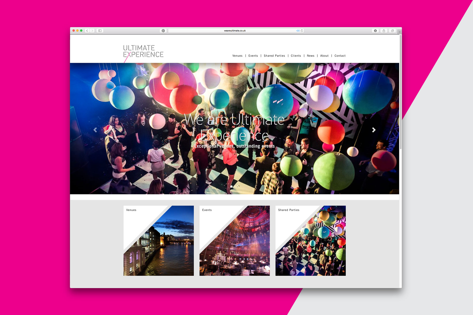
Rebrand for Ultimate Experience – a company offering exceptional venues and outstanding events. The identity and website was unveiled at their summer launch event at the Artillery Garden at the HAC in London, on Thursday.
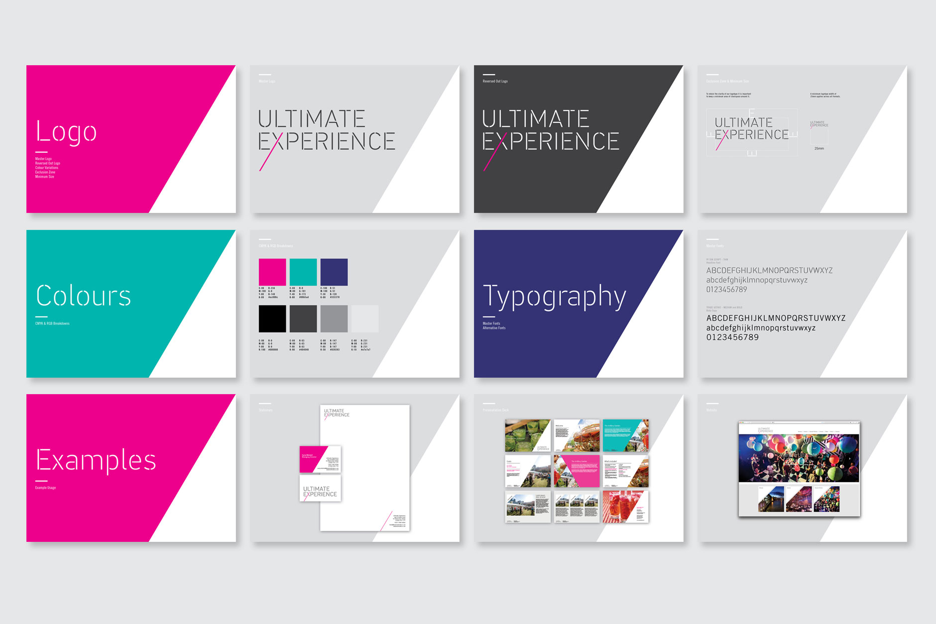
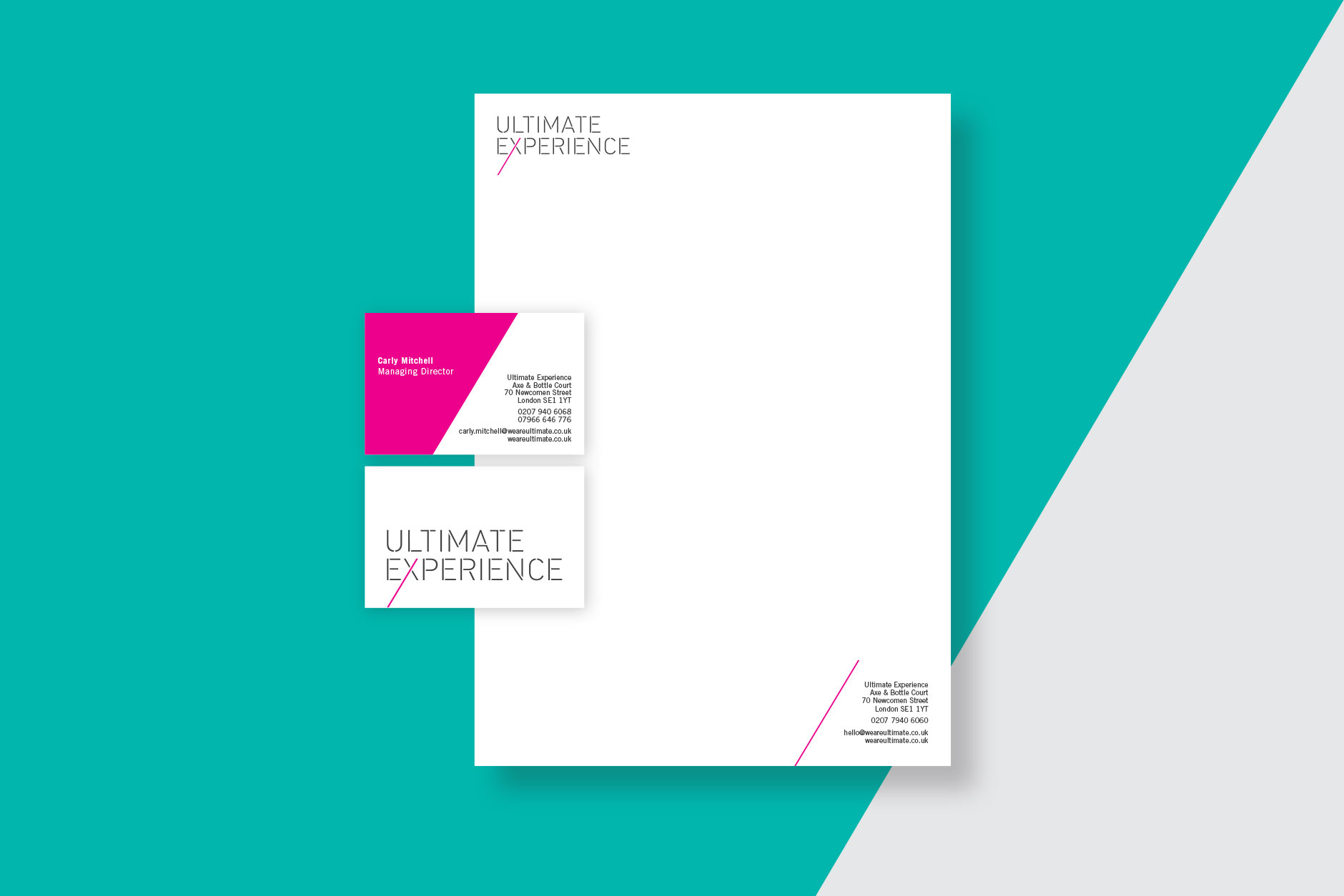
We developed the strategy and UX for the website, understanding the consumer and creating a site that catered for their diverse clientele. We then built them a completely bespoke WordPress site that can be managed internally with a fully editable CMS. The new identity was developed alongside the digital assets, including an overhaul of their marketing collateral and creation of guidelines to ensure a consistent look and feel moving forward.


see the website here:
http://www.weareultimate.co.uk
EAMS Group branding
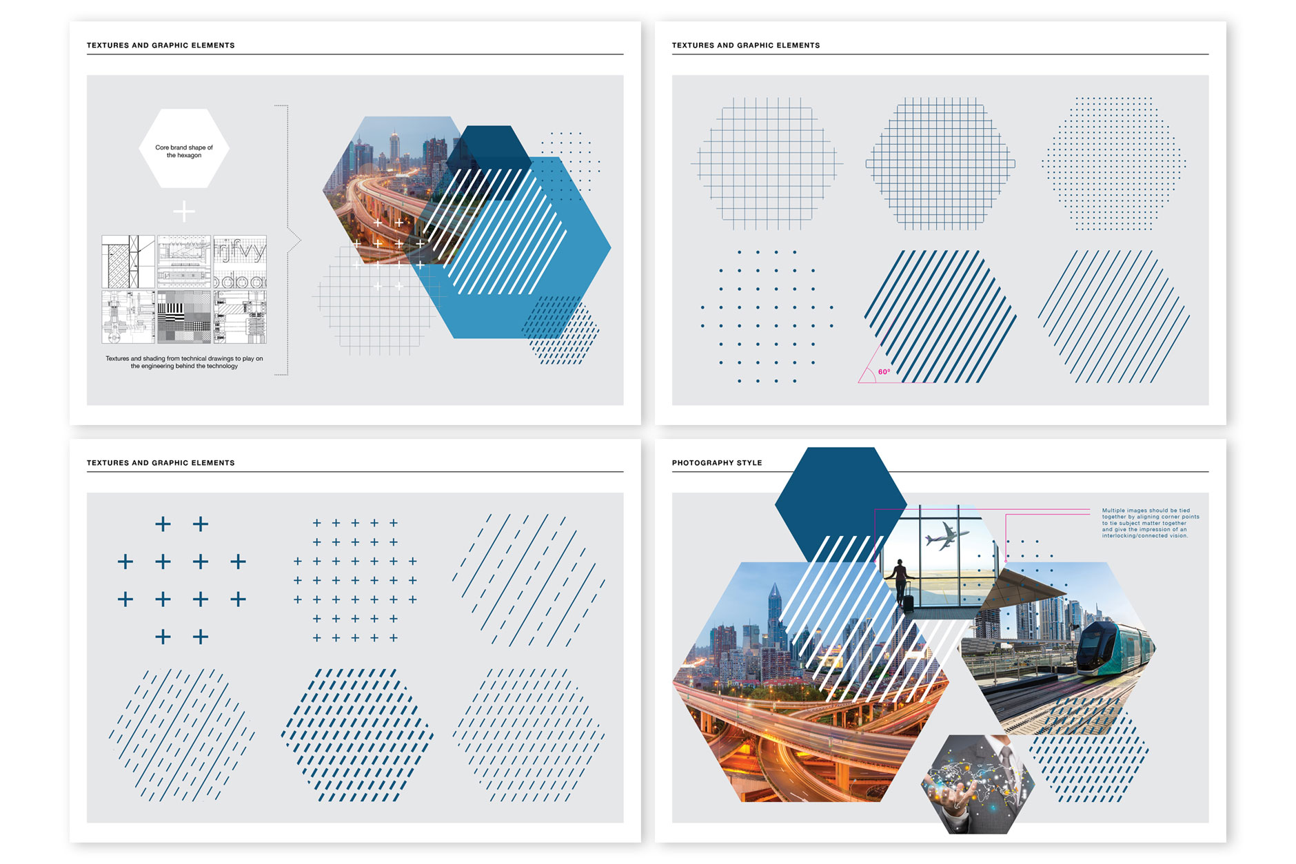
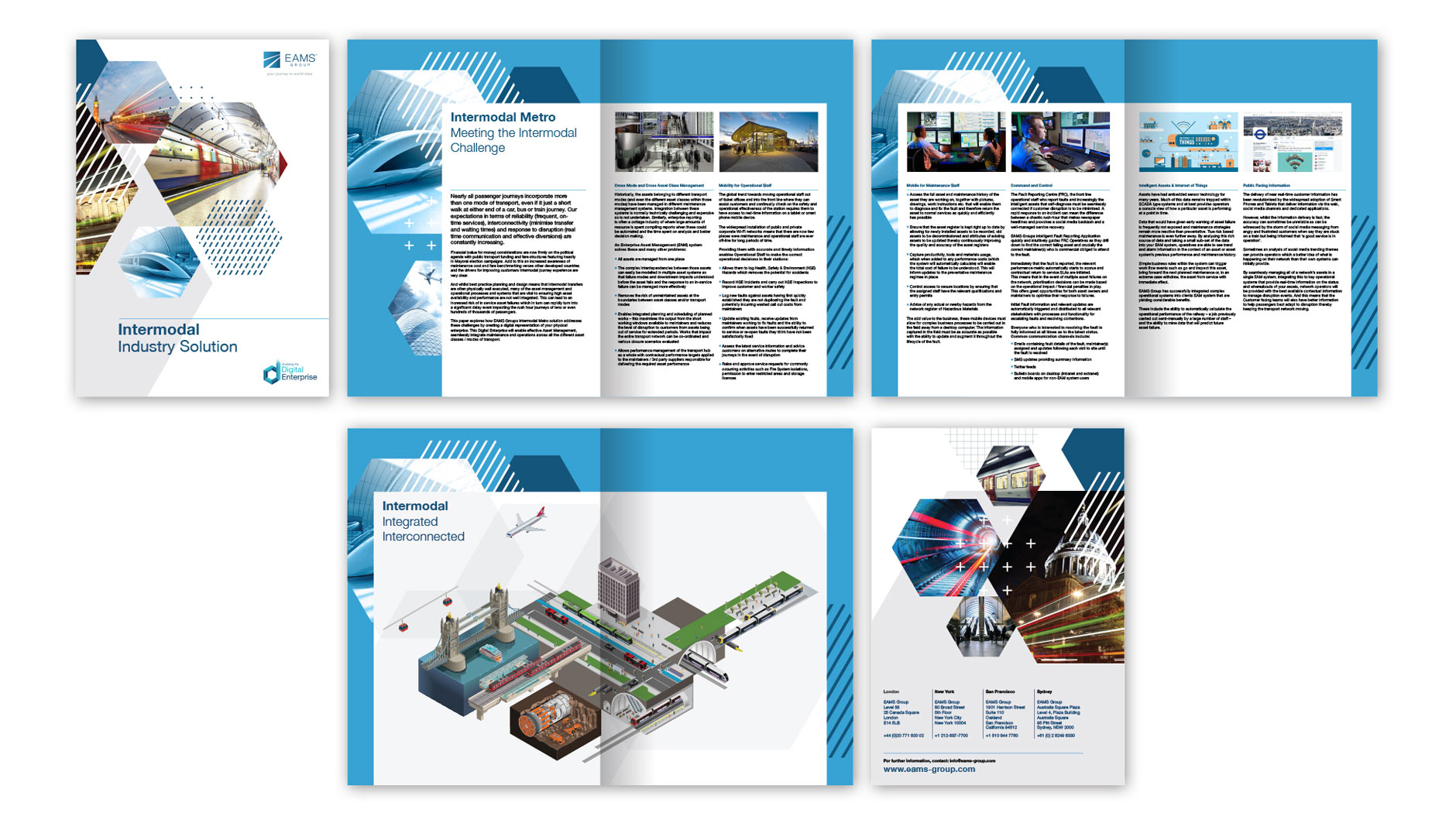
EAMS Group offers world class asset and safety management solutions to an impressive portfolio of global clients. They deliver innovative technology solutions to a broad range of clients in the engineering industry; from airports, rail and transport networks, ports and utilities. We were tasked with bringing this offering to life through a re-brand and rollout of new collateral.
Our concept focussed on creating a flexible system of graphic assets that used engineering textures and shading in a contemporary and impactful way.


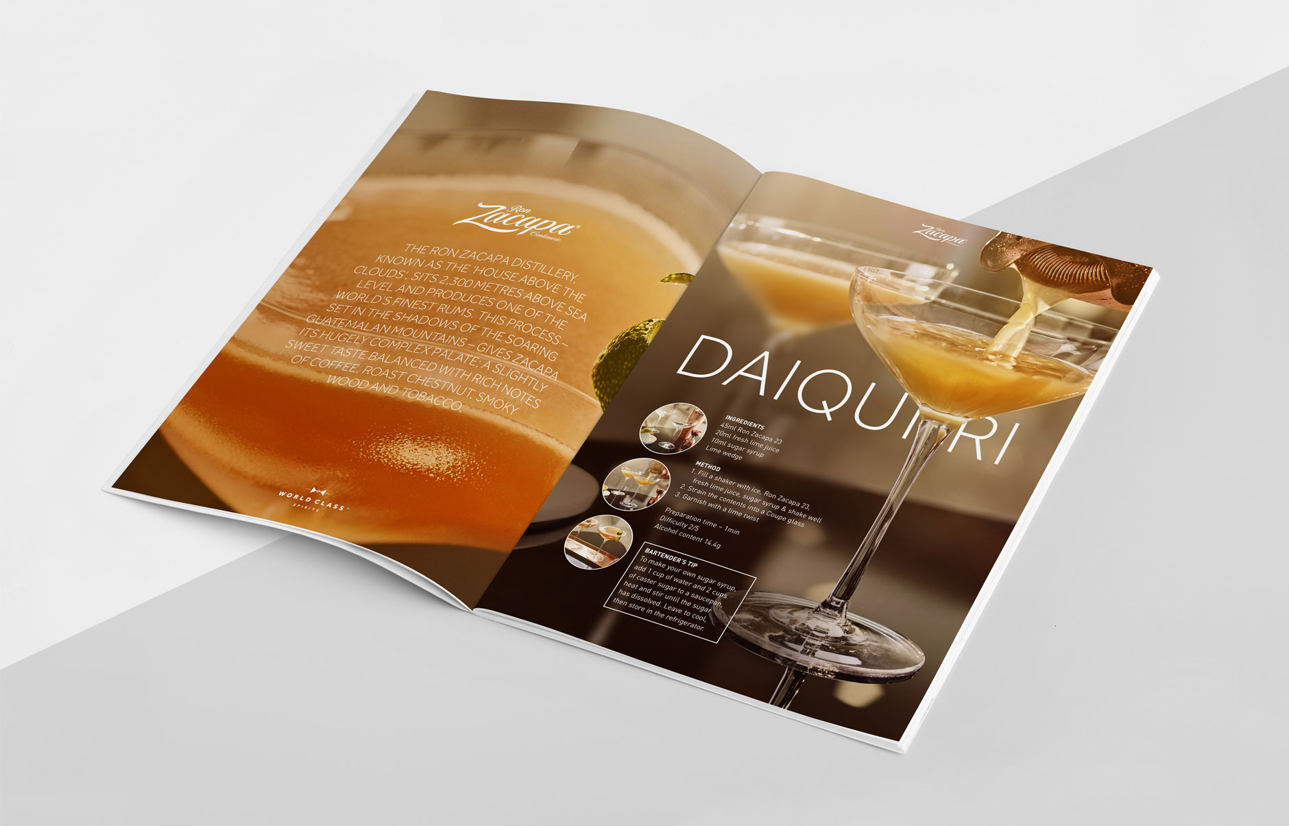
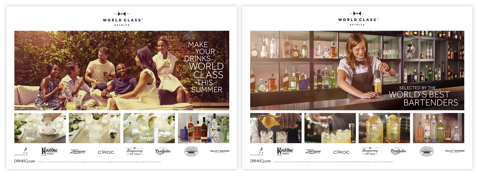
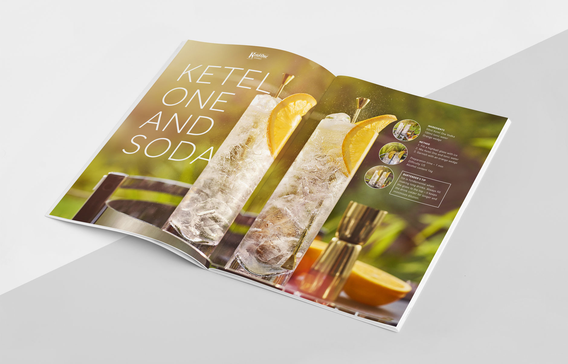
World Class Drinks
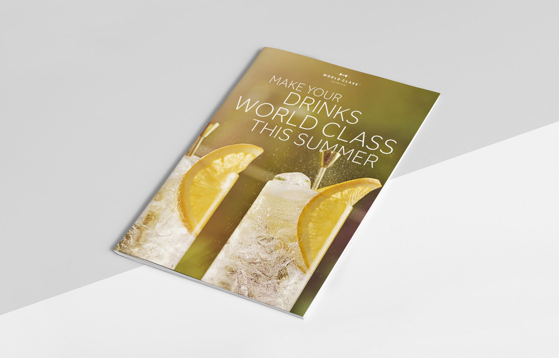
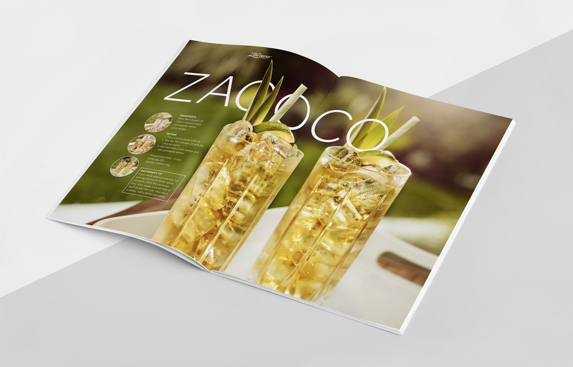
Design and Art Direction for Diageo’s World Class Drinks premium range of spirits. Photography by Rob Lawson across three shoots, including model casting, locations and art direction for the summer drinks campaign and the World Class Bartender Competition we shot in South Africa.


Agency: RPM
Photography: Rob Lawson
Drinks Stylist: Tara Garnell
Props Stylist: Tamsin Weston
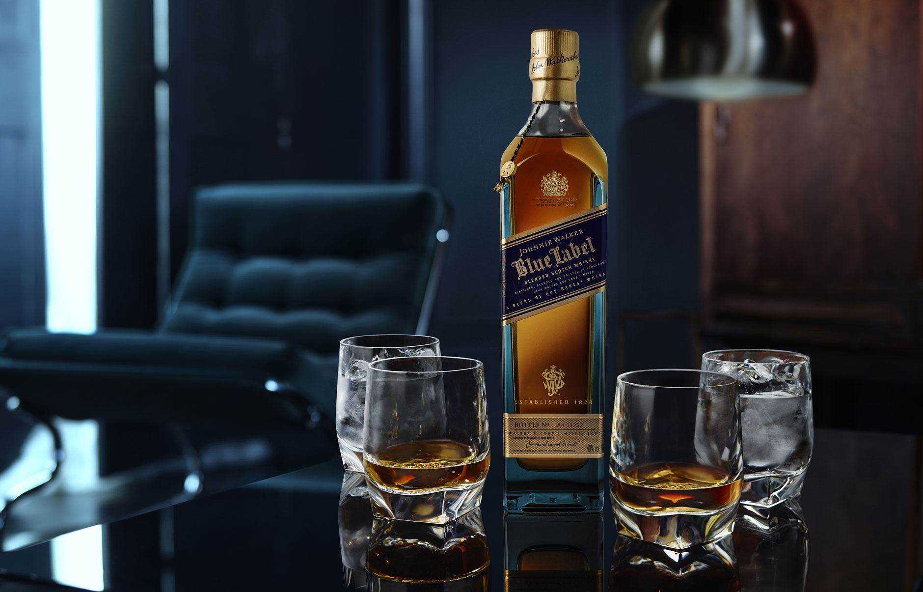
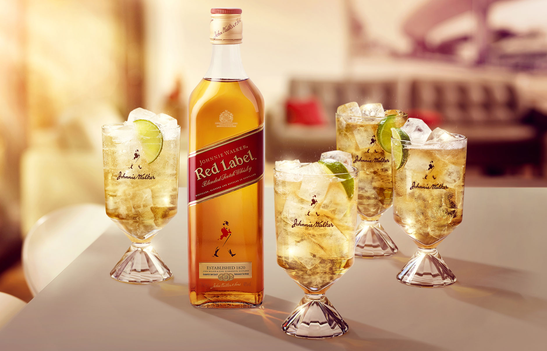
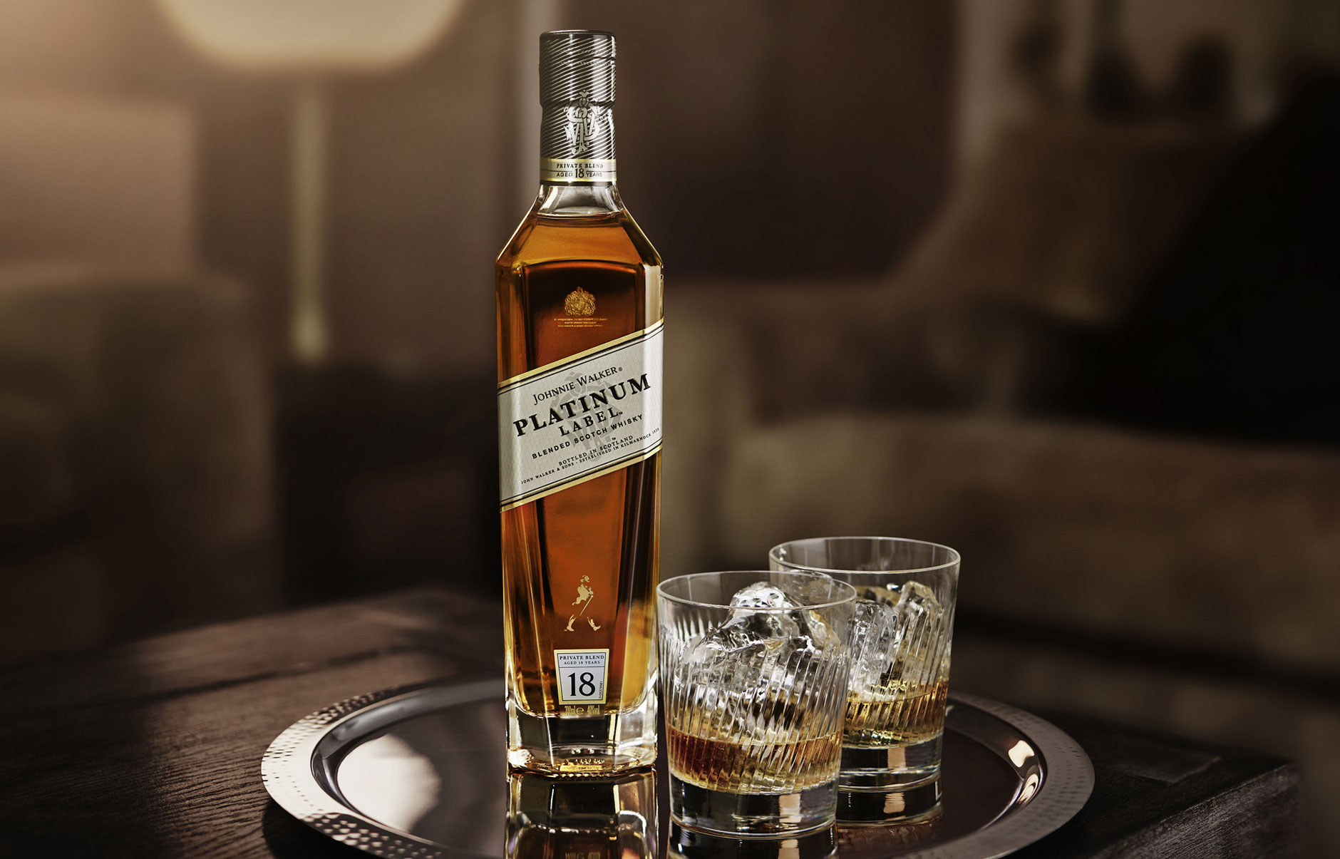
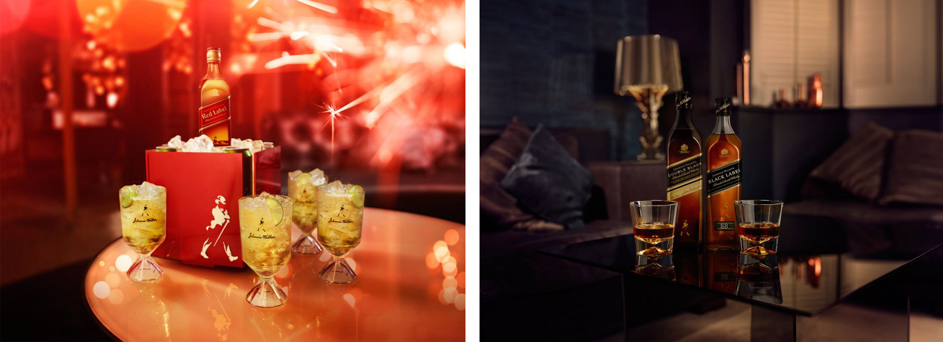
Johnnie Walker
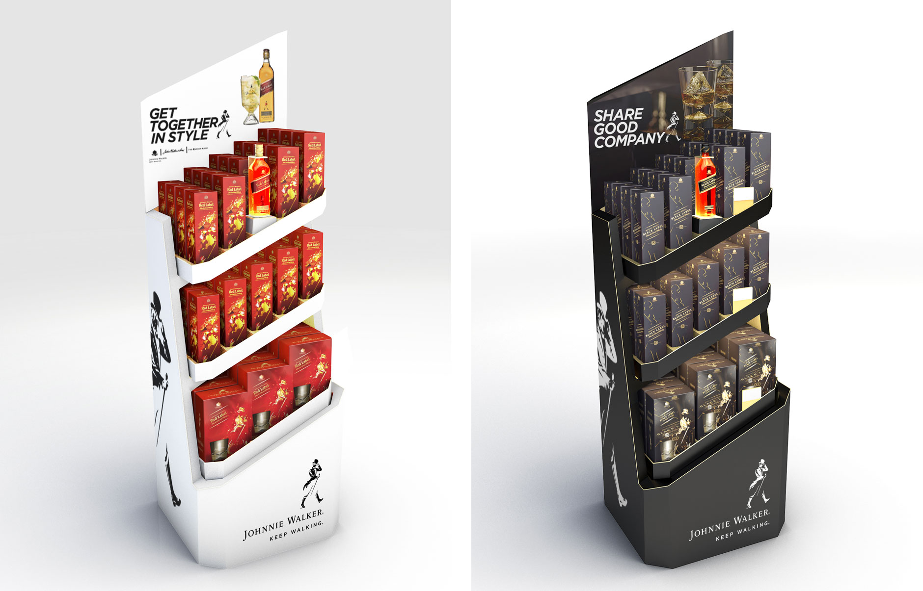
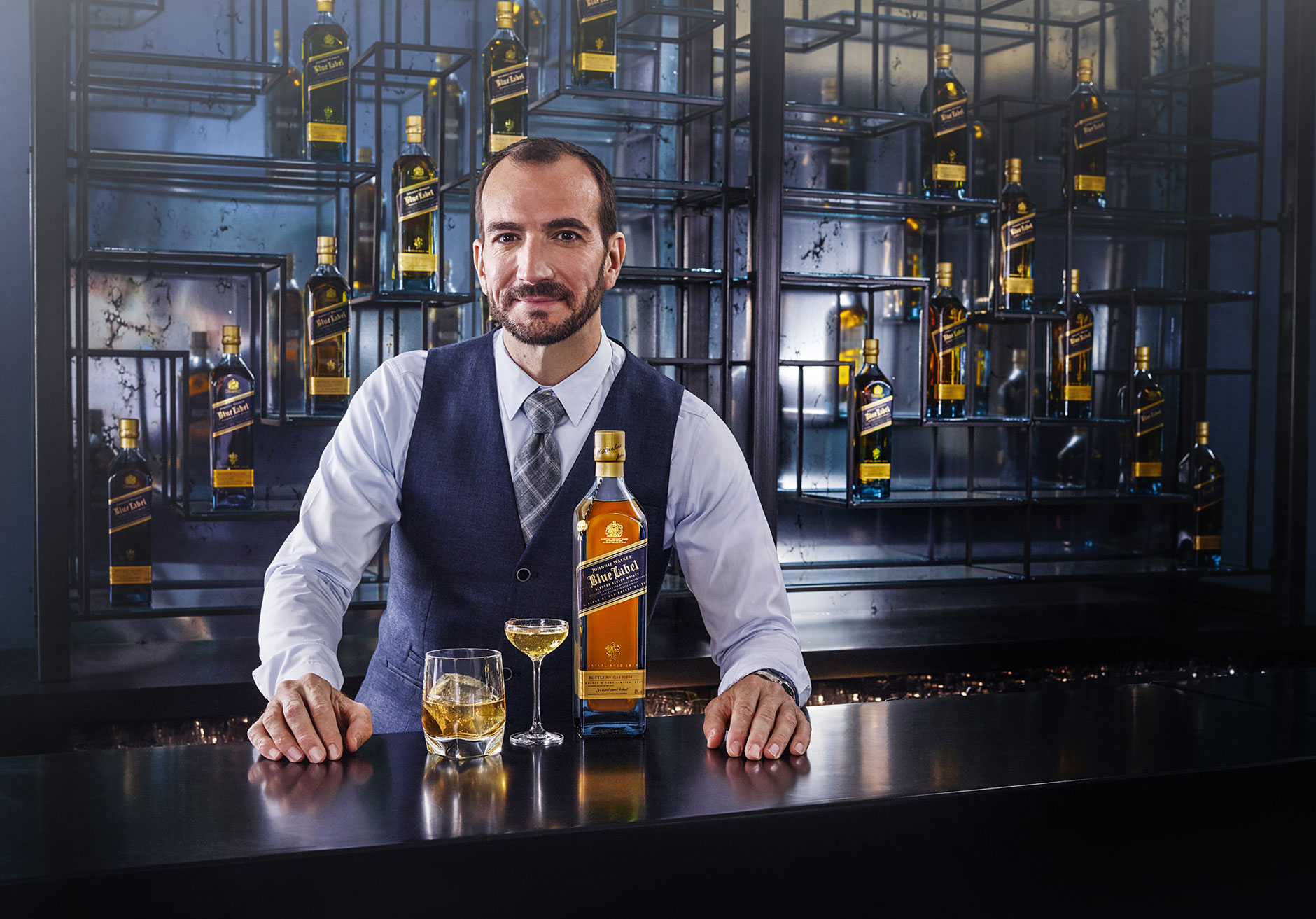
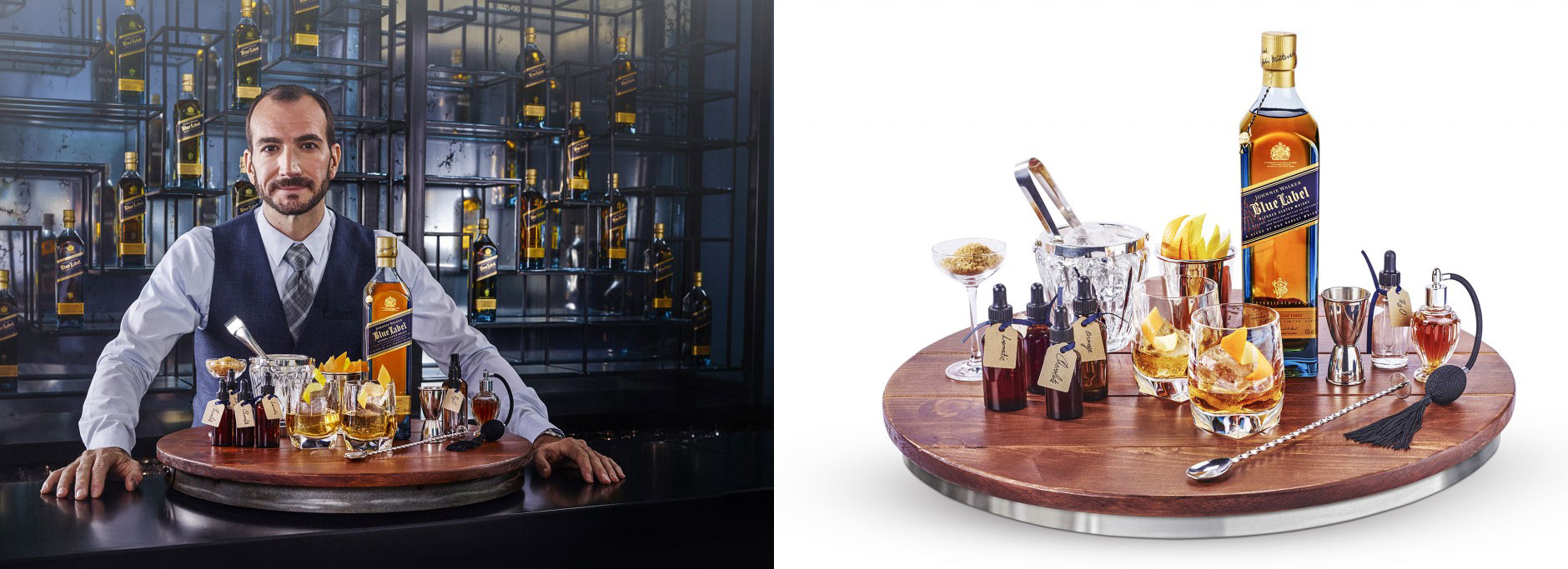
A few bits of design and art direction from our work on the revised Johnnie Walker brand.


Instore FSDU design based on the iconic bottle shape:

Photography: Rob lawson | Producer: Jennifer Pattison | Stylist: Tara Garnell | Props: Tamsin Weston
Agency: RPM/Love | 3D: Greg Walker


