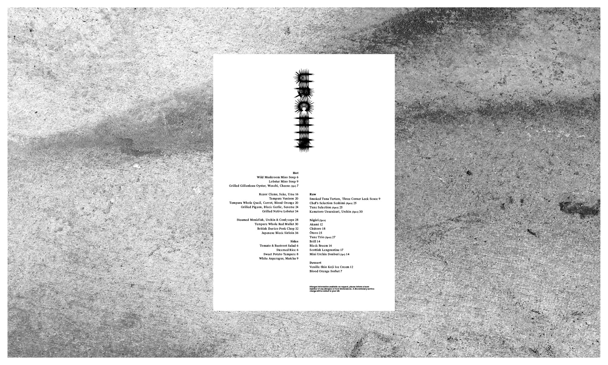
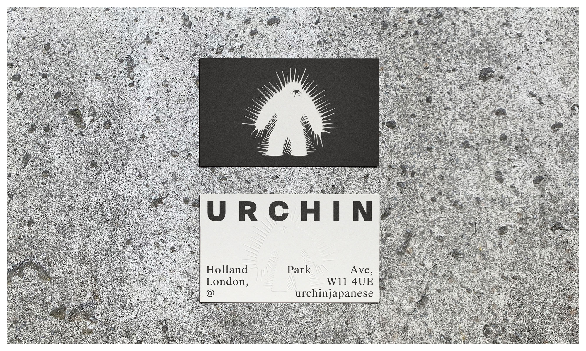
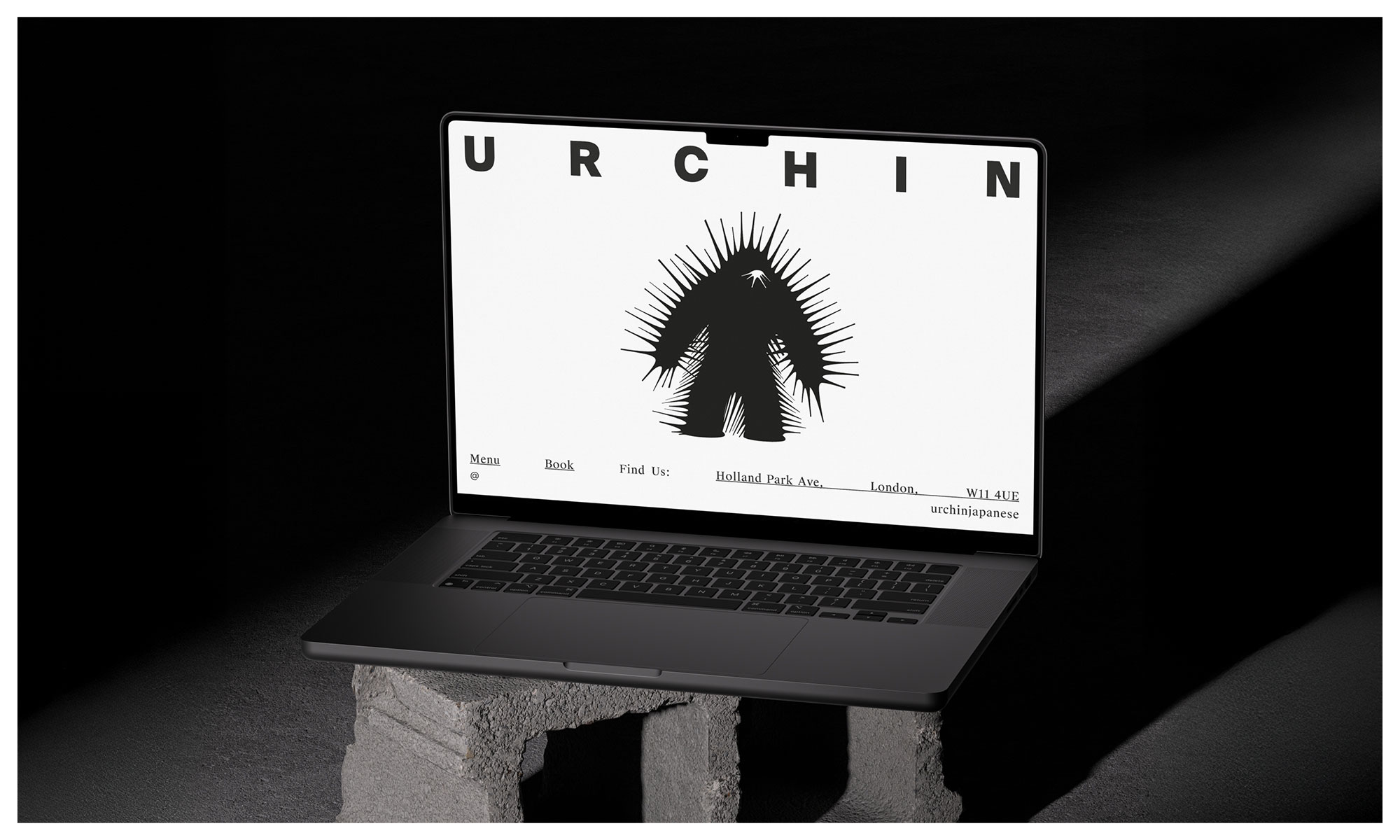
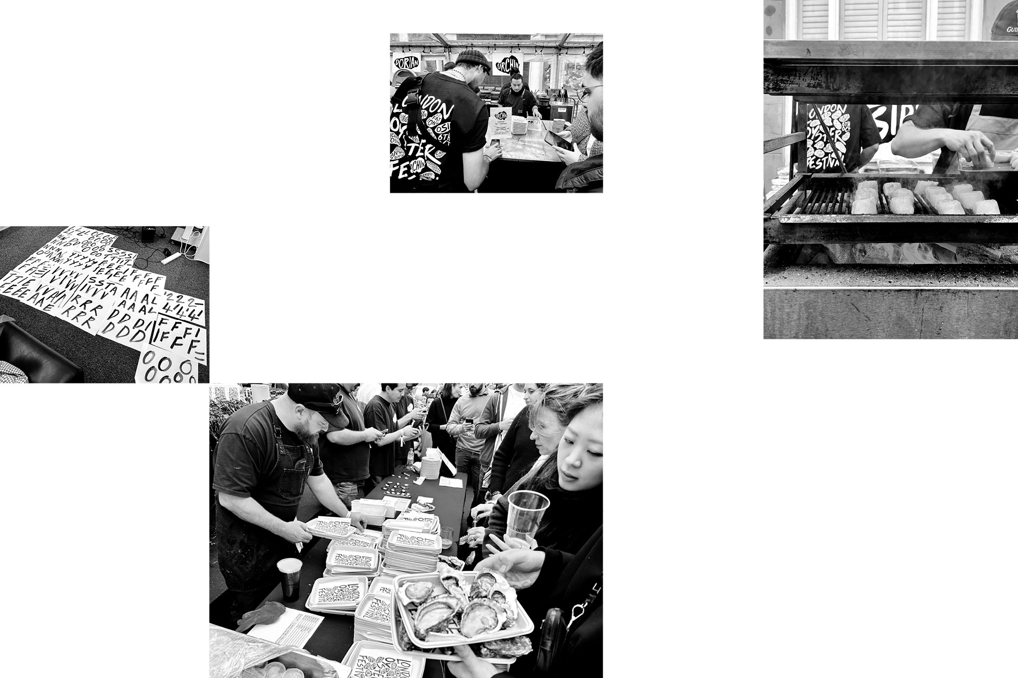
Urchin Japanese is the latest culinary hotspot from the team behind Dorian, Notting Hill Fish Shop, Tuna Fight Club and debuts in their Supermarket of Dreams location in Holland Park. With an upgraded open restaurant kitchen, multi-level wood grill and rotisserie, the killer team have hit the ground running.
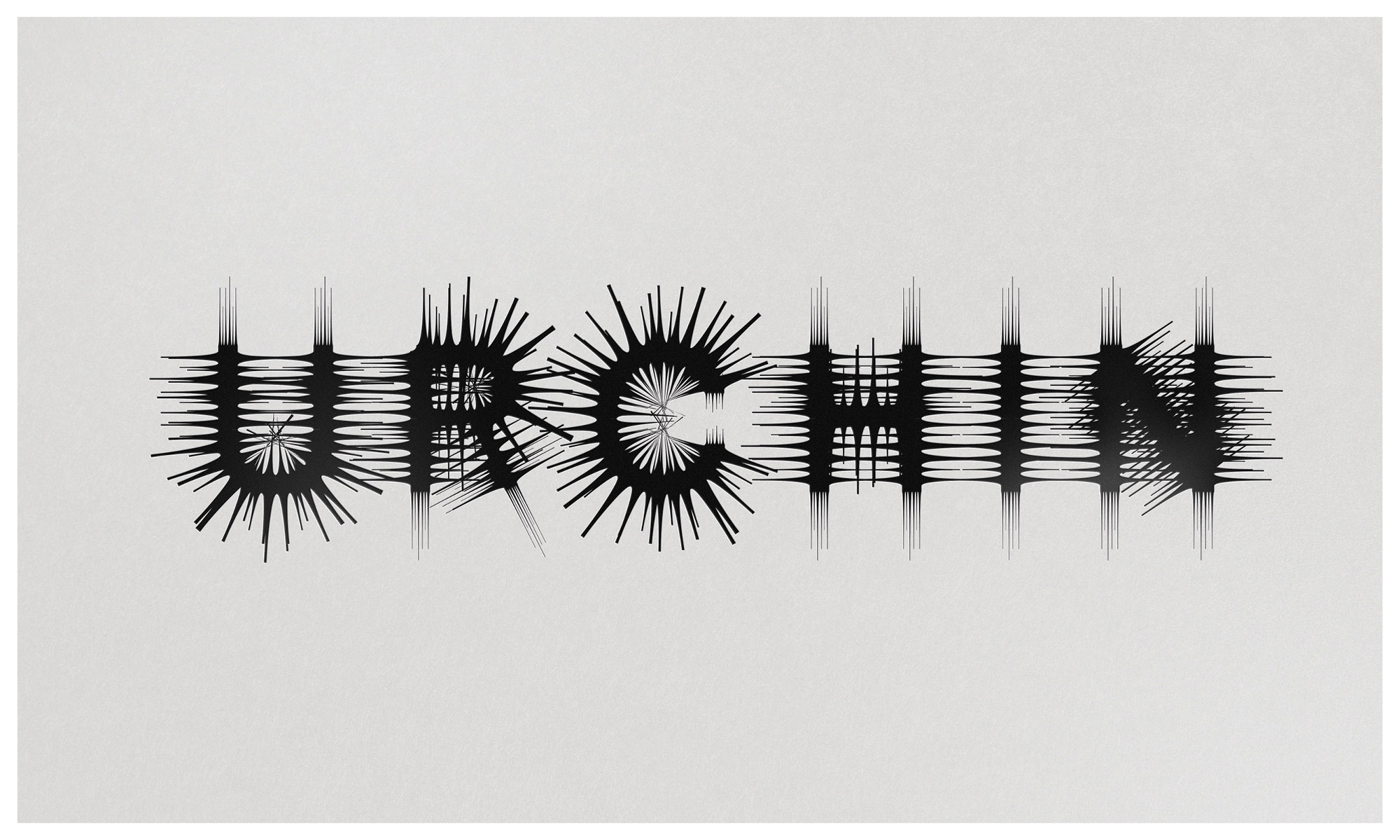
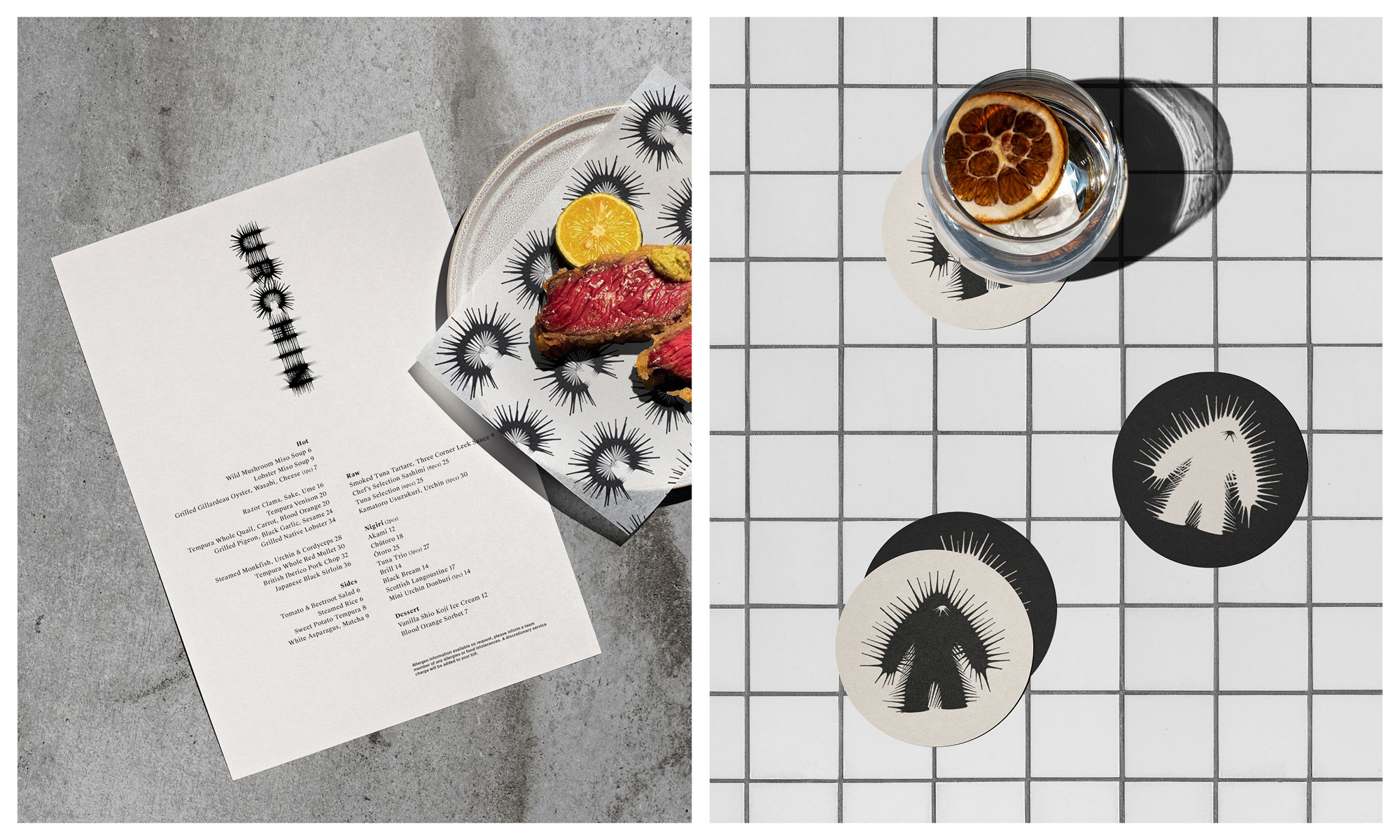
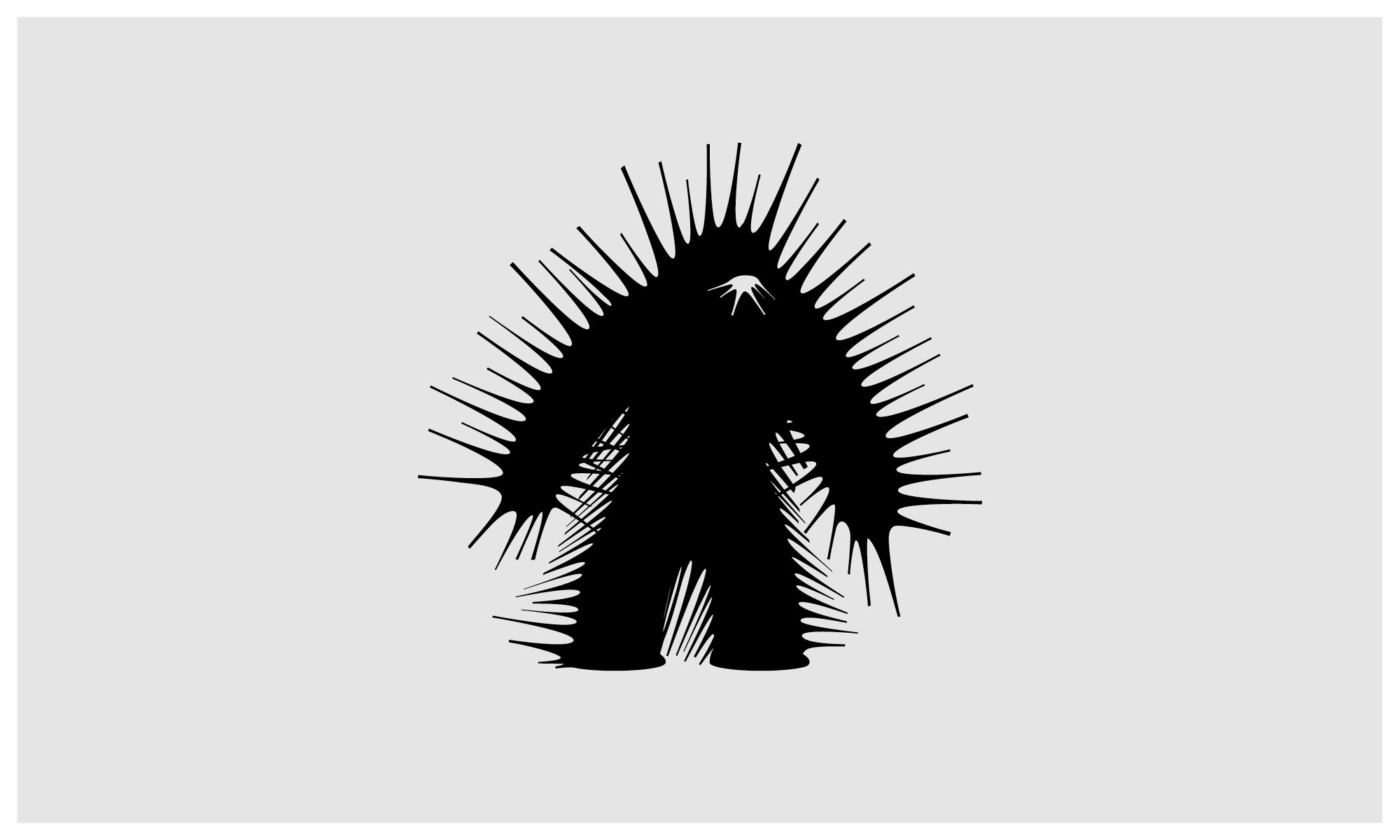
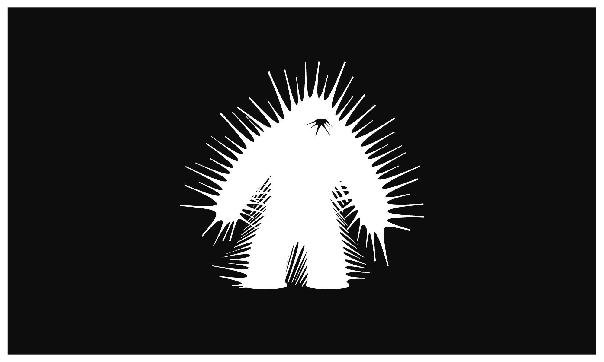
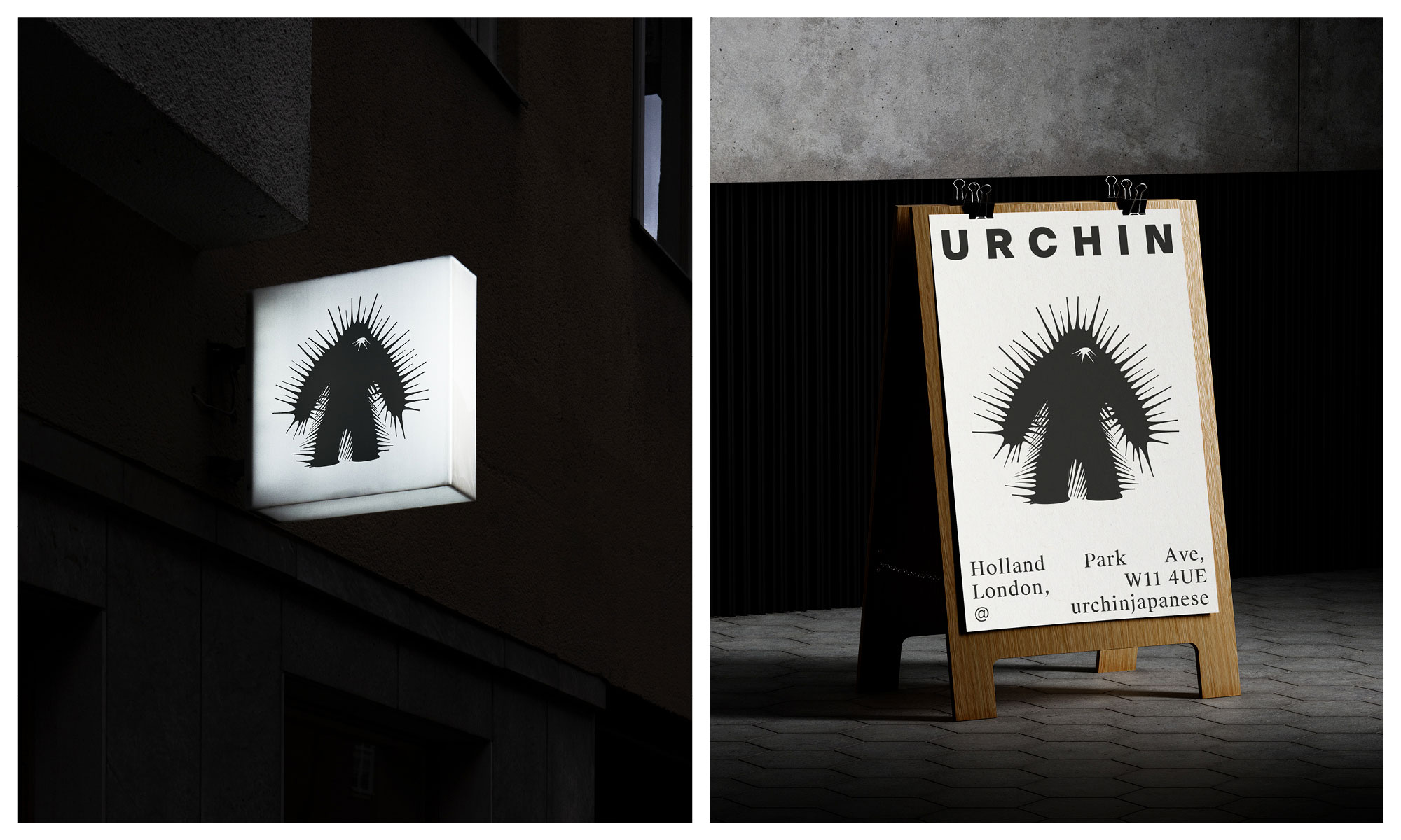
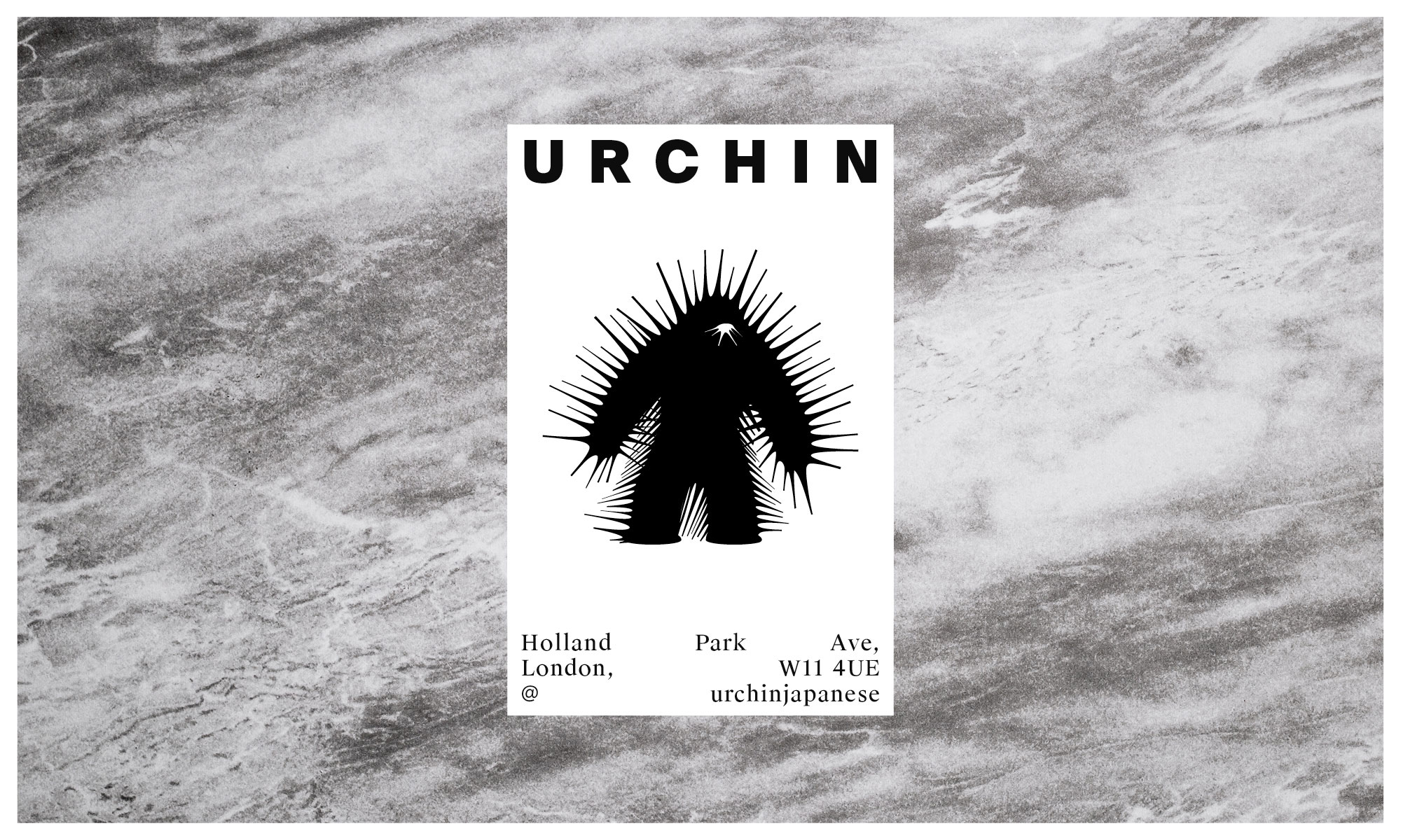
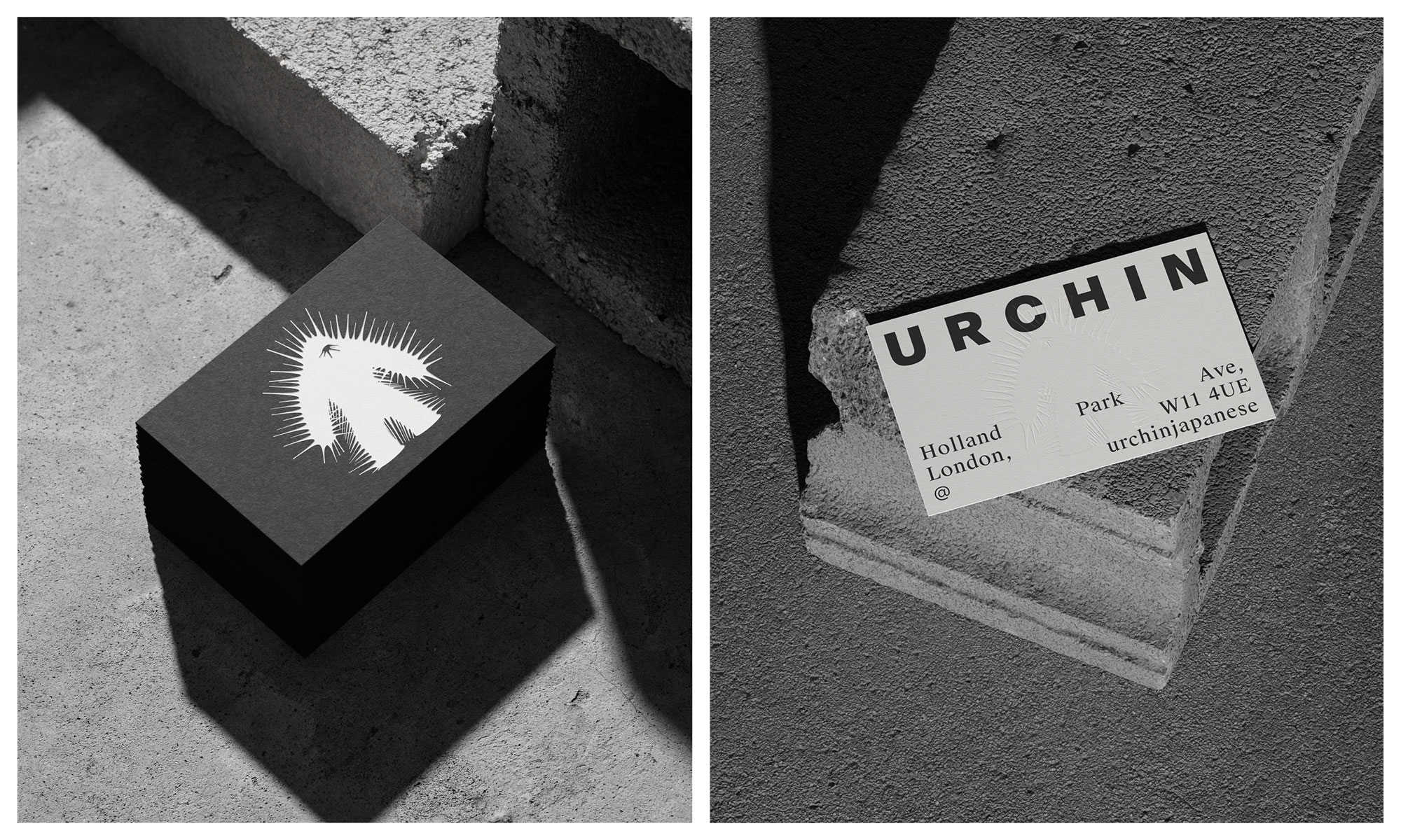
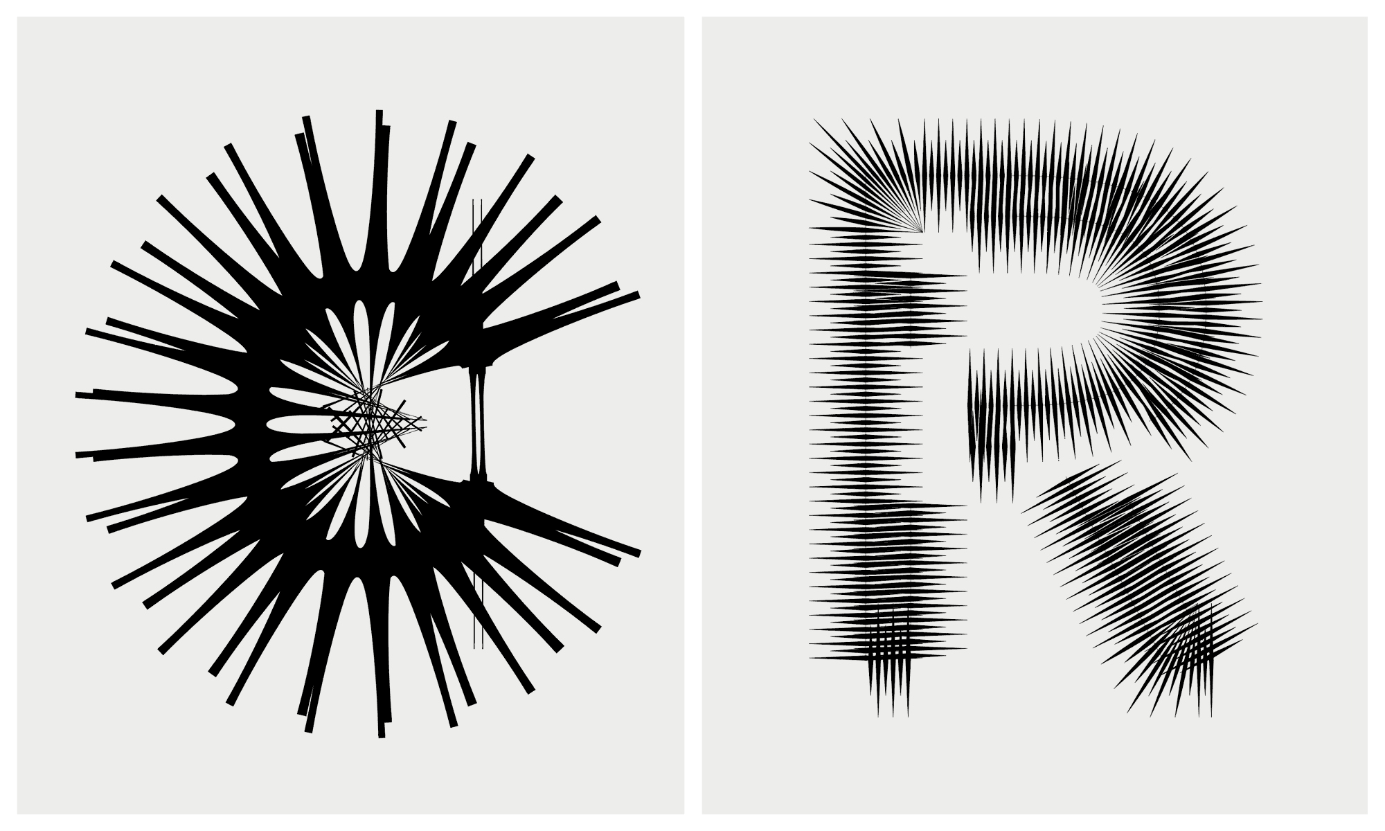
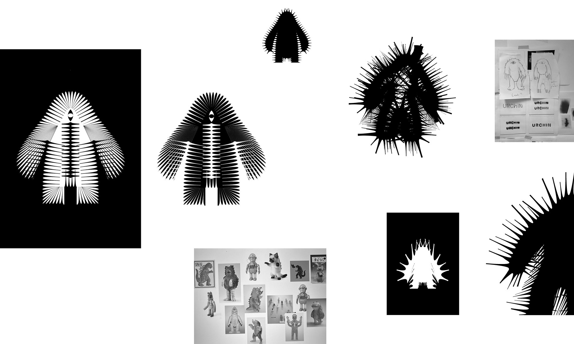
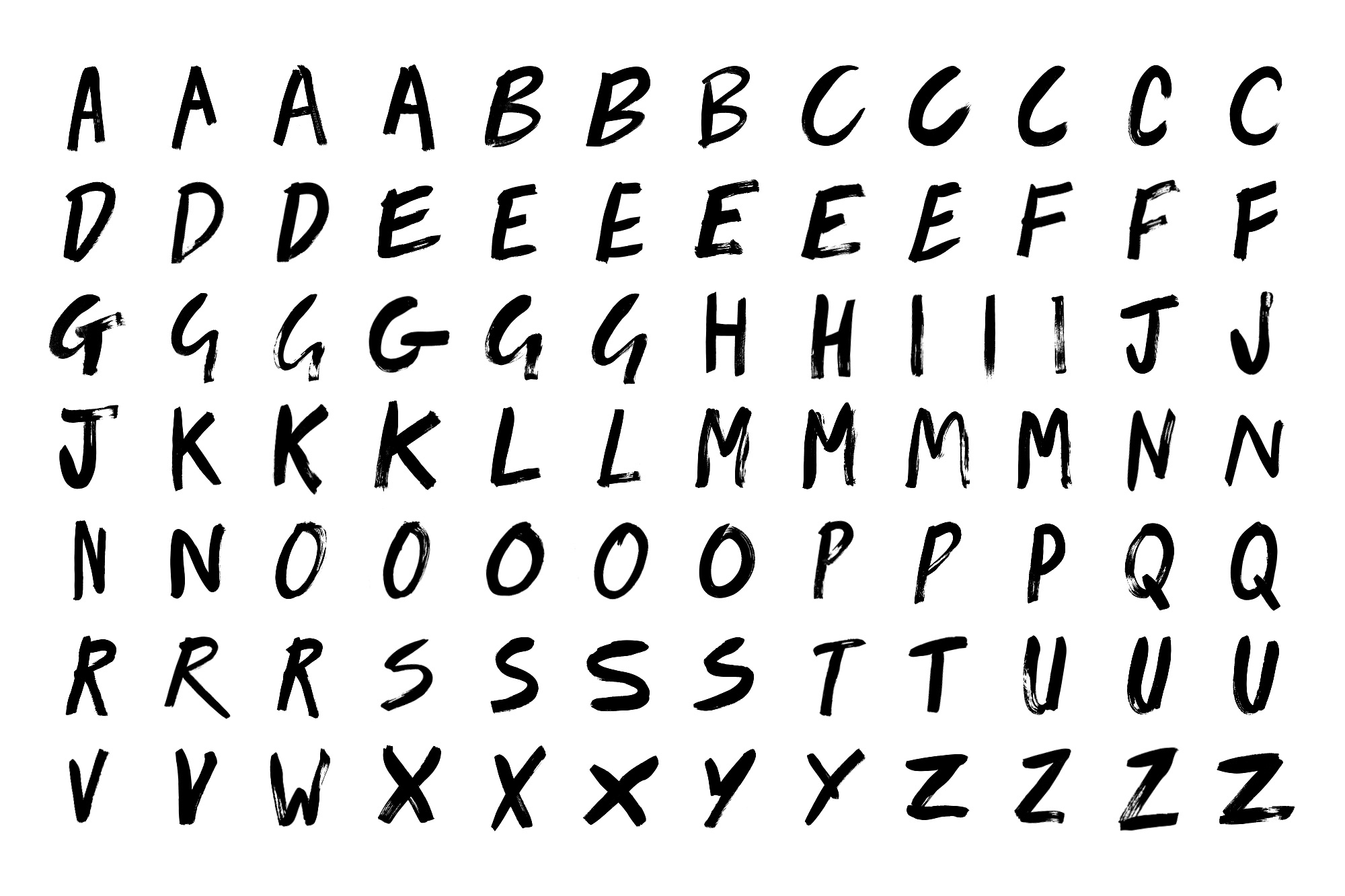
The identity pairs a unique Kaiju-inspired character with experimental typography for the wordmark that echoes the spiky nature of urchins. The monster is a quiet nod to the slang term, embracing a Mischievous and dark persona, a foreboding creature emphasised with the barbed and schizophrenic exterior.
It’s a deliberate shift from the sterile and conservative cues that underly the category. There is still a sense of elegance and sophistication, but with such a dynamic and passionate team, this was never about fitting in.
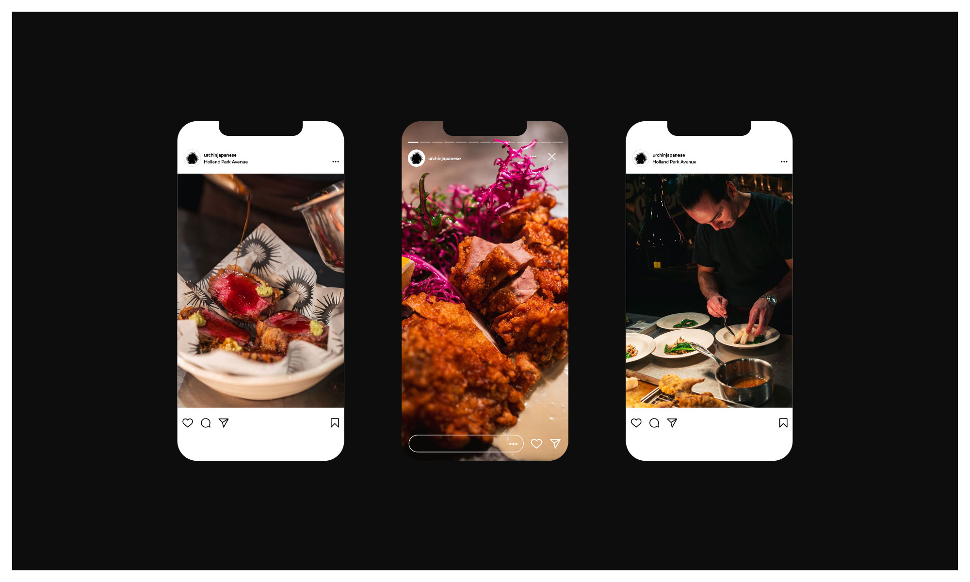
Head chef Yuji Shimokawa has quickly made this new venture a runaway hit, alongside the infamous Tuna Fight Club shenanigans. Authentic cooked Japanese produced with superior produce, meet Hot Japanese.
Expect classic dishes alongside the likes of; Orkney Scallop tempura layered with black truffle dusted with maituke powder garnished with tempura flakes, shaved ceps, ginger sauce and house Dirty Tendashi. Fresh Sea Urchin Donburi with fresh wasabi and Minina leaf.
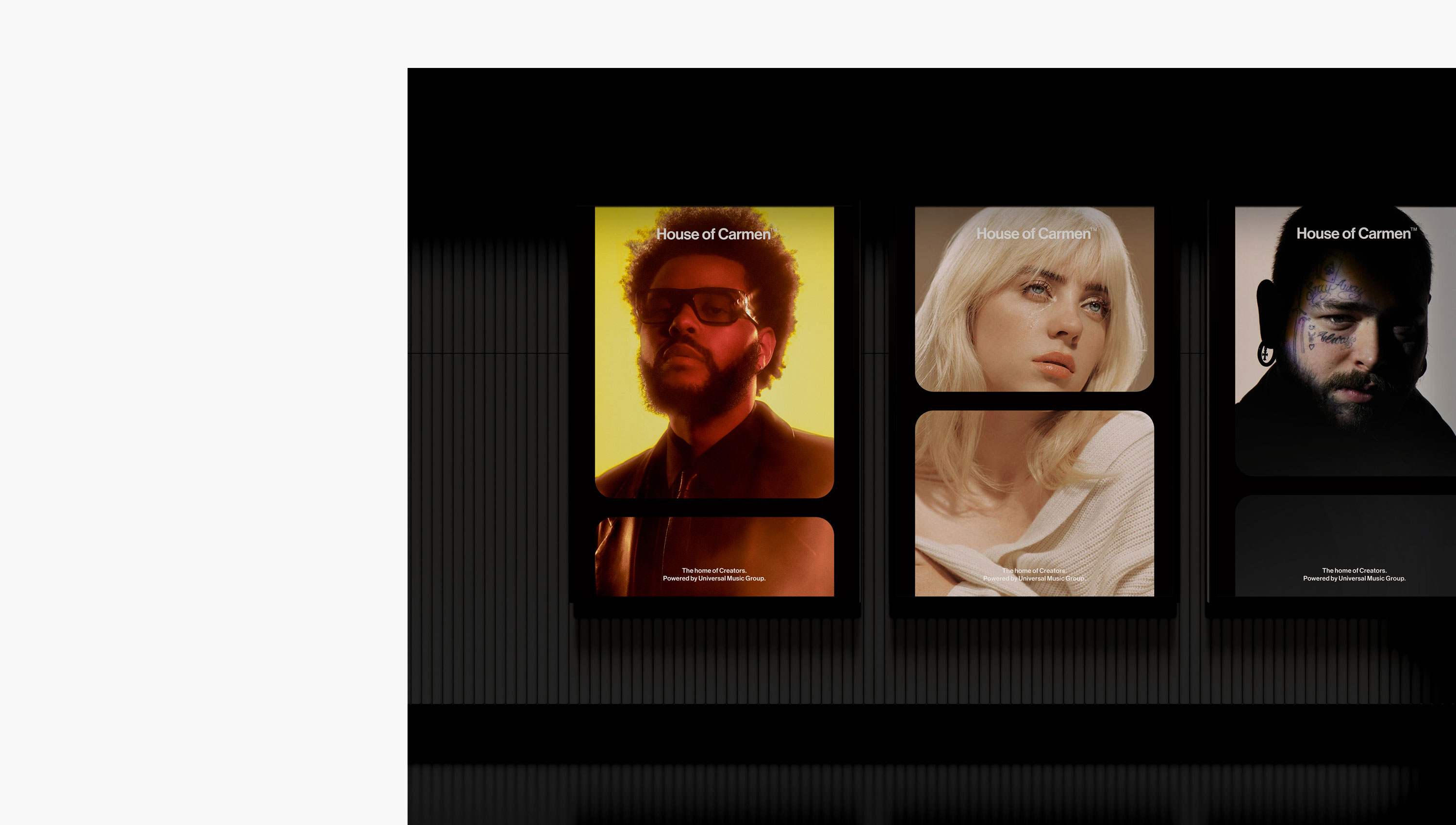
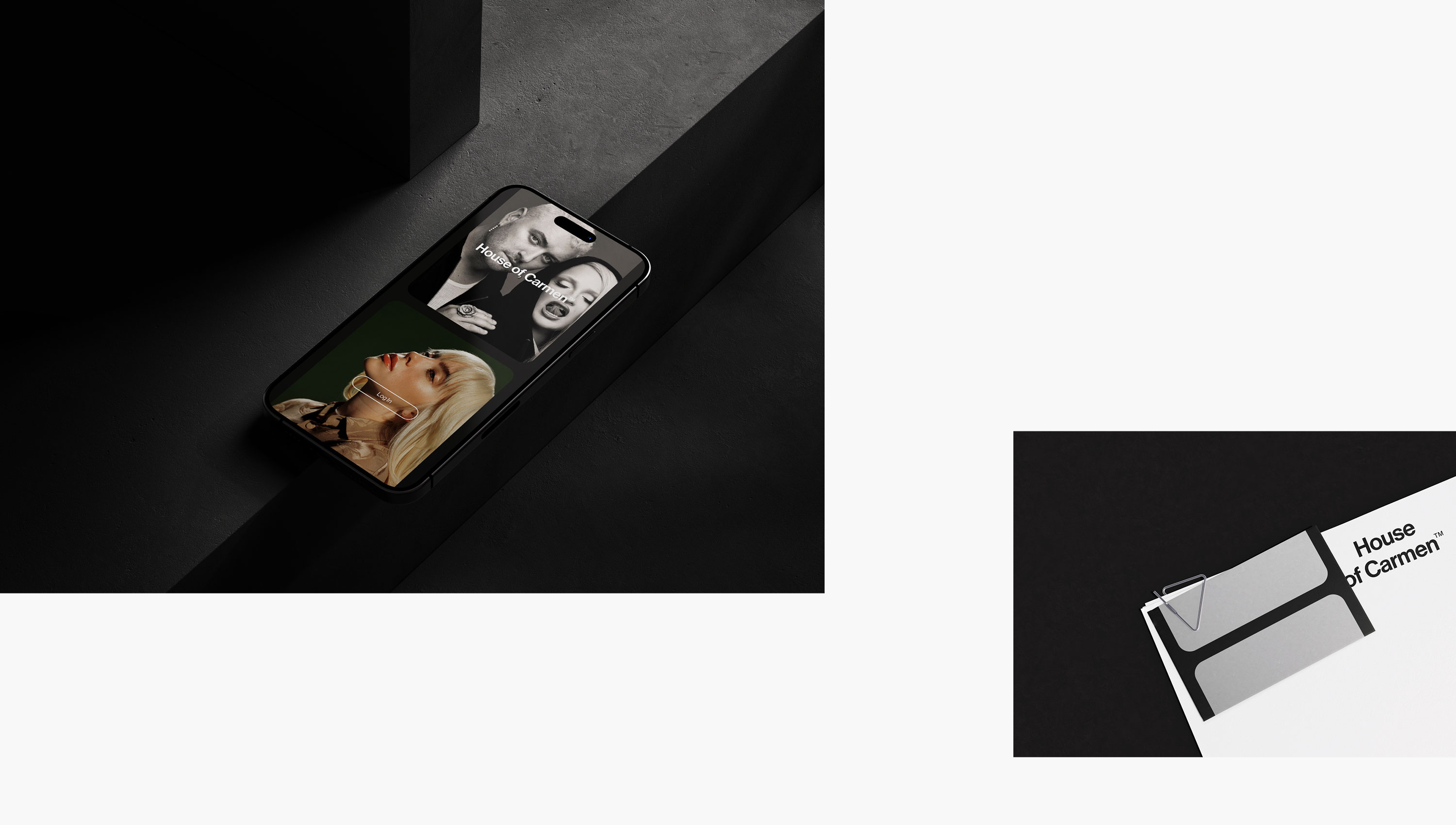
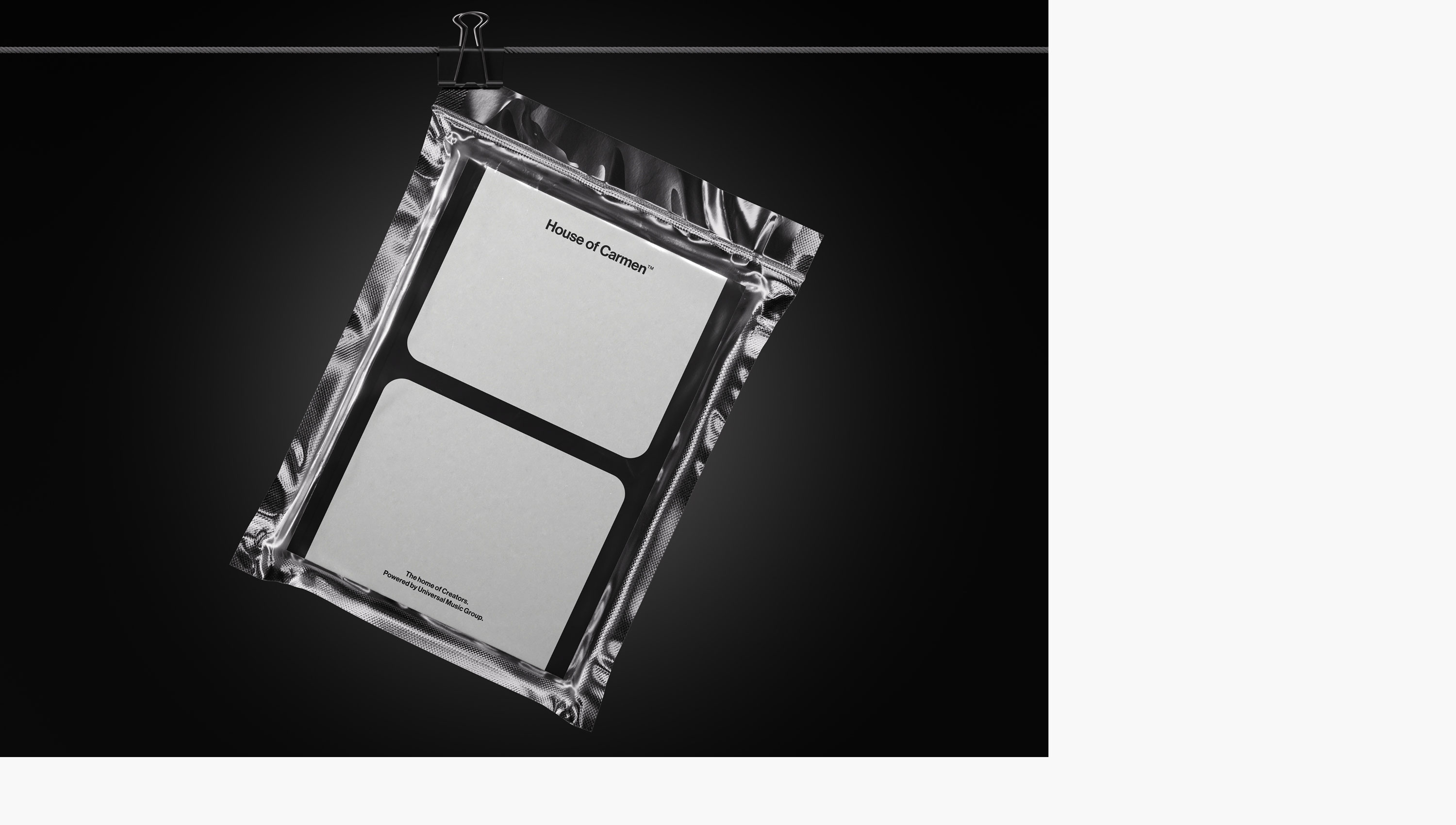
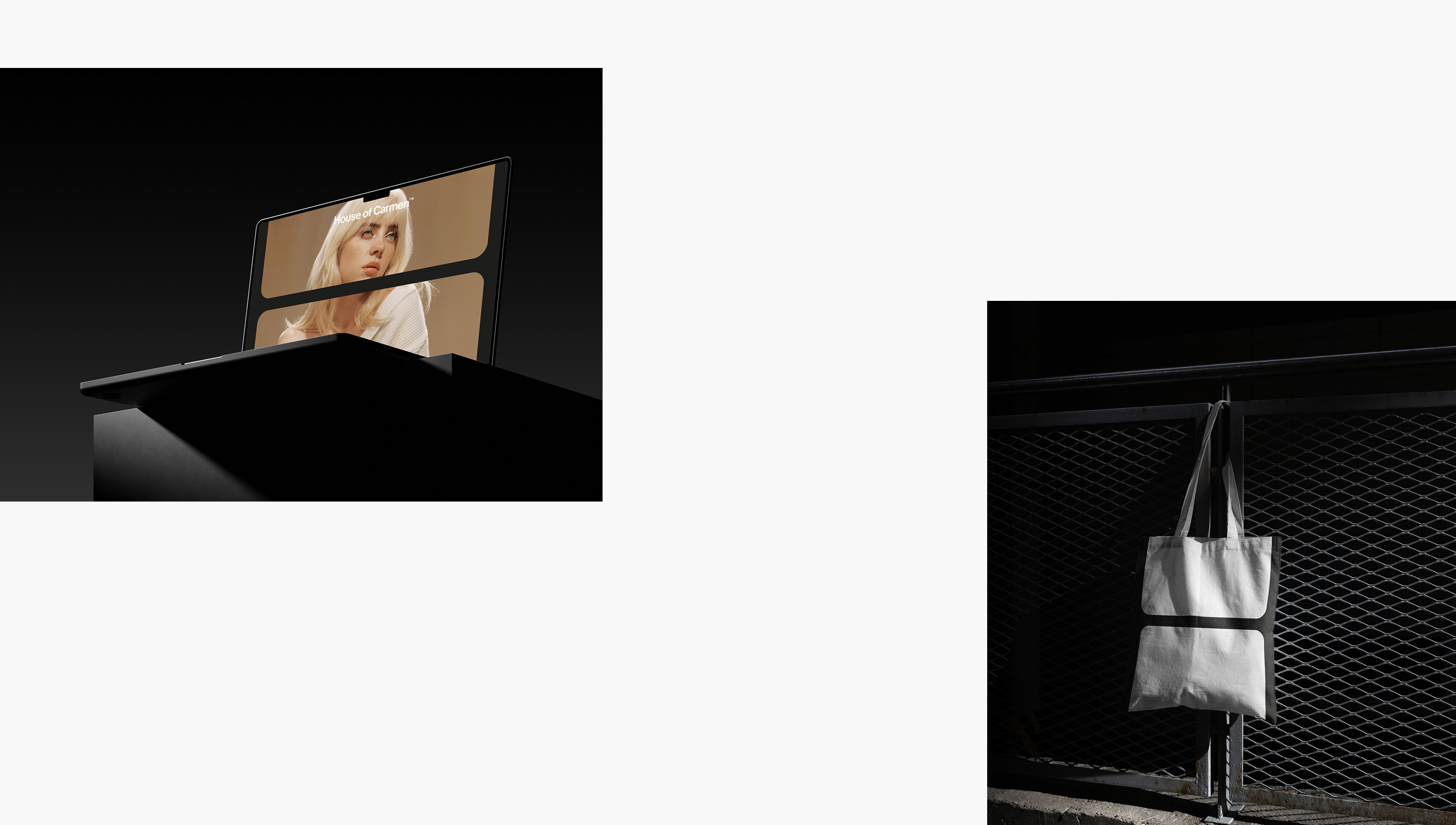
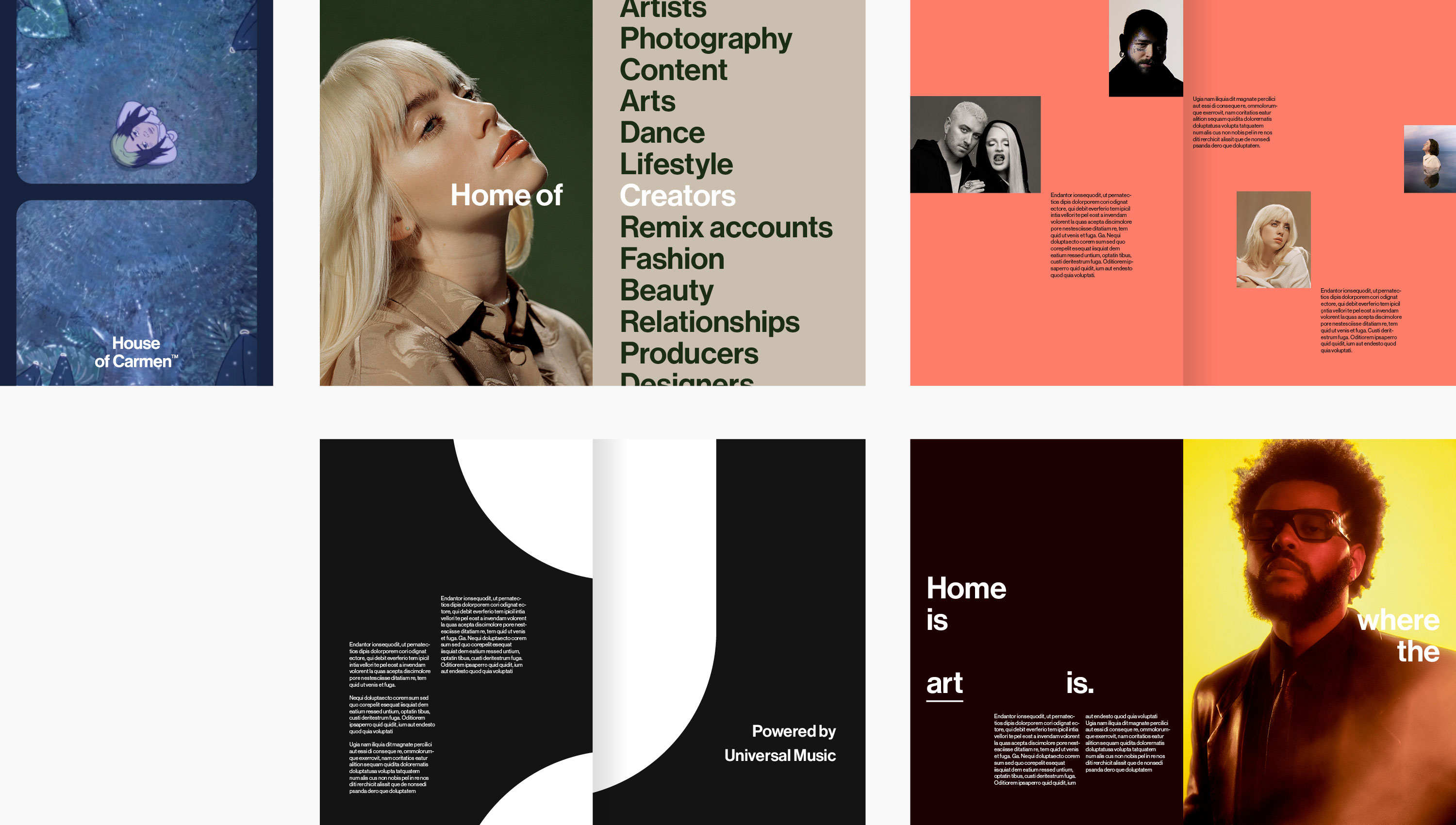
New brand identity and App design for the House of Carmen from Universal Music Group. House of Carmen is designed specifically as a community for creators who want access to some of the biggest artists in the world. Members of the community are presented with challenges that run across social platforms including; TikTok, Instagram and YouTube. Briefs vary, but the House of Carmen enables users to earns rewards and payment for their unique content. Join the community. Shape music culture.
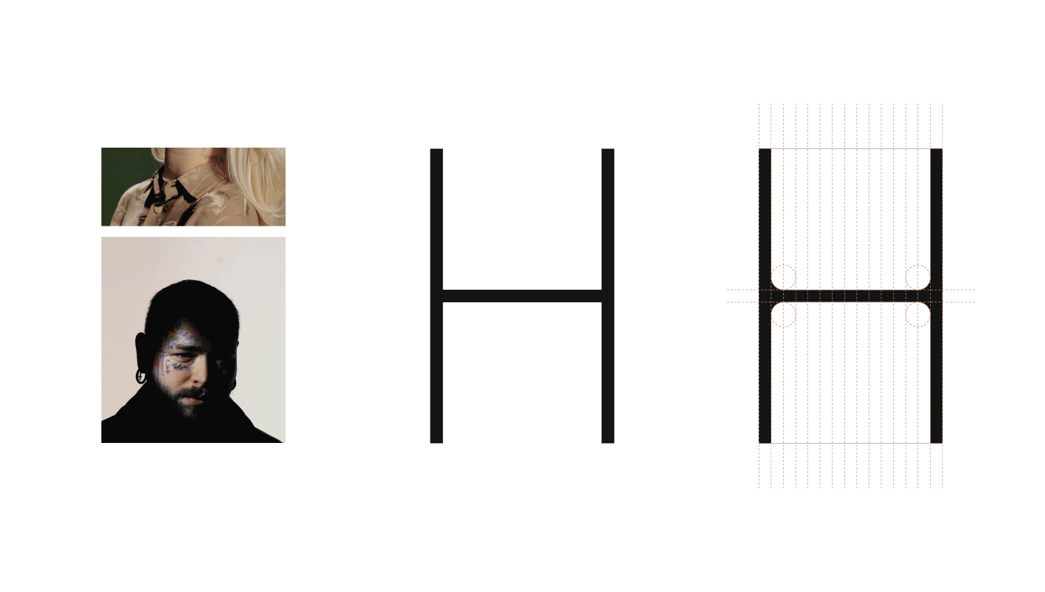
The identity echoes the scrolling characteristics of social, with a quiet nod to film reels. The resulting H becomes a flexible holding device that creates a dynamic frame for photography and moving image. The suite of assets allows the brand to be both playful, and reserved, when needed. We also applied this design direction to the UI and UX approach for the App, with the internal team delivering the final build.
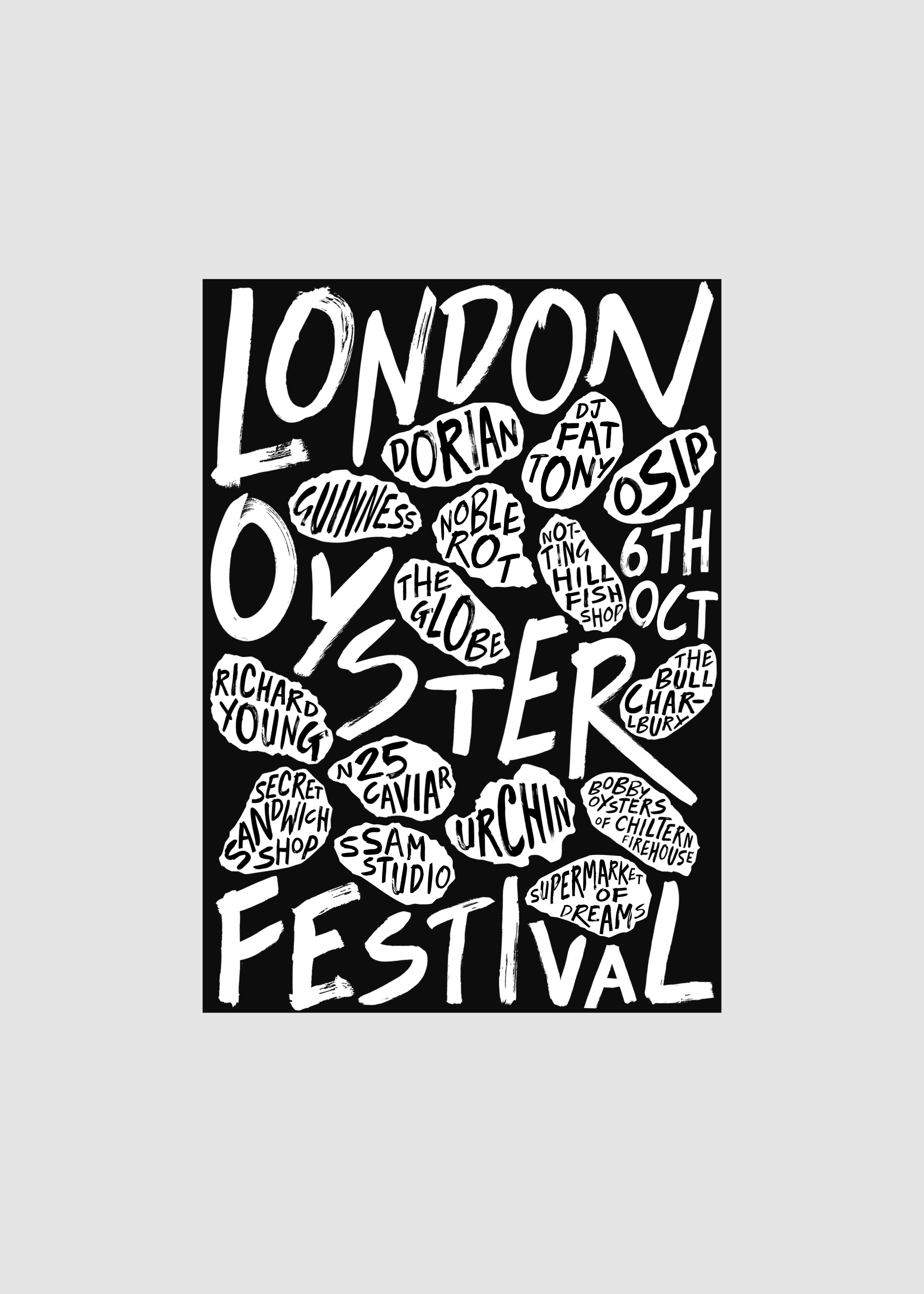
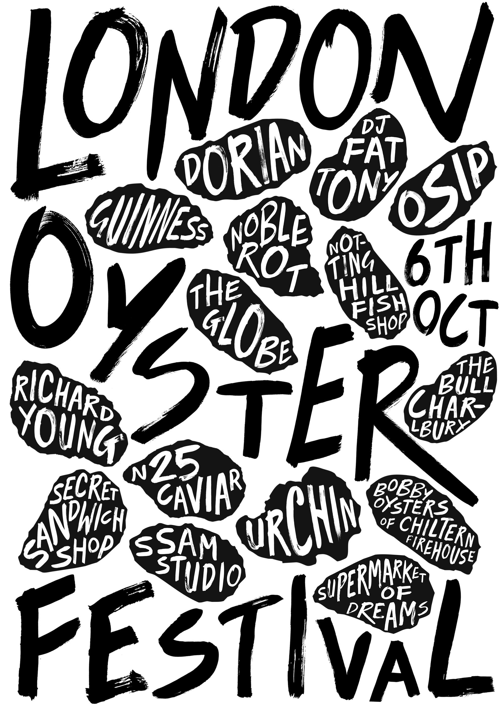
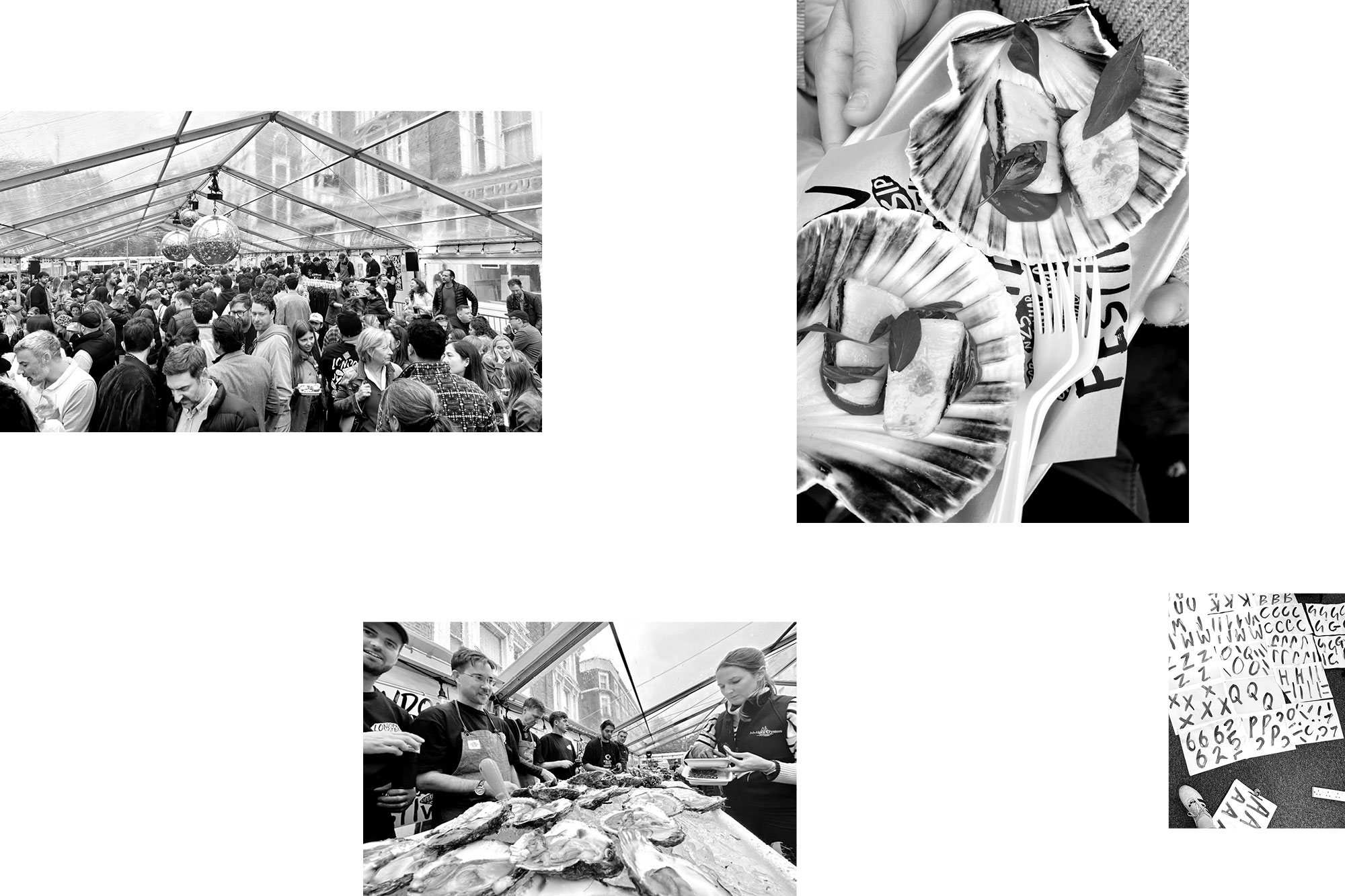
Notting Hill, closed roads, DJs, a giant mirror ball, arguable some of London and the UK’s best chefs, Guinness, fine wines, and a shed load of oysters. The London Oyster Festival is back, from the infamous team at Notting Hill Fish & Meat.
We crafted a bold brand identity with hand-painted typography that let the line-up sell itself. A strong black and white palette, and simple paper cutouts for contrast.
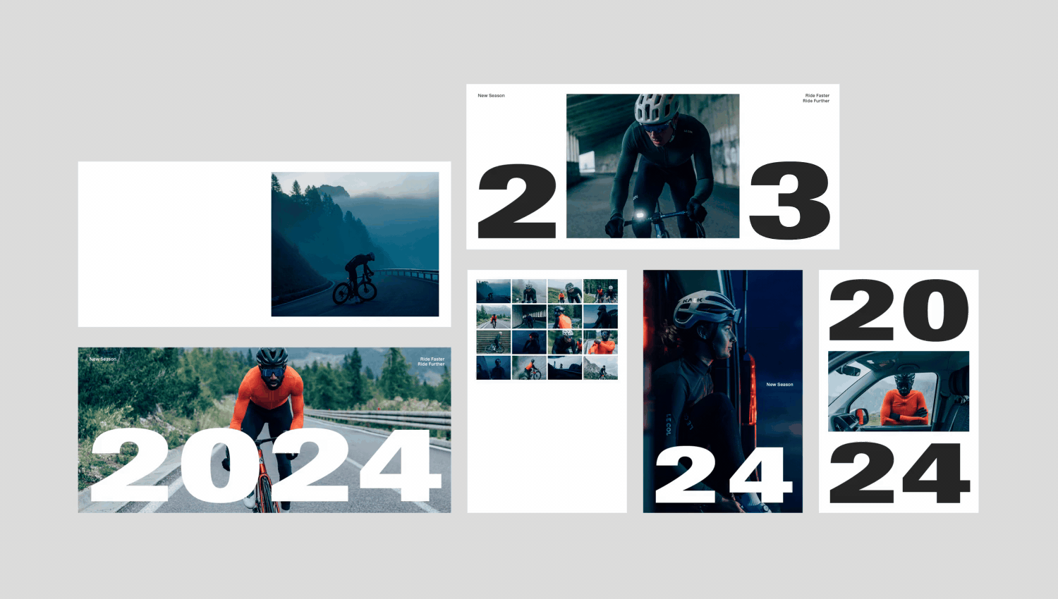
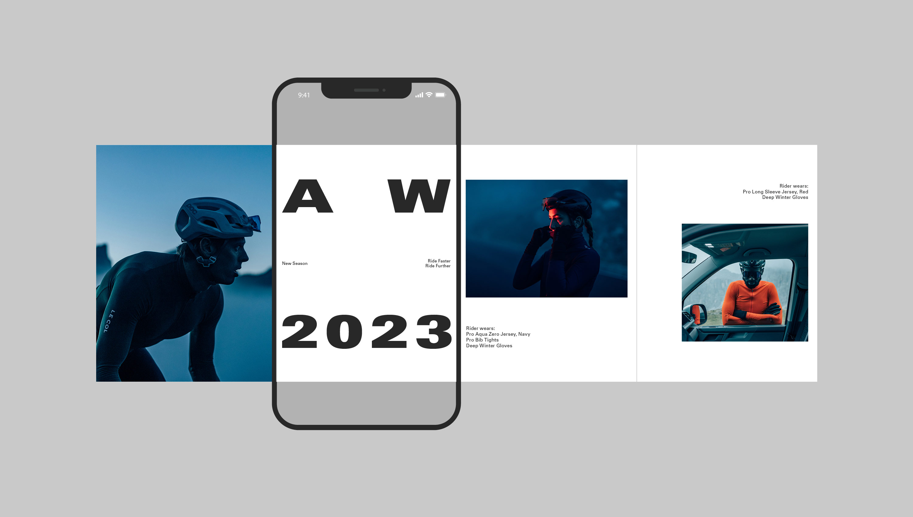
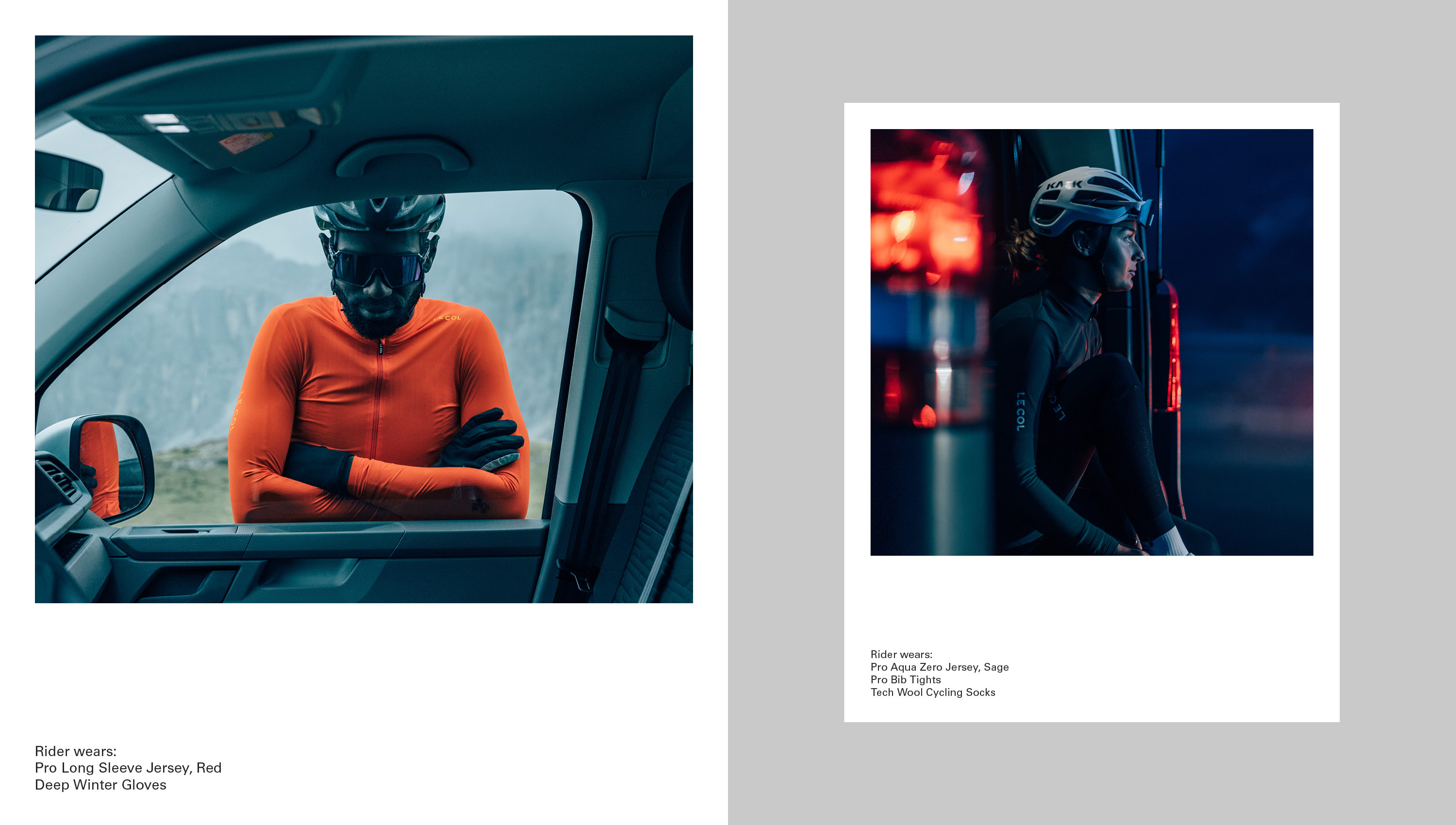
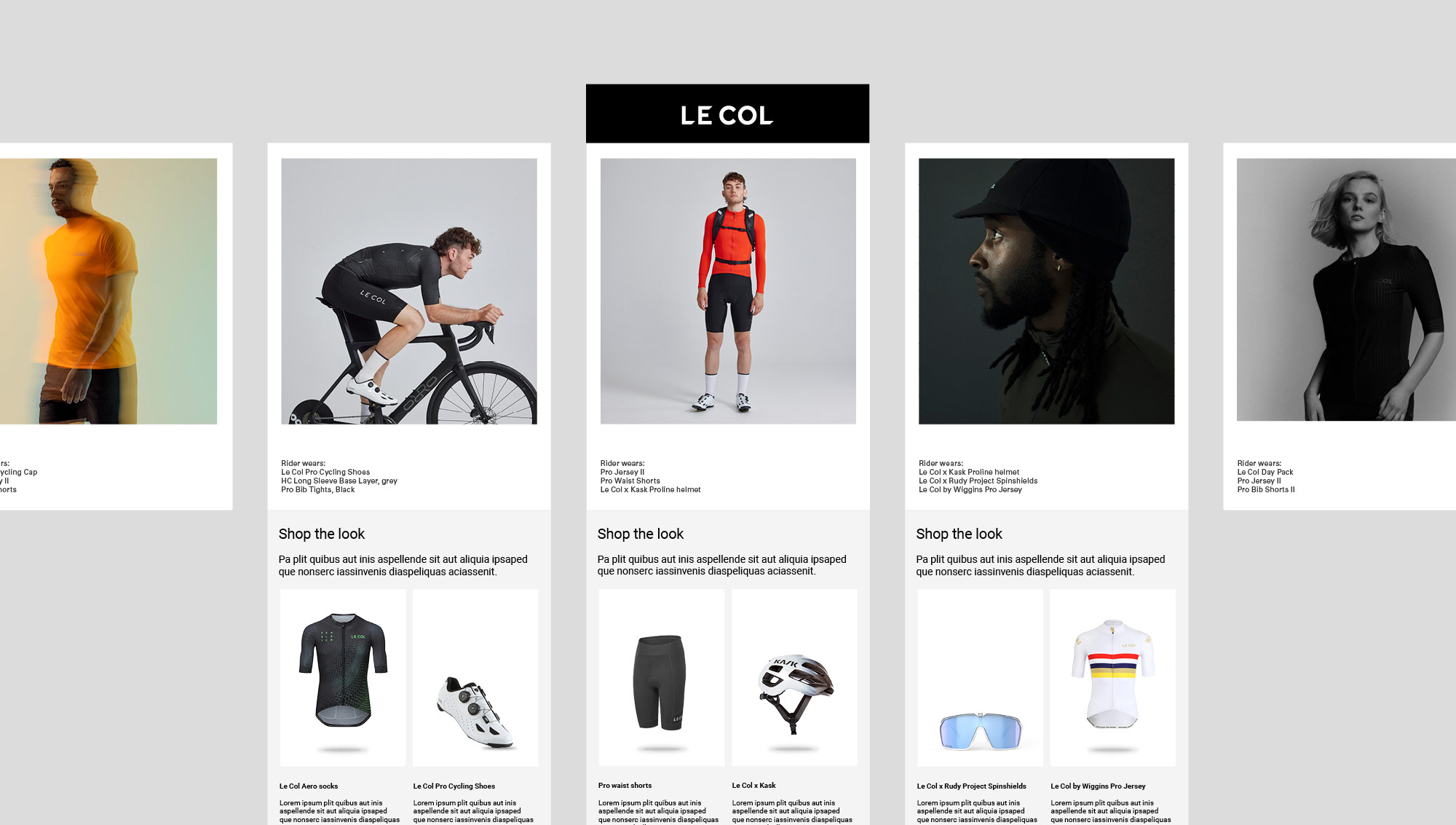
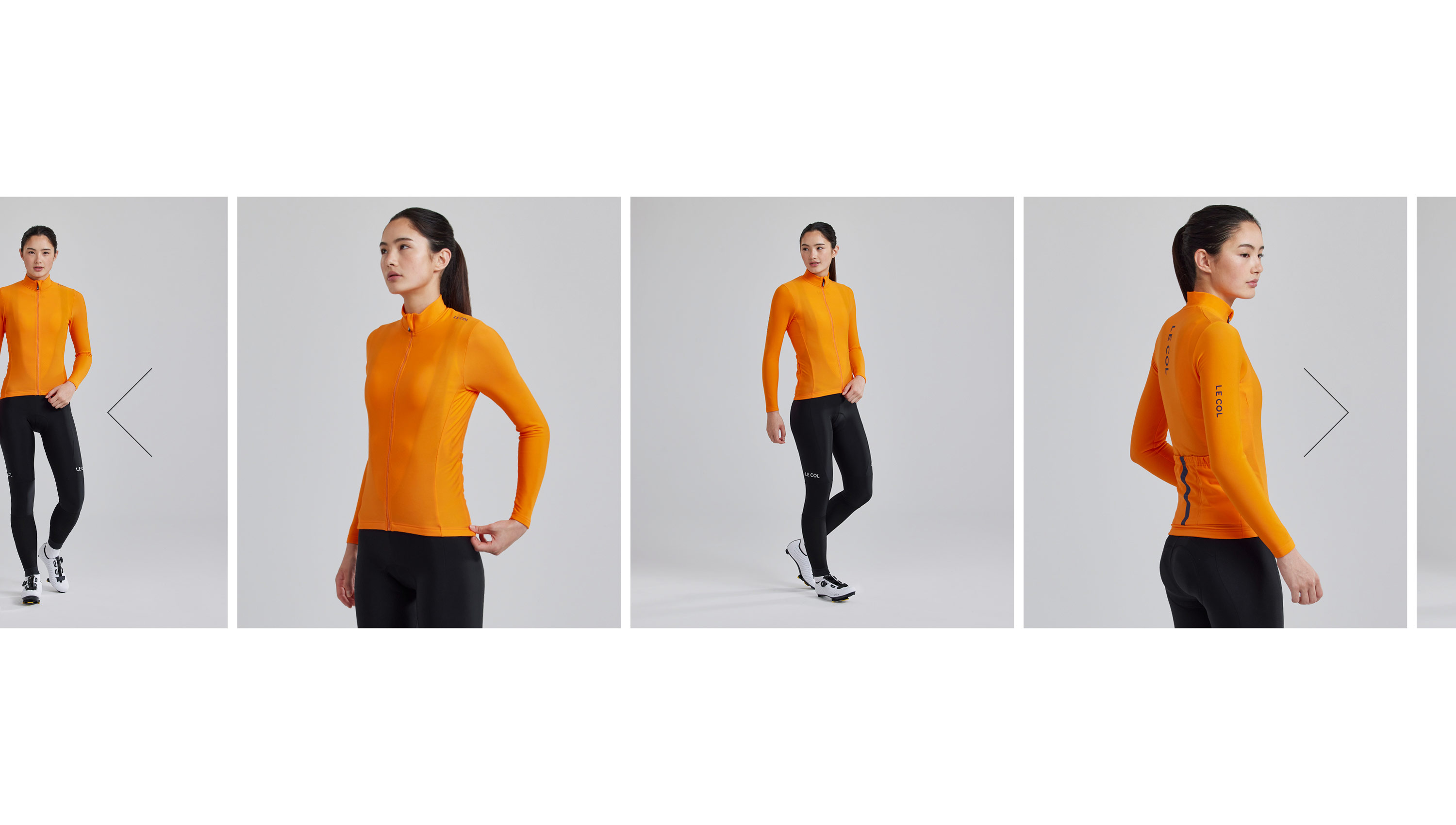
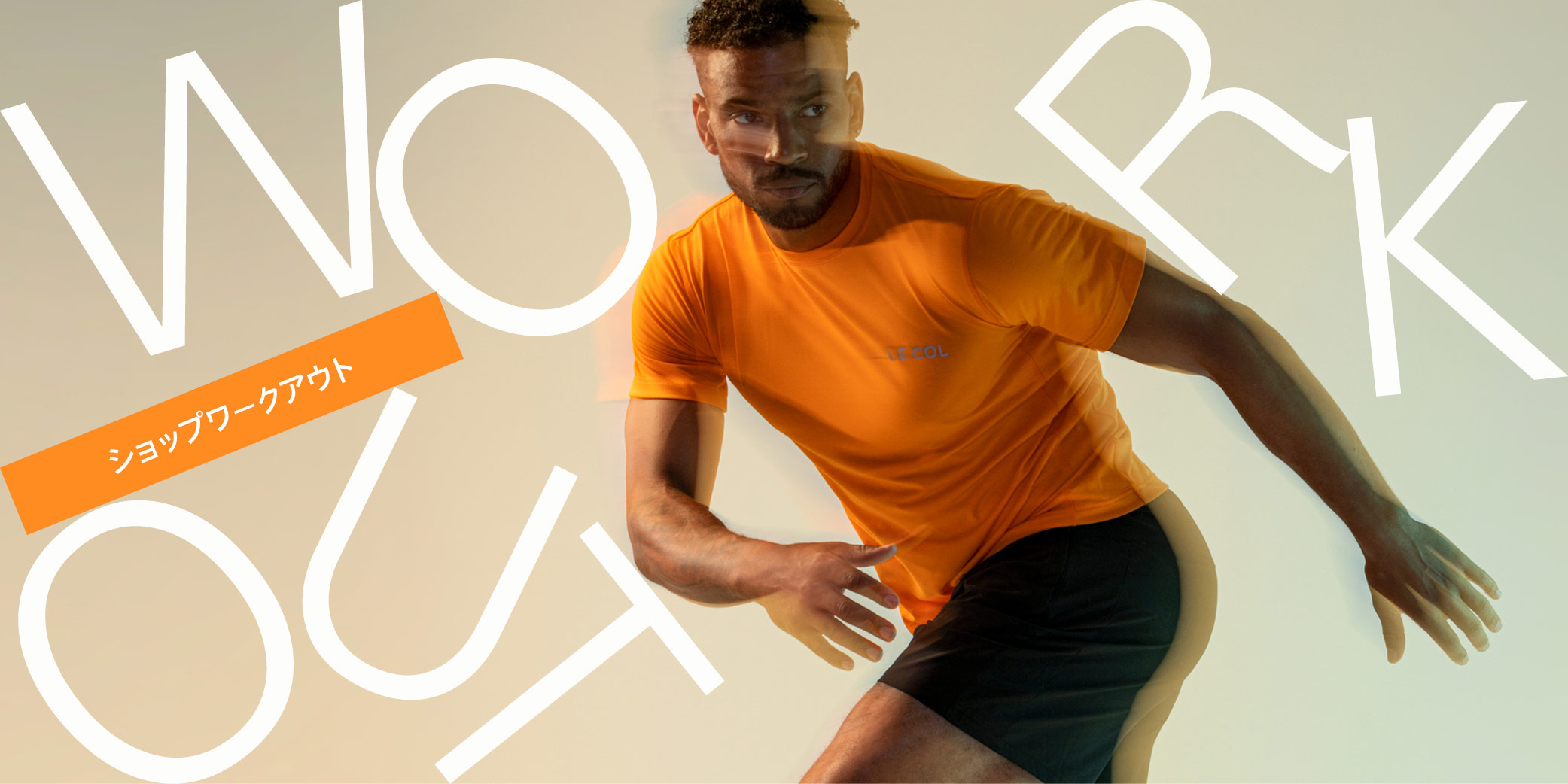
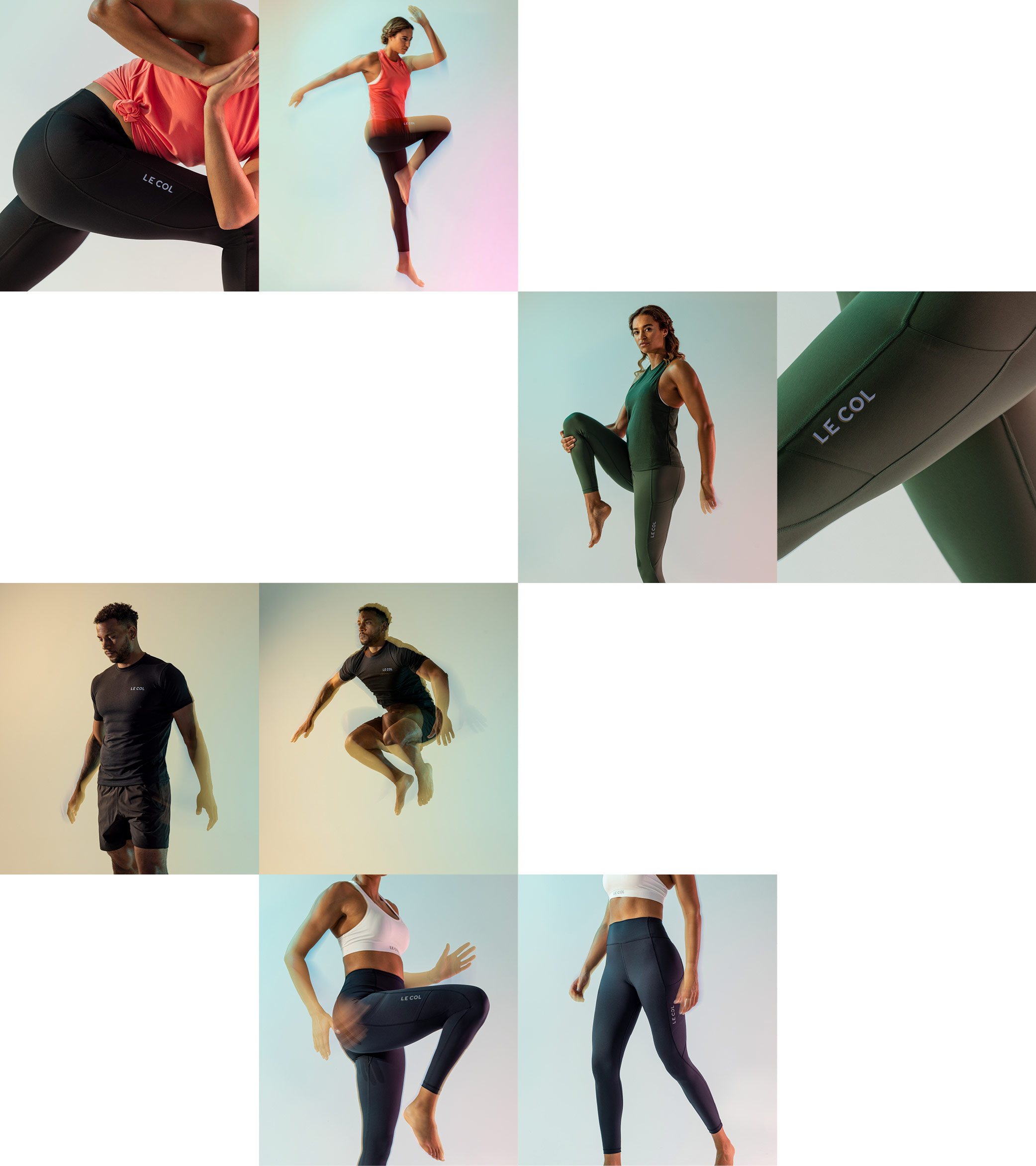
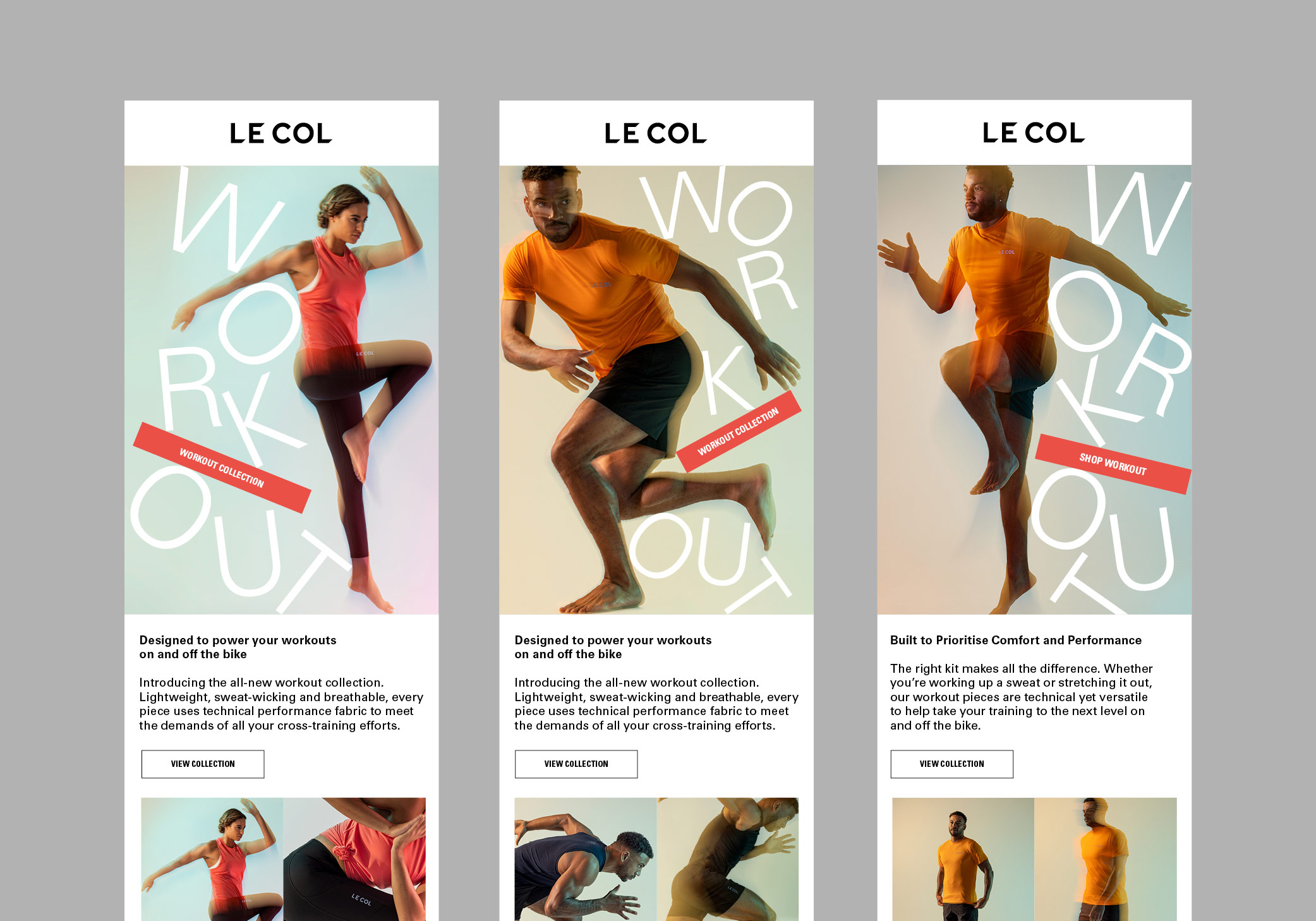
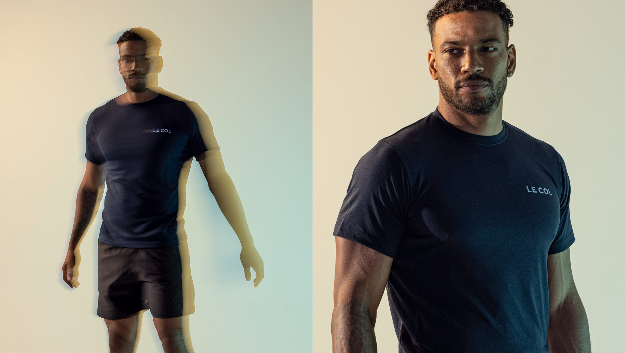
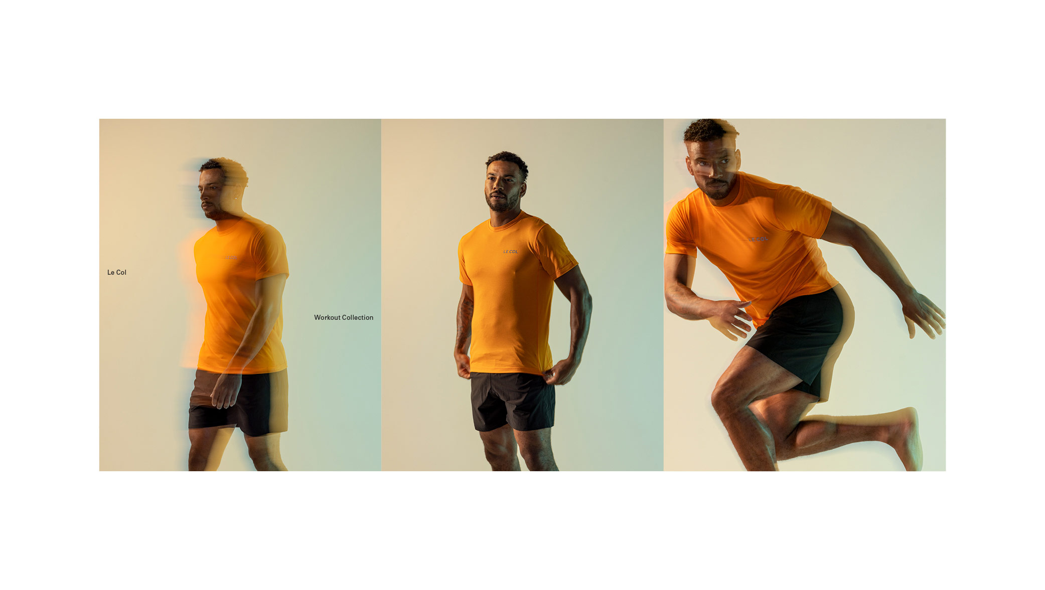
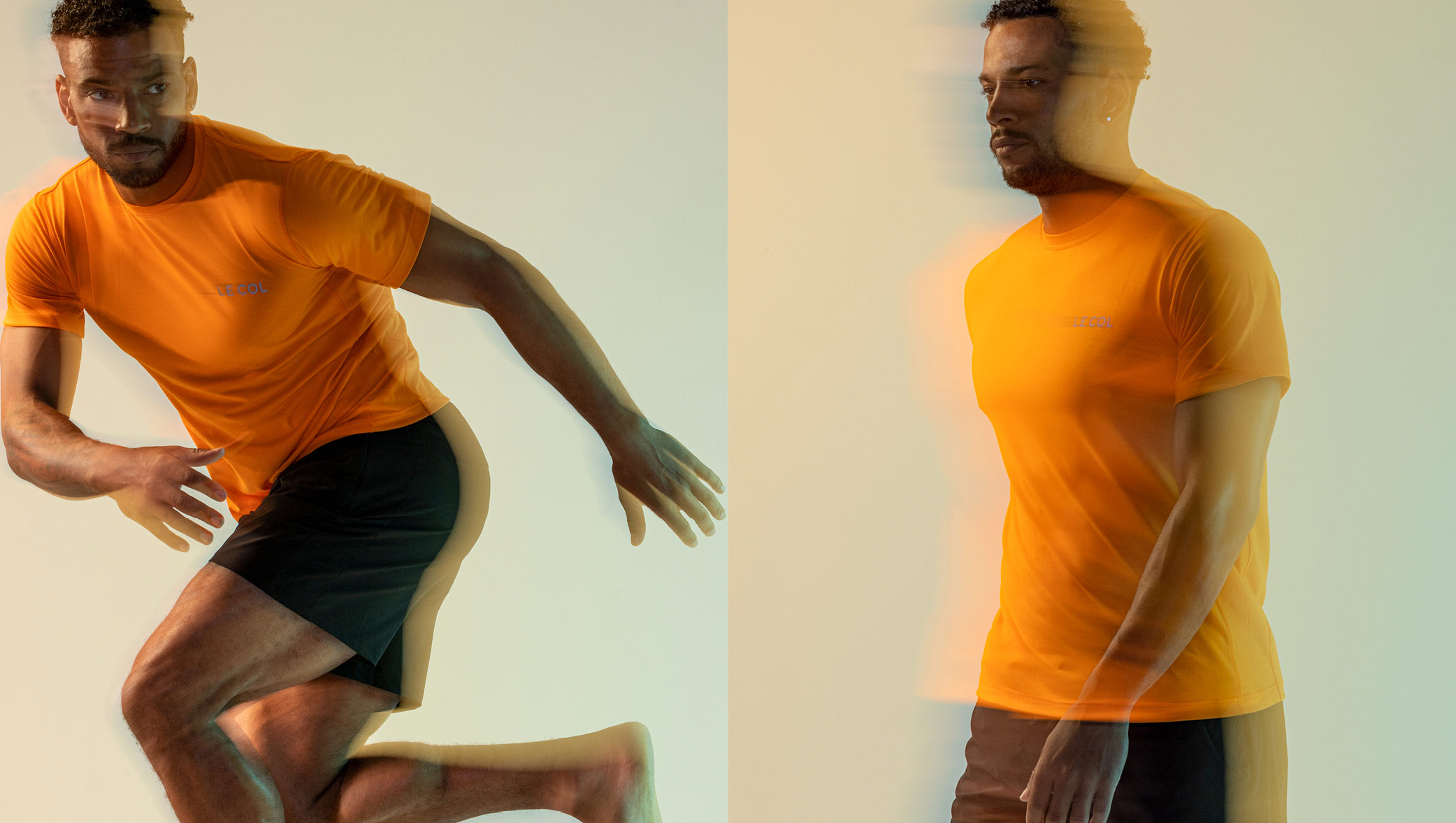
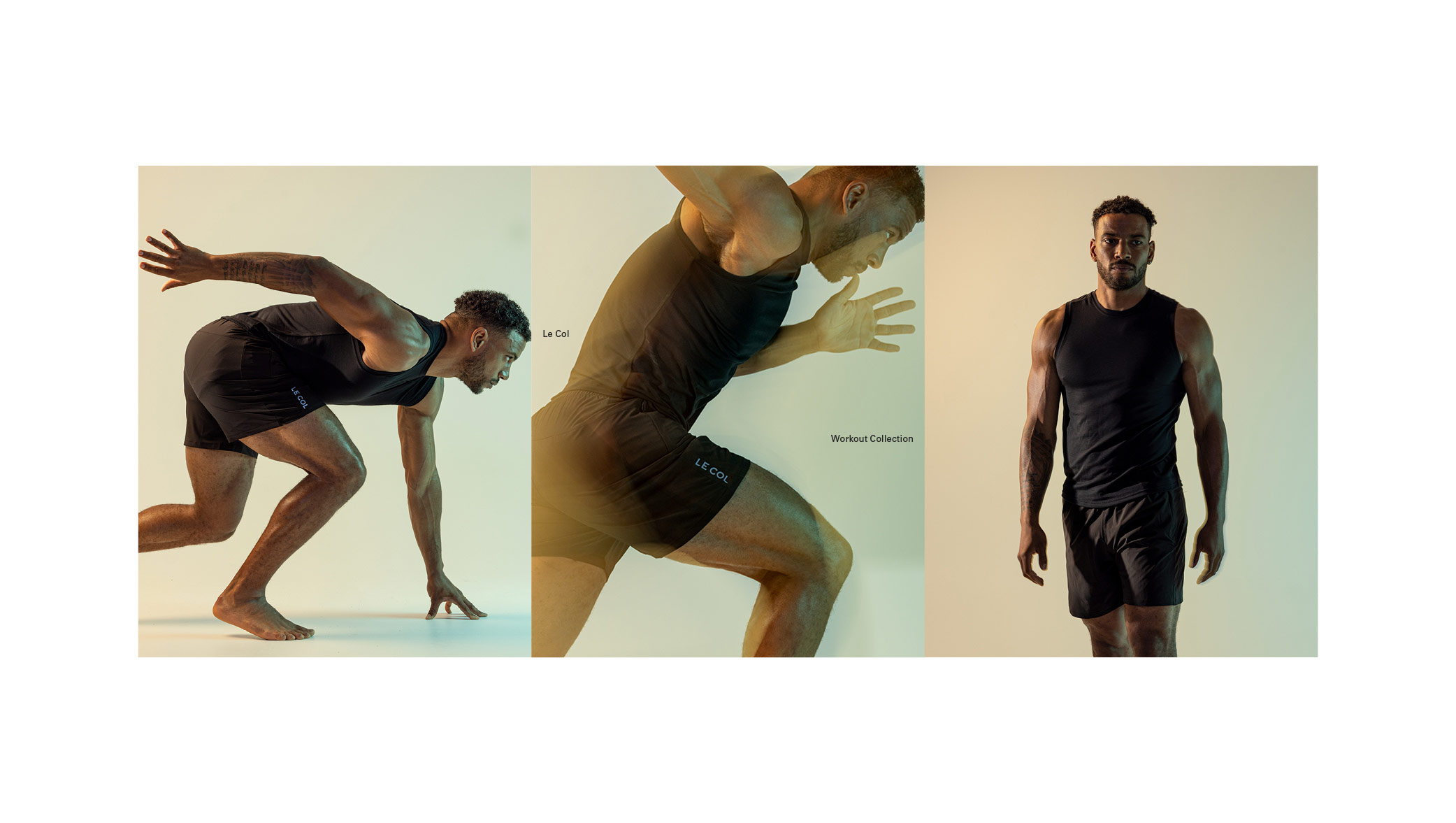
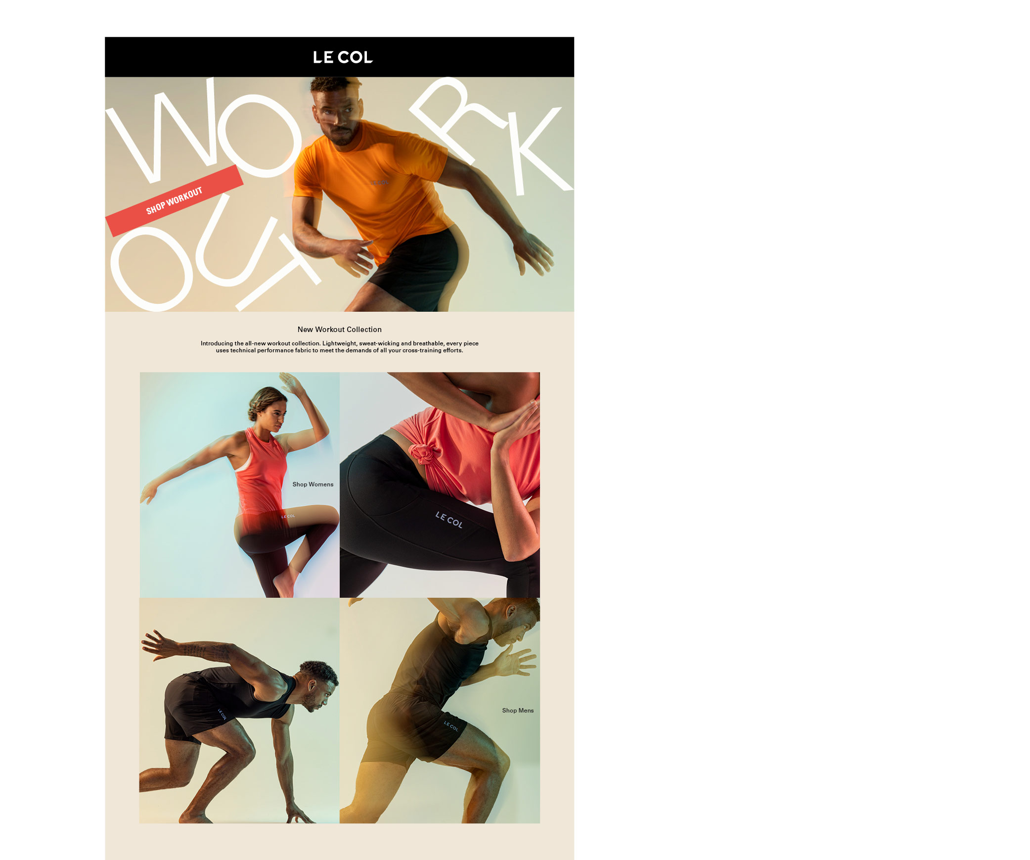
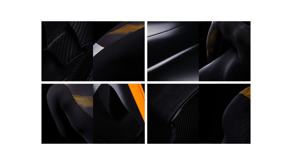
Our work with Le Col covers strategic consulting and creative direction, as well as full delivery of large scale campaigns for digital, eCommerce, paid social, marketing and eCRM. In more recent years we have played a more pro-active role in rooting out key issues within the business and putting systems in place to reduce strain on resource, improve the quality, and reduce spend. Our focus has always been to do more, for less, by using our years of expertise to streamline the areas that are being over-serviced, but not at the expense of the bigger creative and conceptual wins.
We’re not usually ones to boast about what we do, but when we started this journey, Le Col was an unknown entity, from an unknown bike rider. In the past decade we have built a brand that has secured over £15m+ in funding, has worked with the highest calibre of Tour winning riders, Giro winning teams and a host of enviable partnerships. From the logo to the TV commercials, we can proudly say we’ve had our hand in most of it.
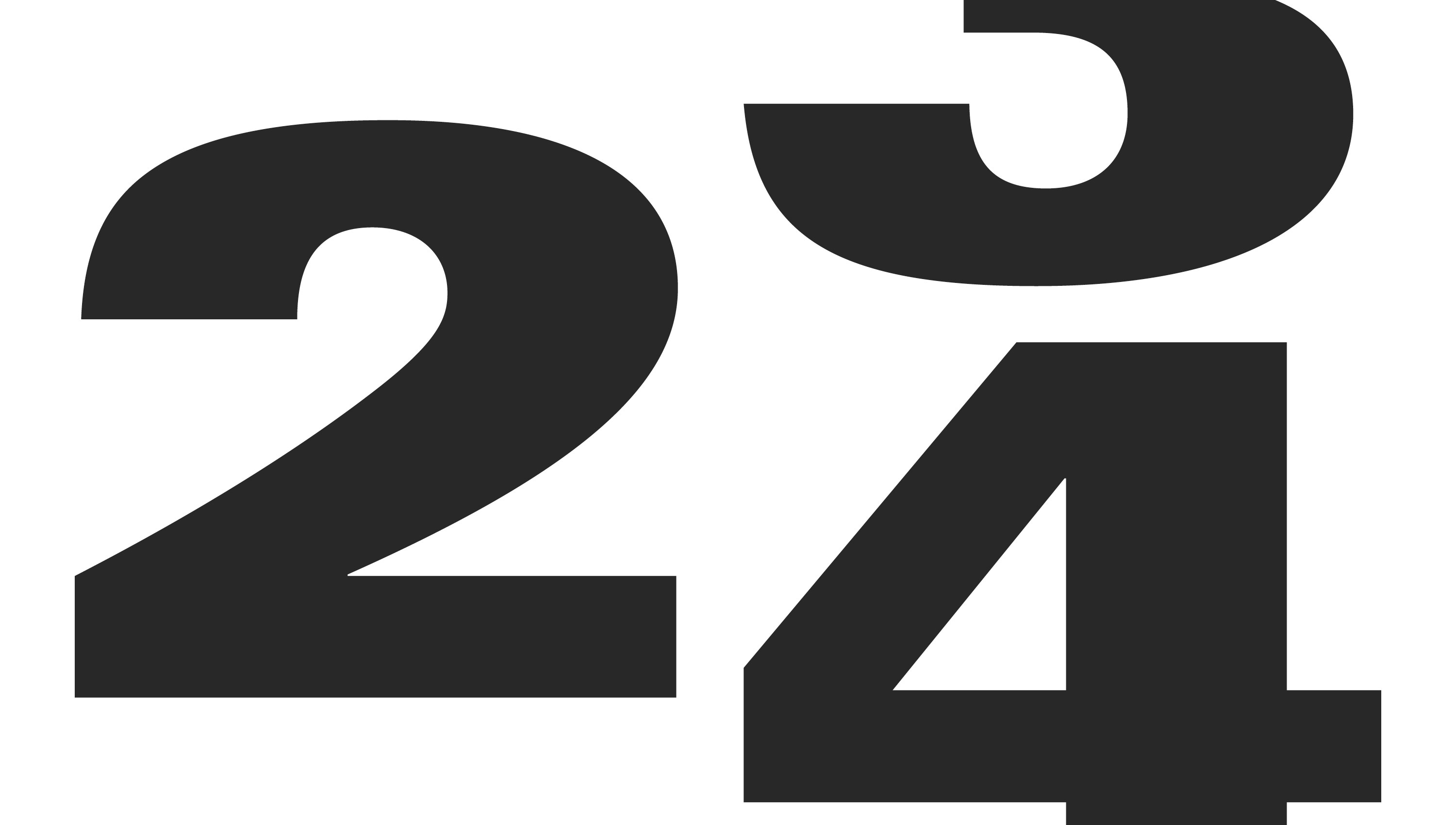
We’re always striving to build on the brand – for higher quality assets, more consistently, with a premium brand offering. But, more than that, we want the passion that most of us riders feel to be handled with care, it’s not just a commodity, and those working on it should enjoy the journey. This passion and drive culminates in more functional deliverables like our over-arching concept development for 2024 below.
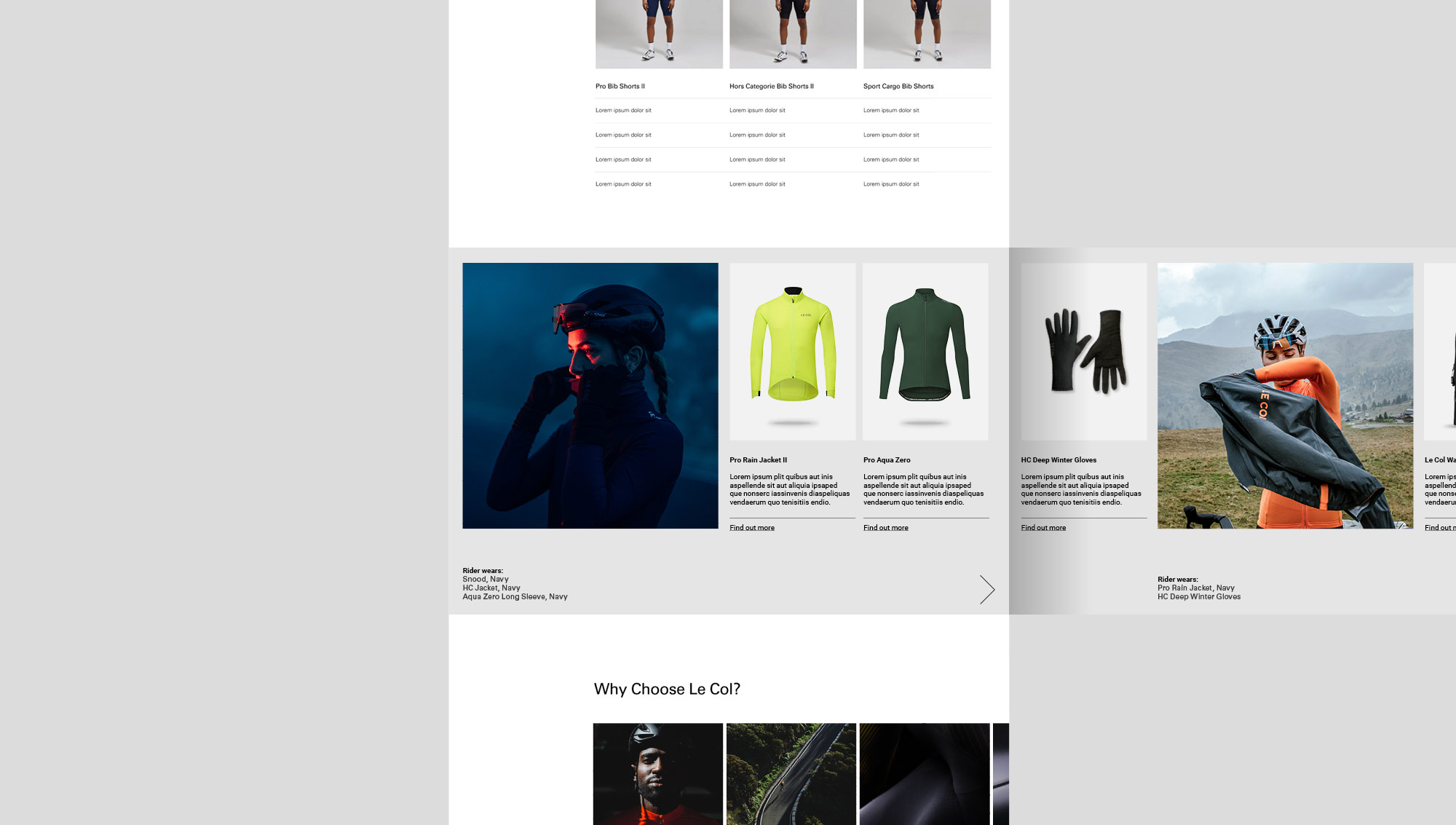
Our strategic approach has led to a number of key improvements across the business – an overhaul of email marketing; including new guidelines, a new hierarchy and photography approach, flexible templates, as well as implementing automated batching and scripting processes across the bulk of its products. Having seen first hand the internal issues as the business scaled, we could resolve repetition, as well as specifics like global pricing, gender splits, slow turnaround times and high volumes of assets. Delivering a 60% reduction in design and marketing resource, with more control being put back into the eCRM team to focus on performance.
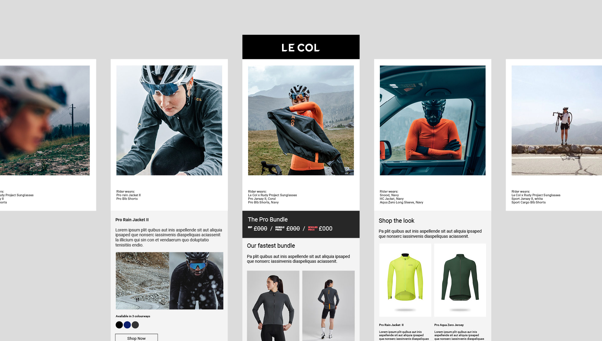
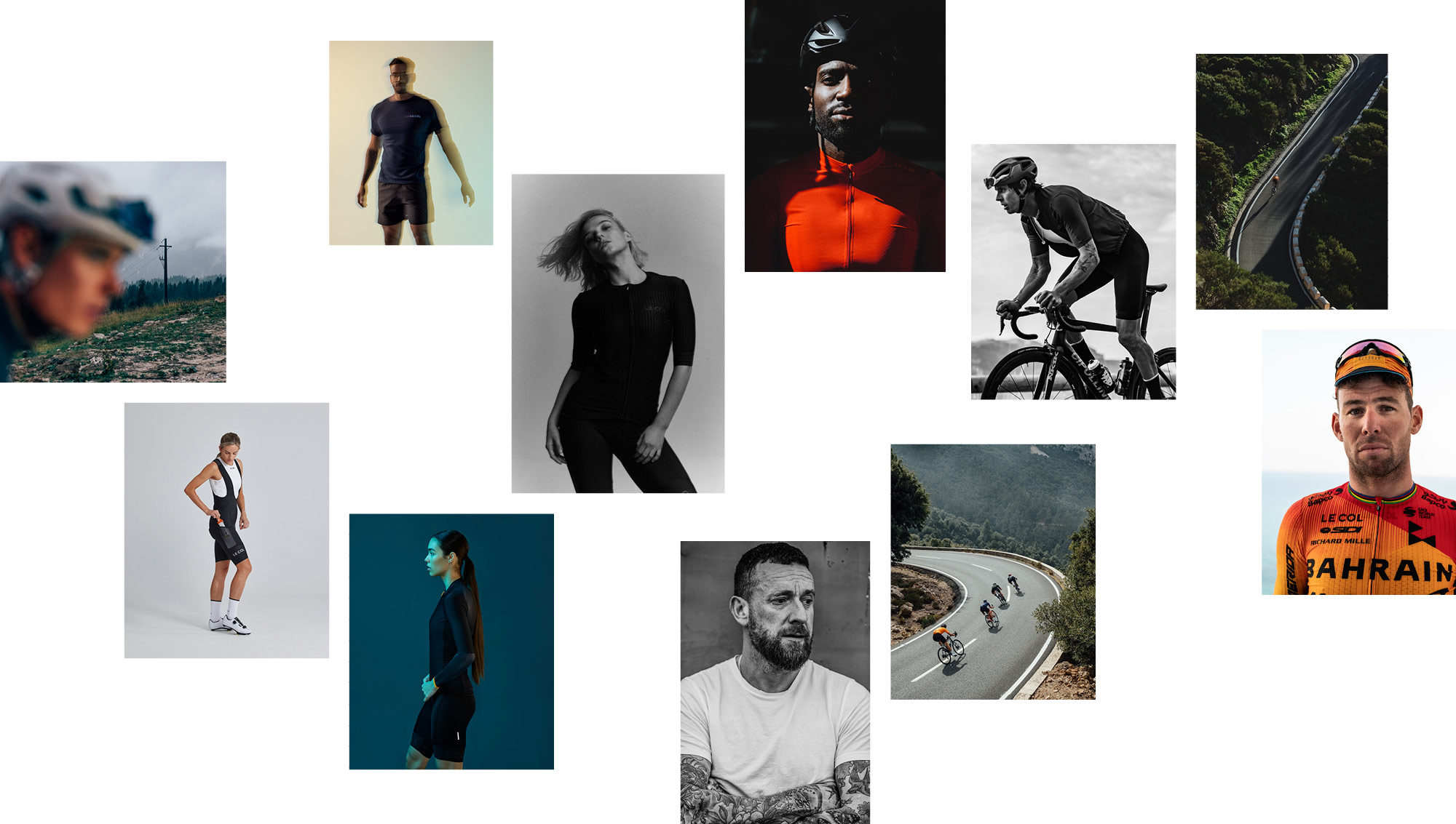
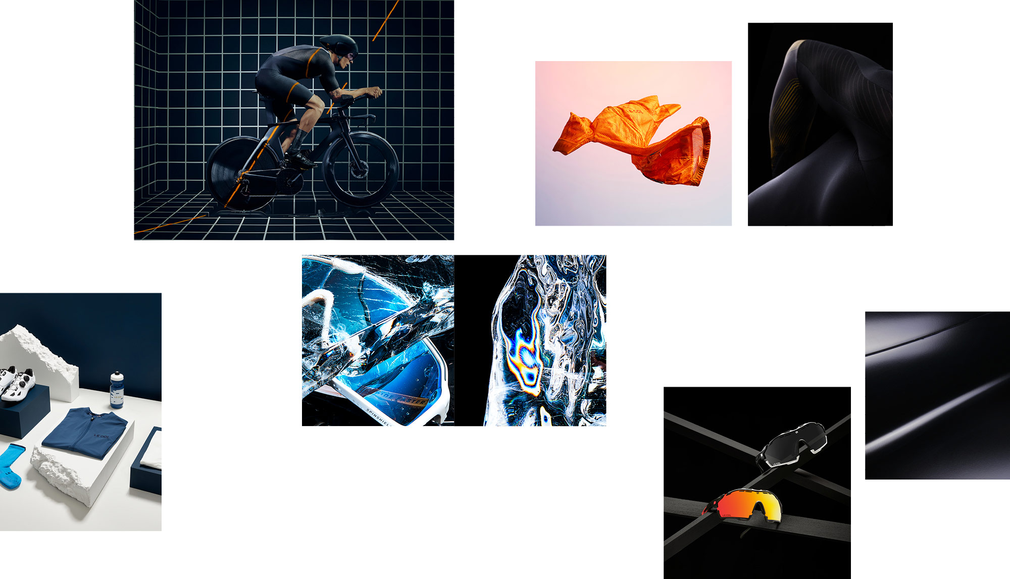
We’ve audited and recommended better solutions for photography and videography across the board, looking to elevate the offering at all opportunities from a customer perspective. We’ve introduced some immensely talented creatives from photographers, videographers, 3D/designers, animators, production companies and directors along the way, who continue to deliver the vision. This enthusiasm has most noticeable improved the digital and eCommerce proposition with a much more forward focussed approach to improvements and nimble, data-driven, iterations.
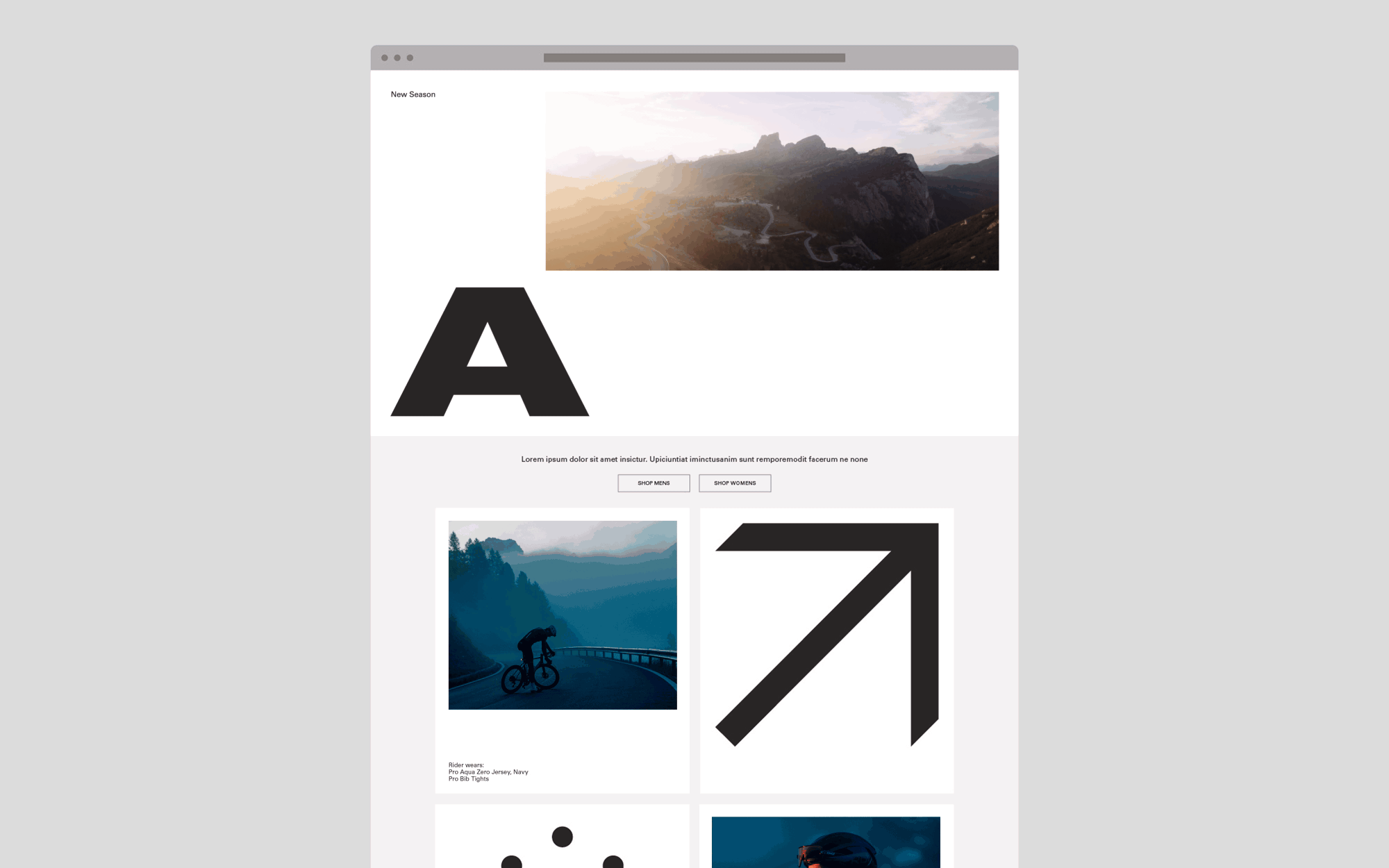
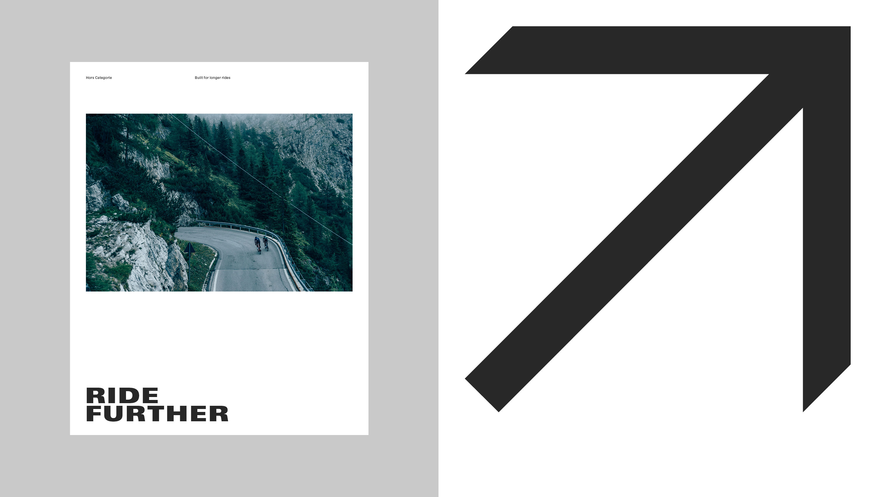
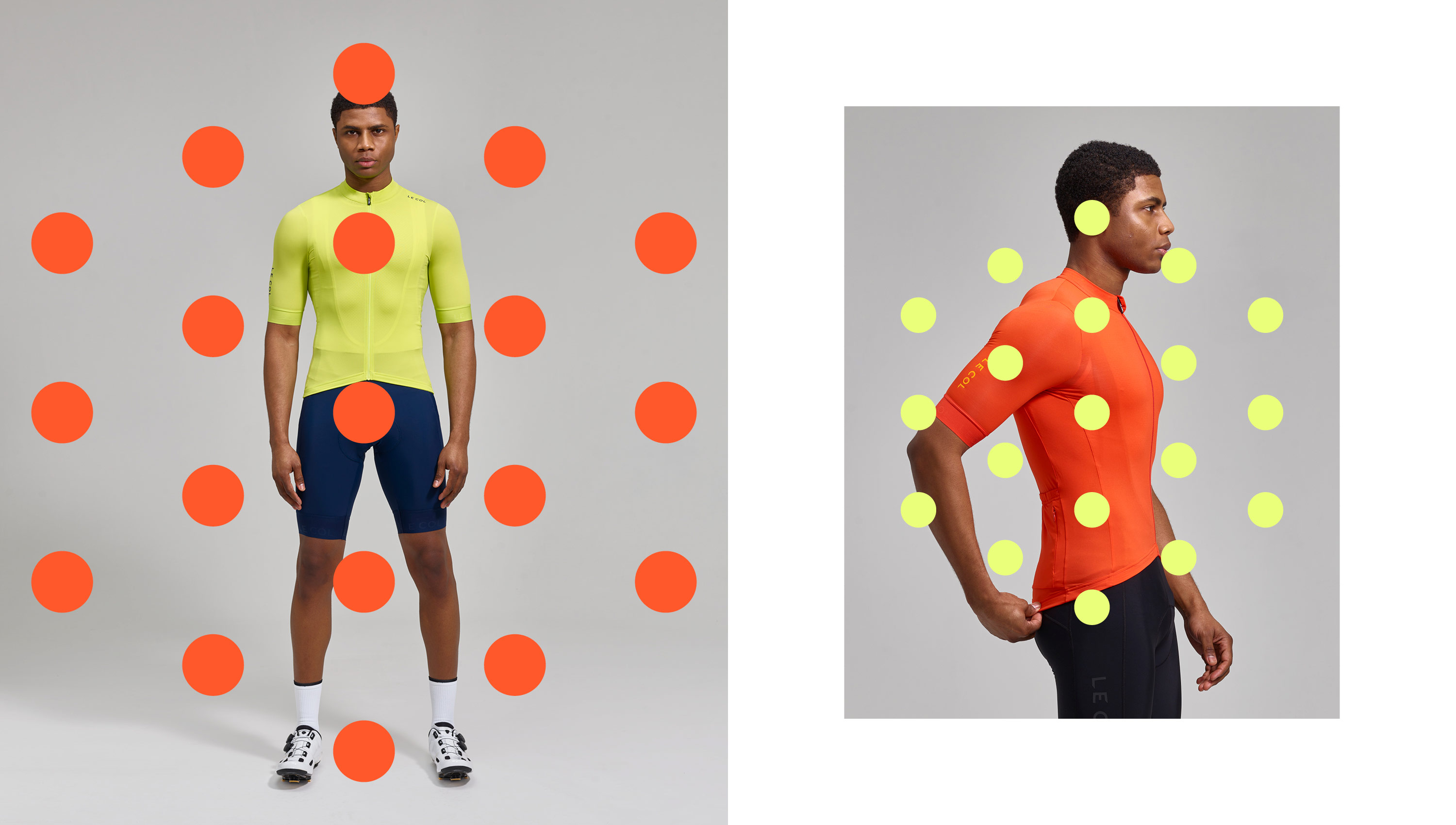
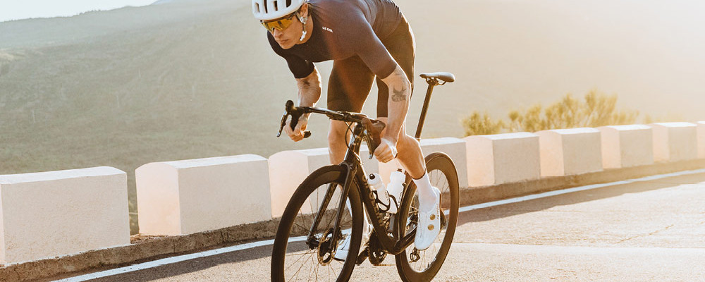
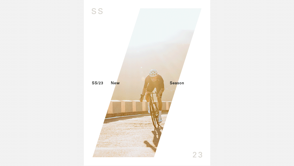
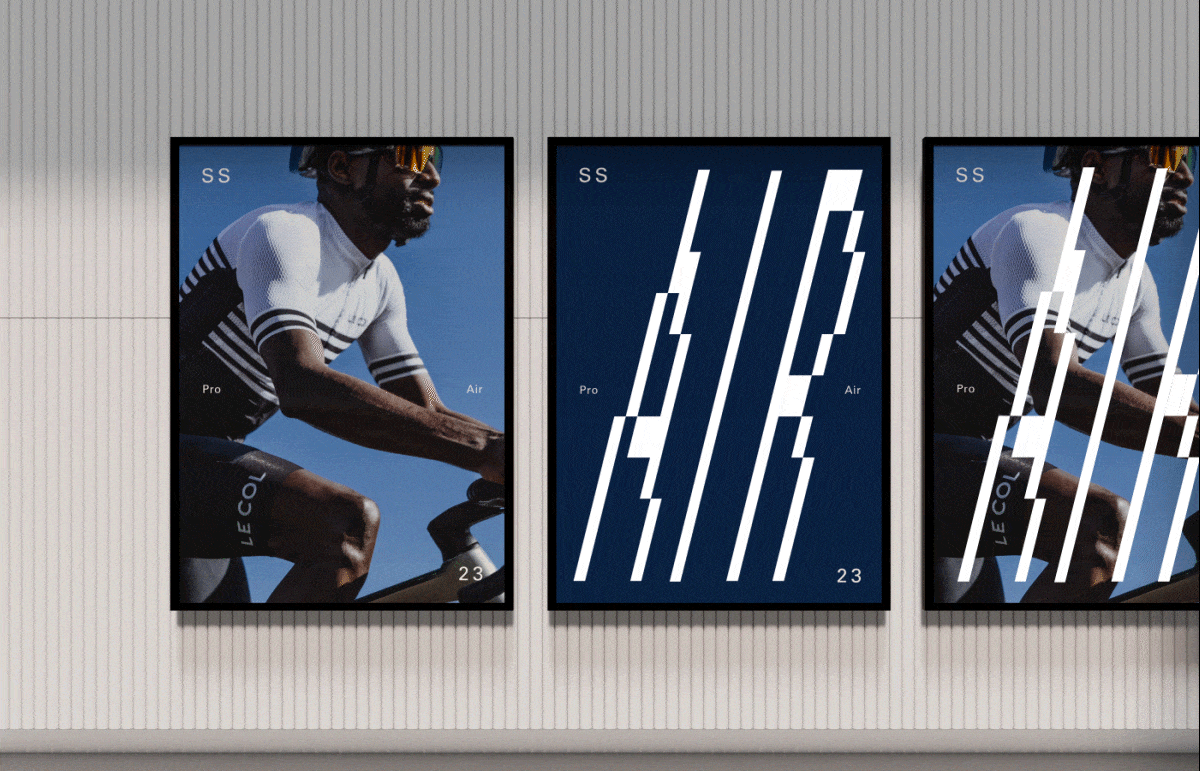
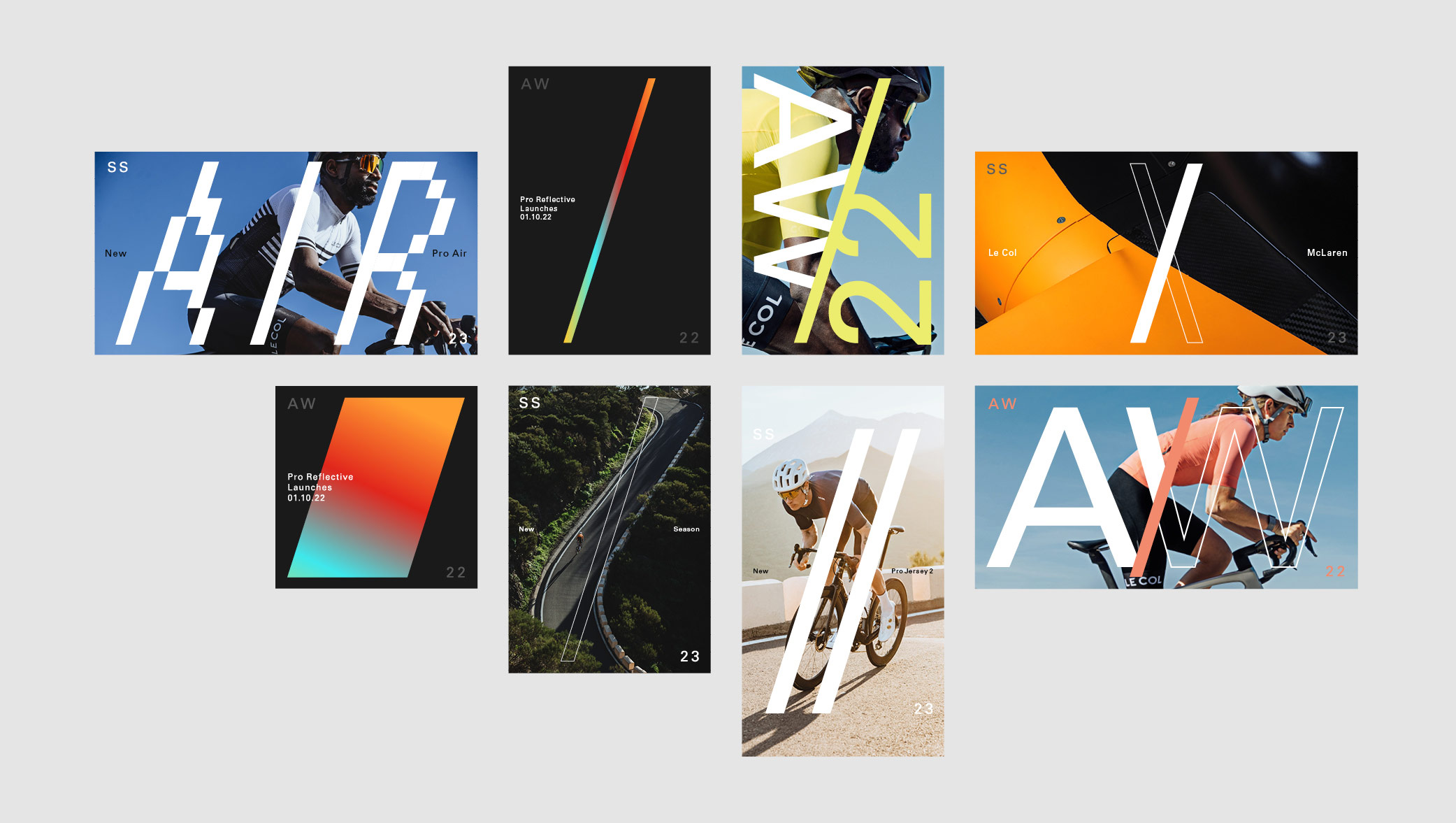
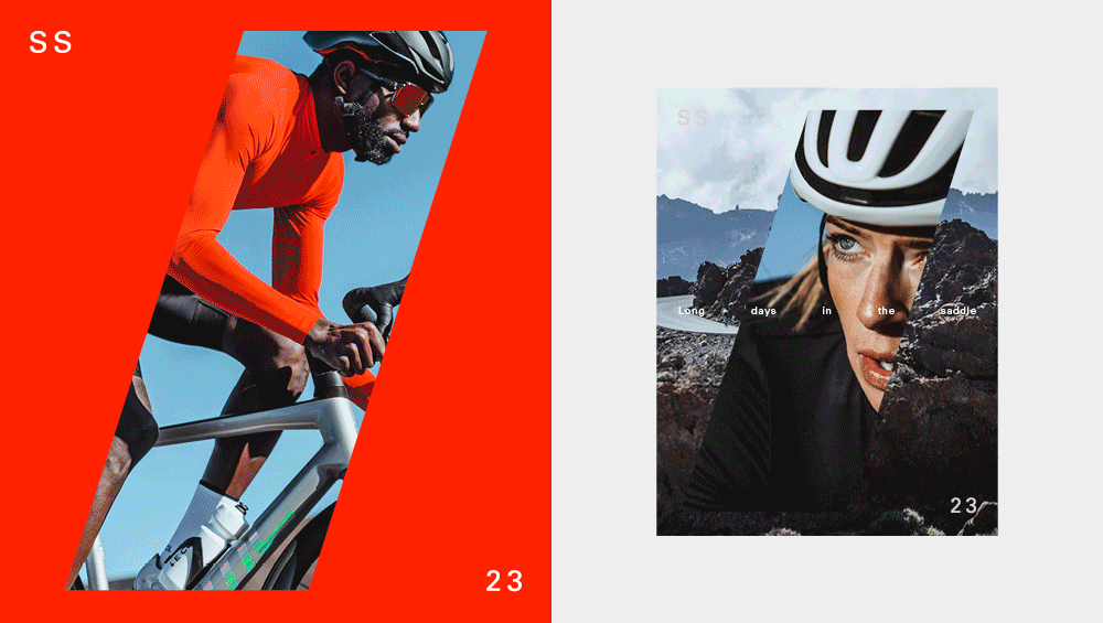
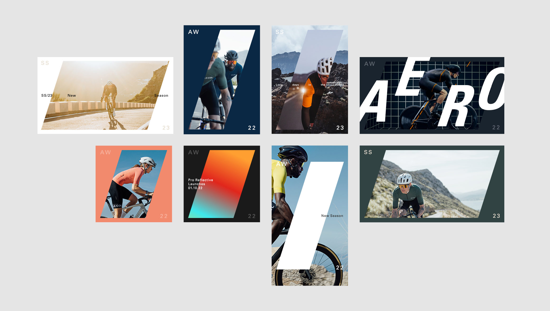
Having audited the brand development from previous seasons, we created a flexible identity system that would streamline internal resource without impacting on the quality of the output. By producing an over-arching design system, we were able to build an identity that was dynamic enough to deliver simpler, more templated, solutions when the deadlines are tight, whilst having the ability to be flexible on larger campaigns. We also delivered a large proportion of the output and art direction across all platforms.
The forward slash solution and frame device allowed room for creativity, maintaining a consistent look and feel across multiple products and ranges. The key was to find a solution that enabled typography, a key brand pillar, to work effectively as well as leave room to be playful without stringent rules that would stifle exploration.
As part of the brand audit, we also gave recommendations on shoot direction and photography approaches for social media and all digital platforms. As well as creating a new set of brand guidelines across eCrm, to again, pull back valuable time that was being lost, but also to raise the bar on the quality of output. We overhauled the teams approach to studio & model photography that considers UI and UX work that is in progress.
Our unique position allows us to really understand where the internal team can make better use of resources, driving competitive edge and deliver across multiple channels effectively. A future-proofed approach that can be built on for the next season.
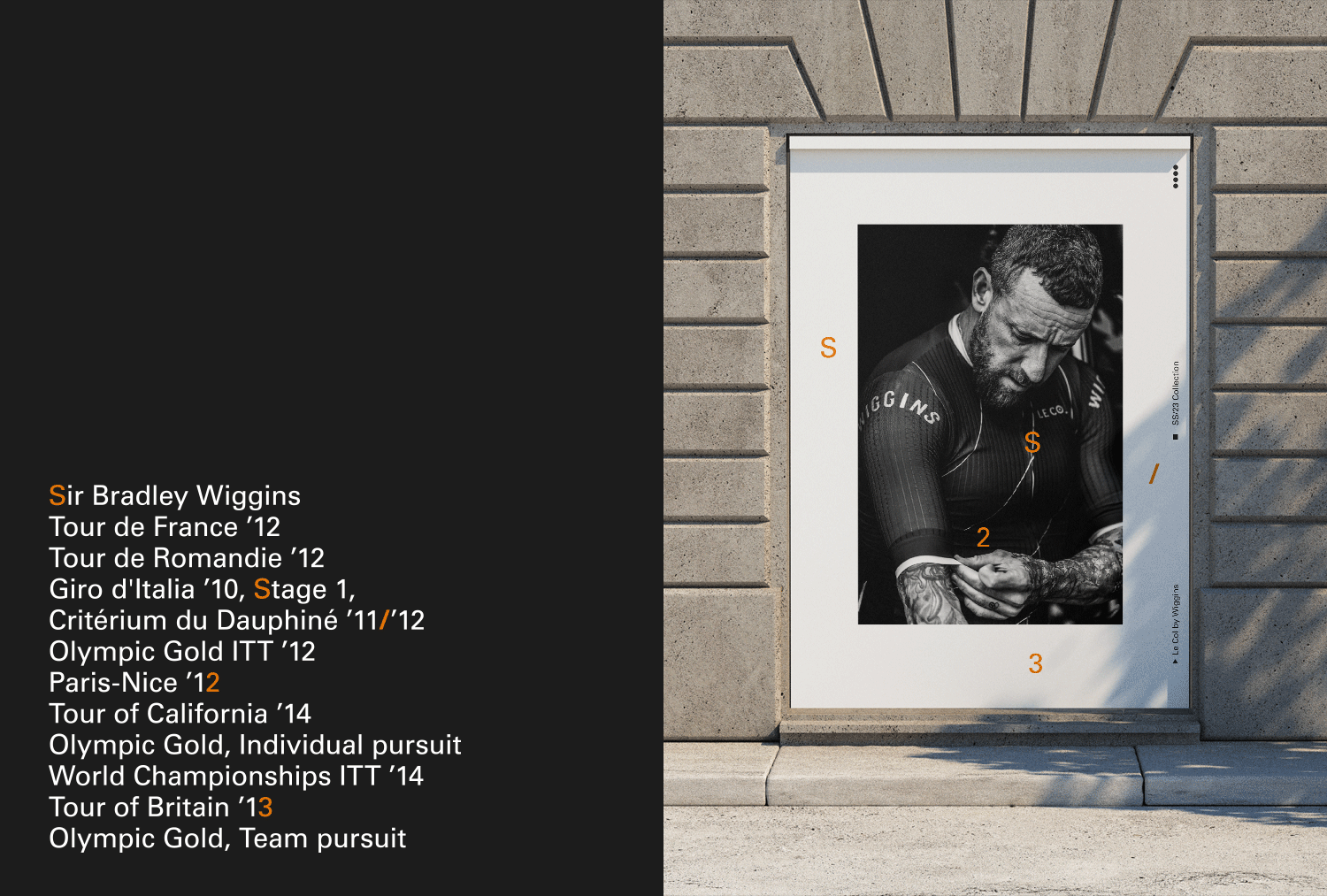
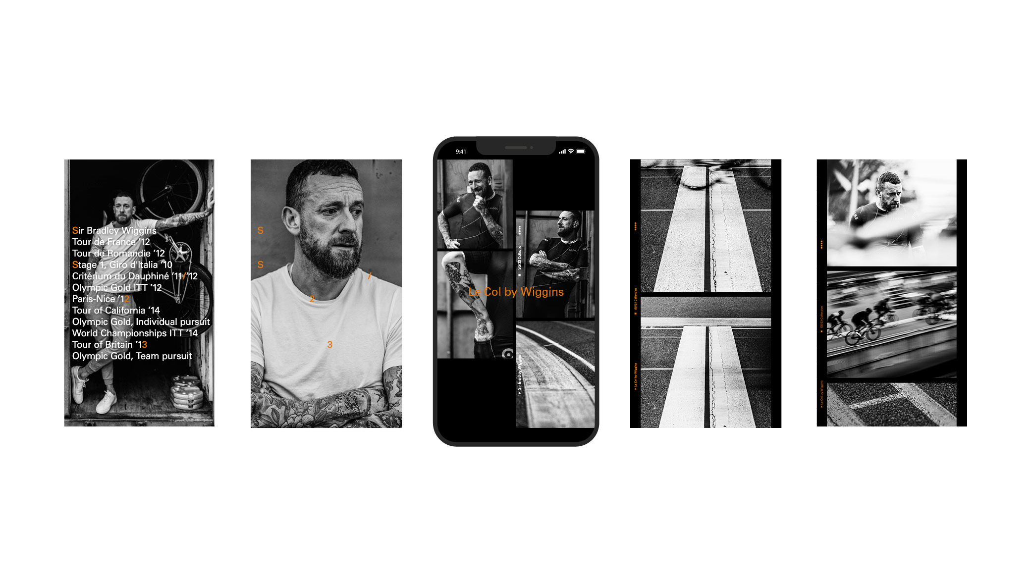
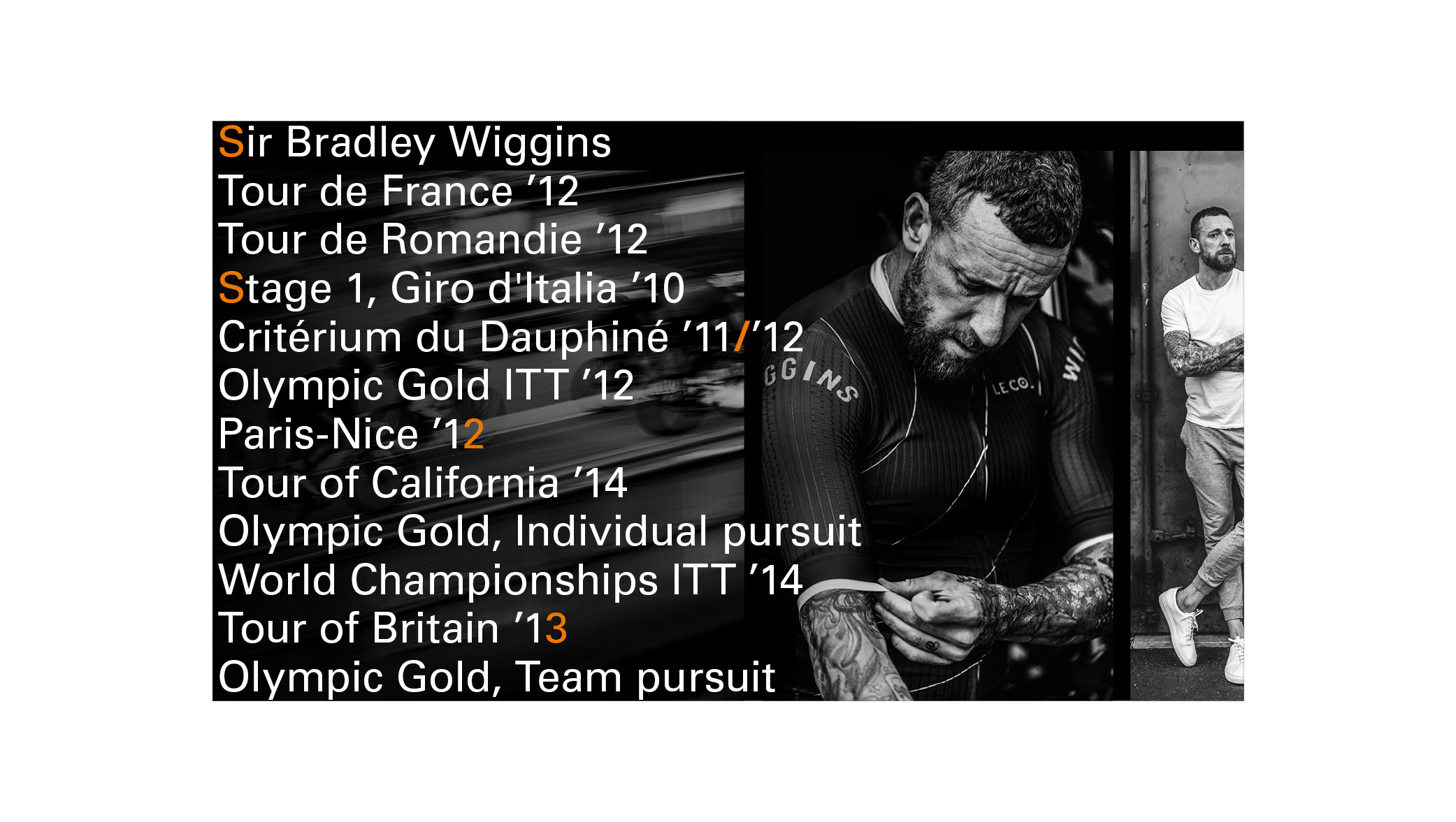
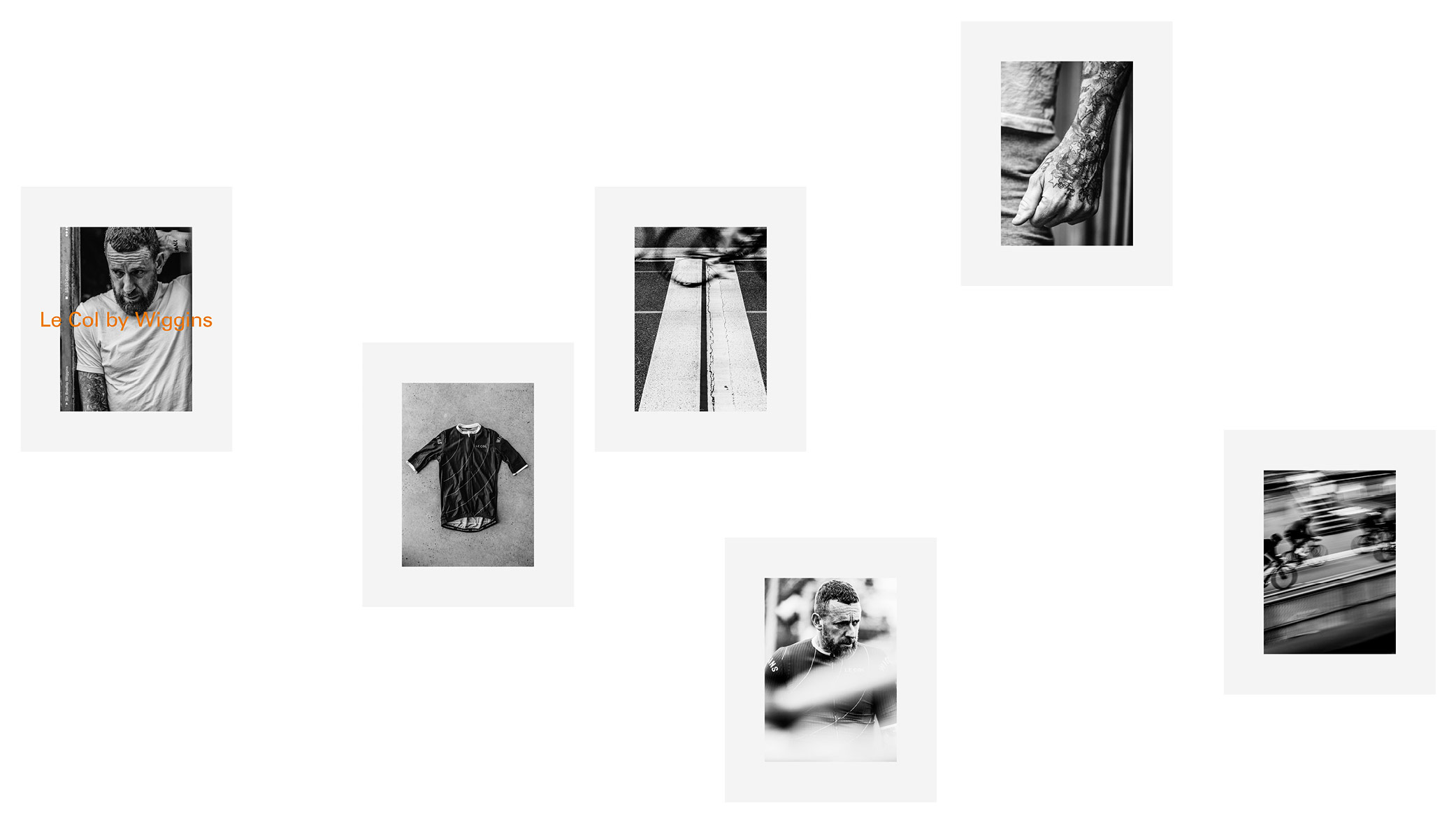
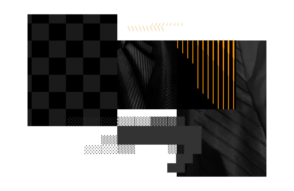
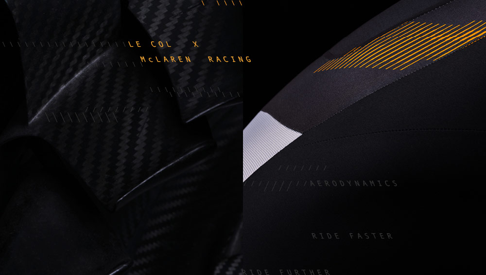
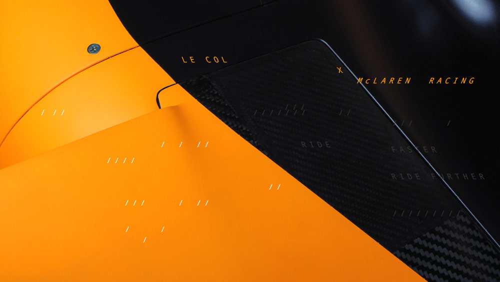
Adapted and applied to the Le Col x Wiggins launch: