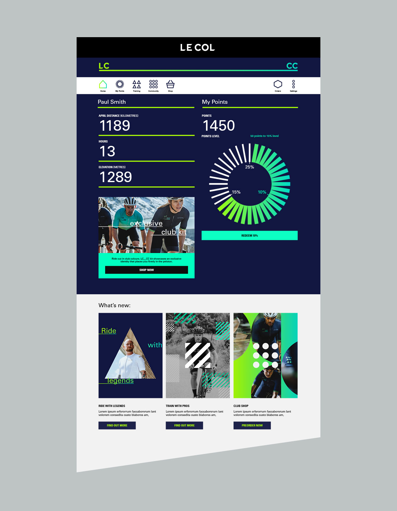
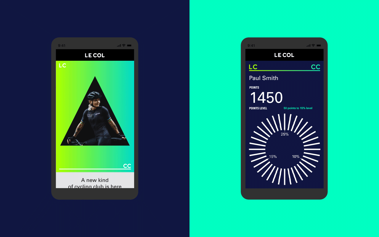
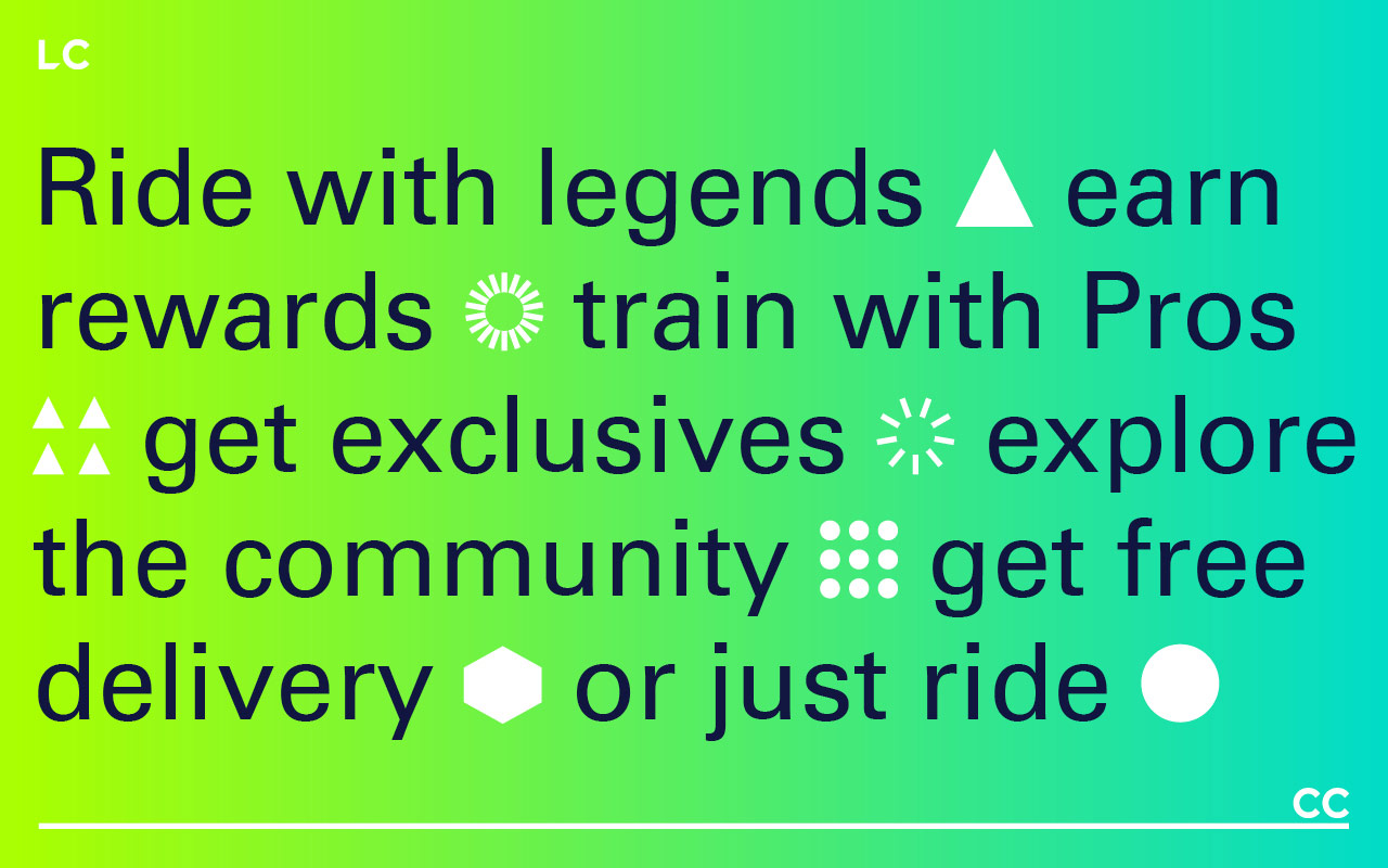
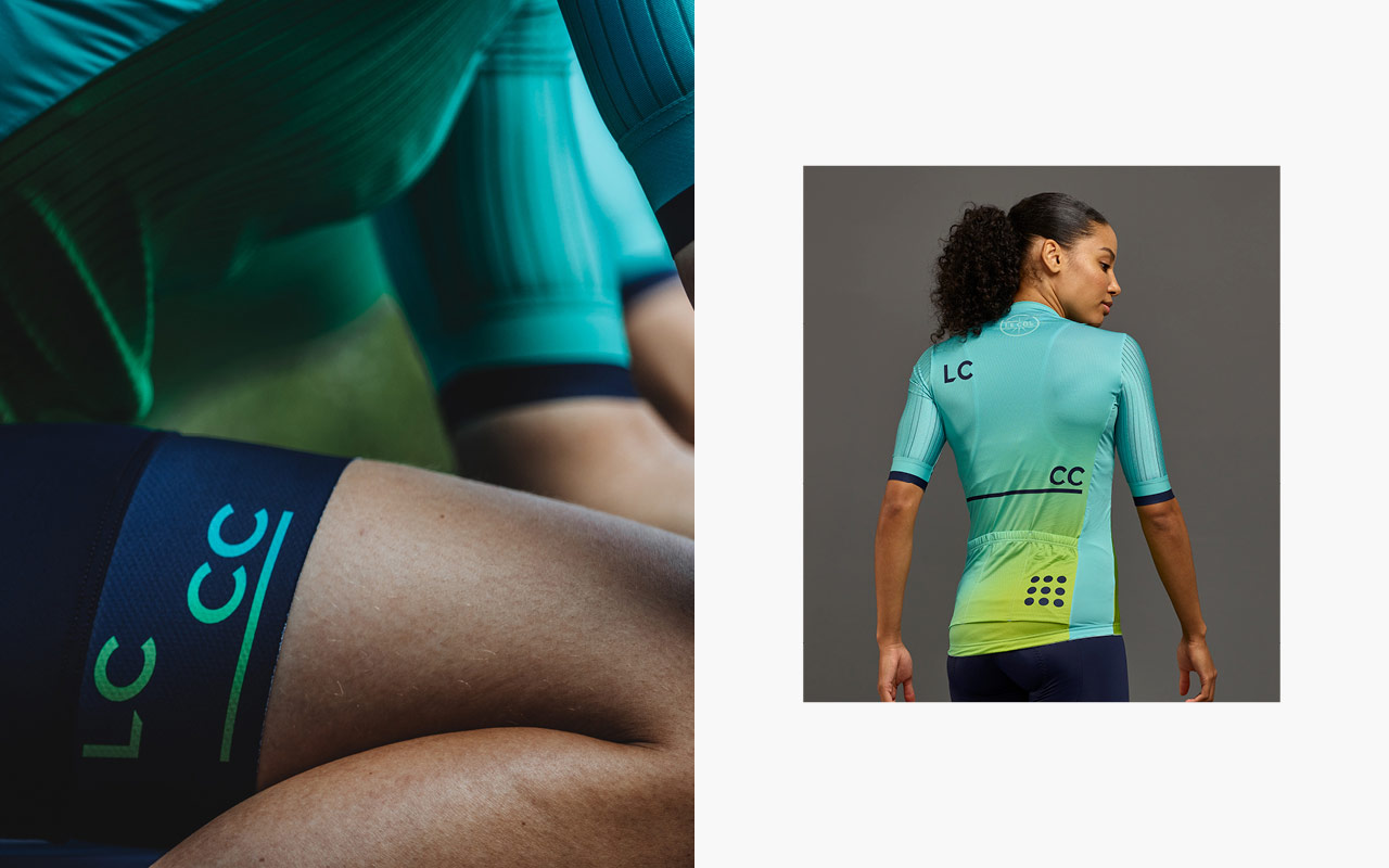
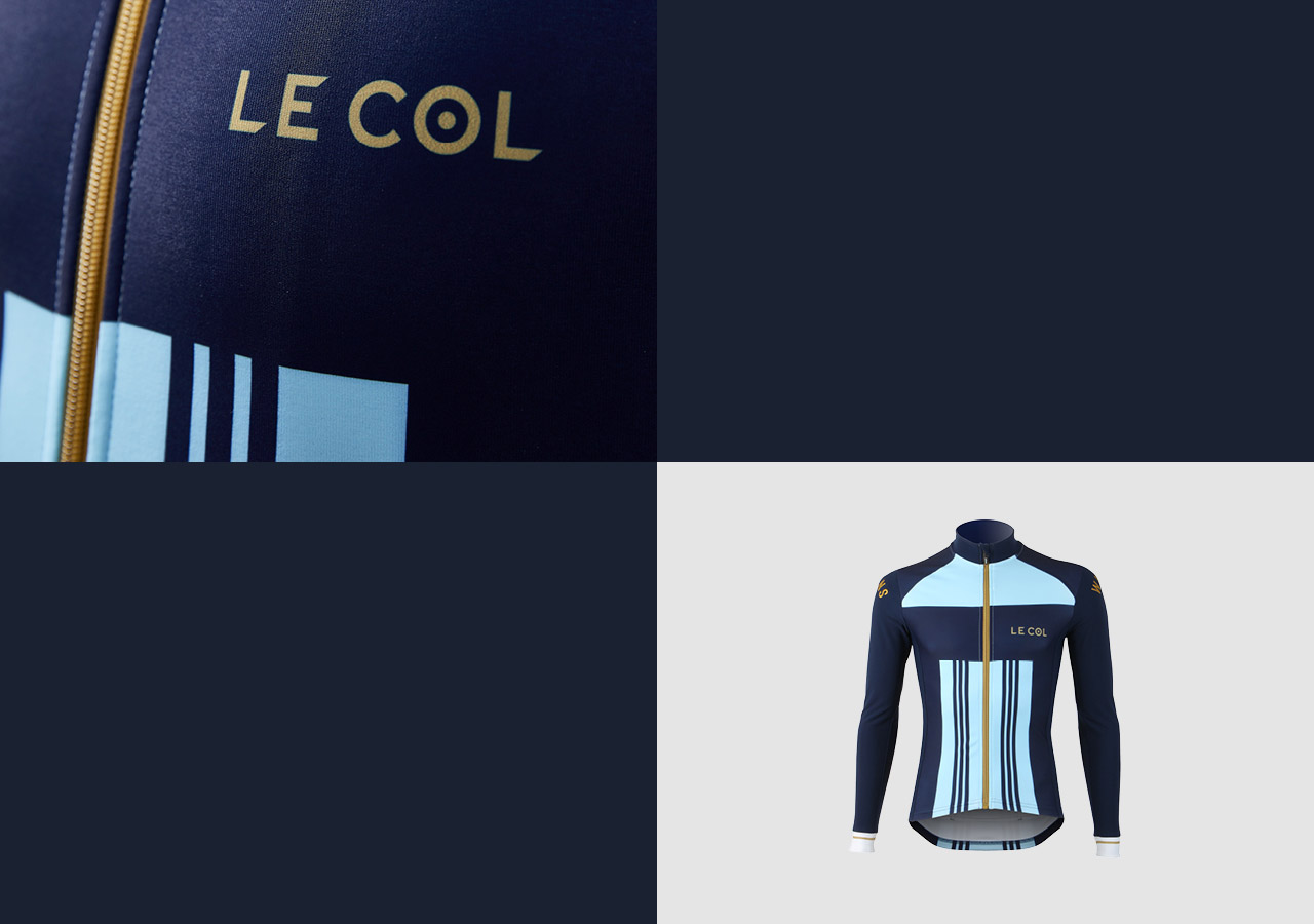
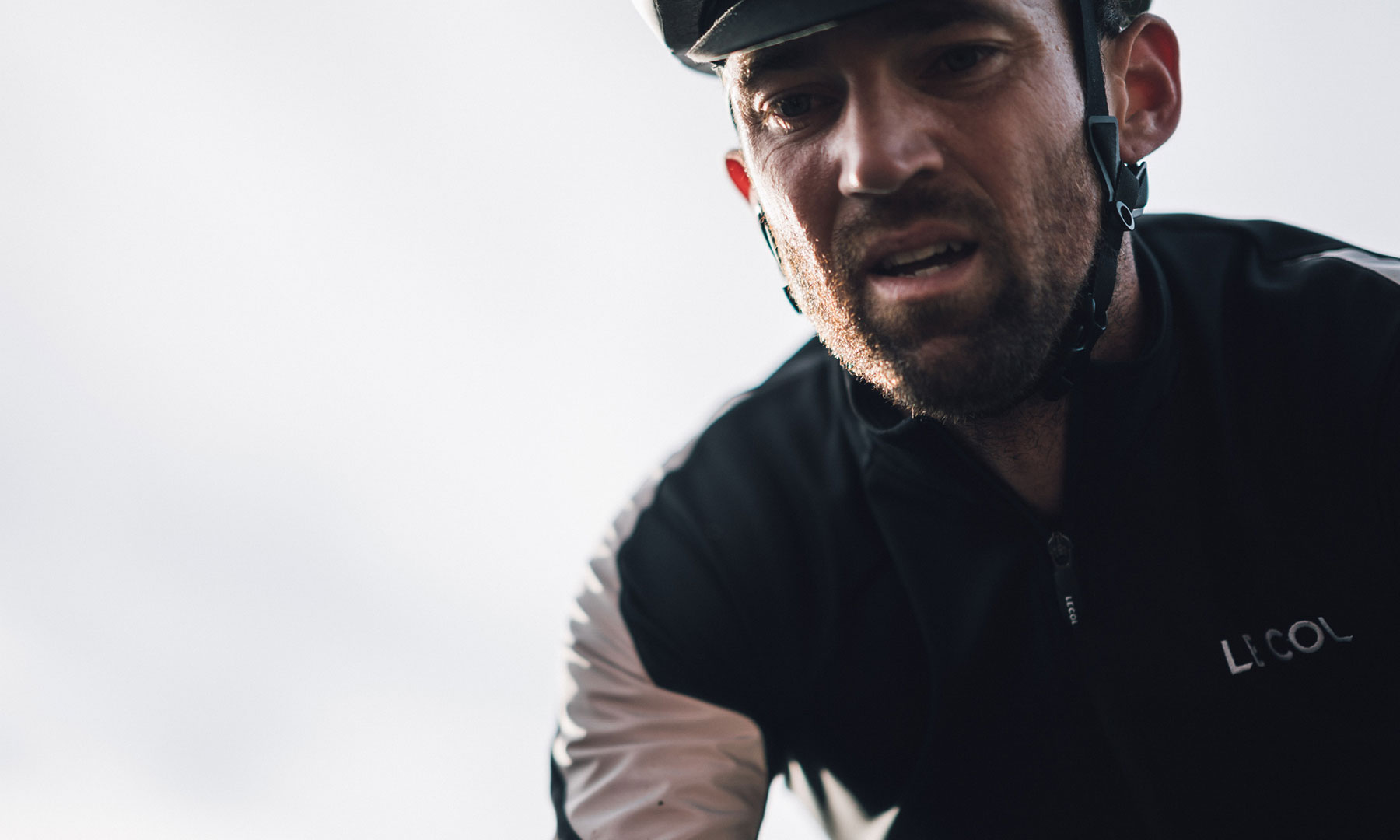
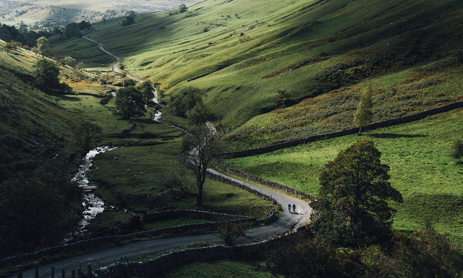
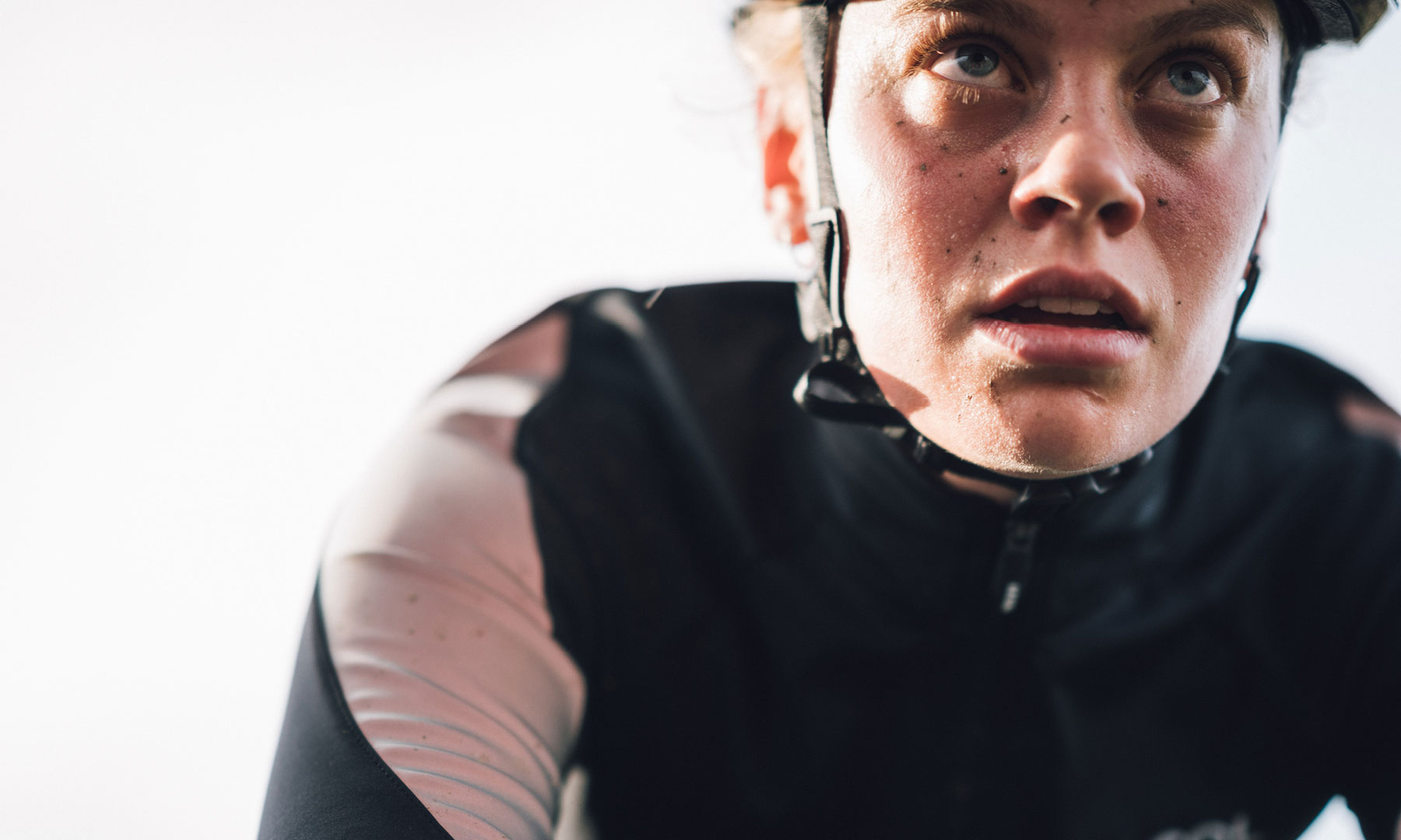
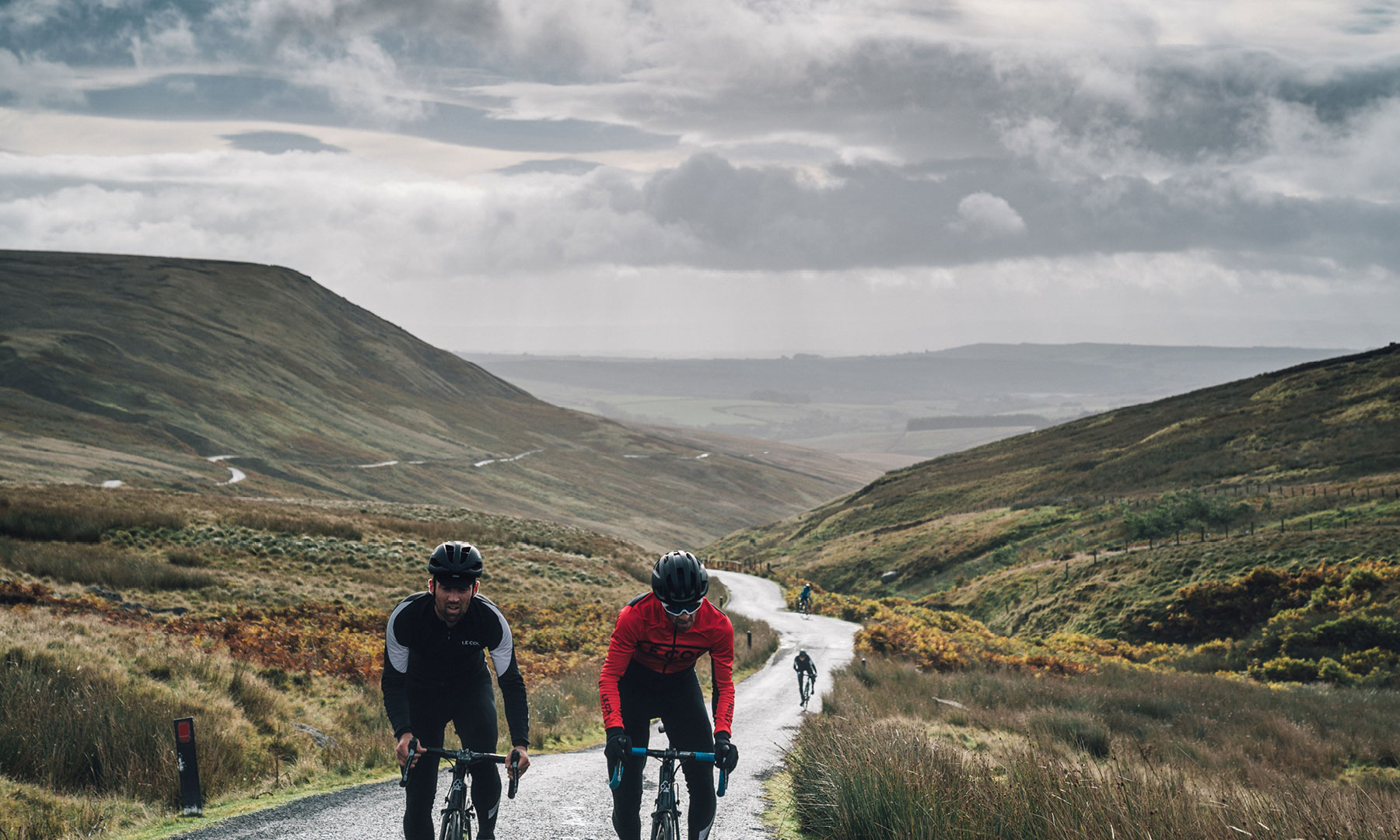
Welcome to LC___CC – Le Col Cycling Club. Ride with legends, train with Pros and turn your effort into rewards. A community united by stories, shared goals and hard-and-fast ambition. The most rewarding club in cycling.
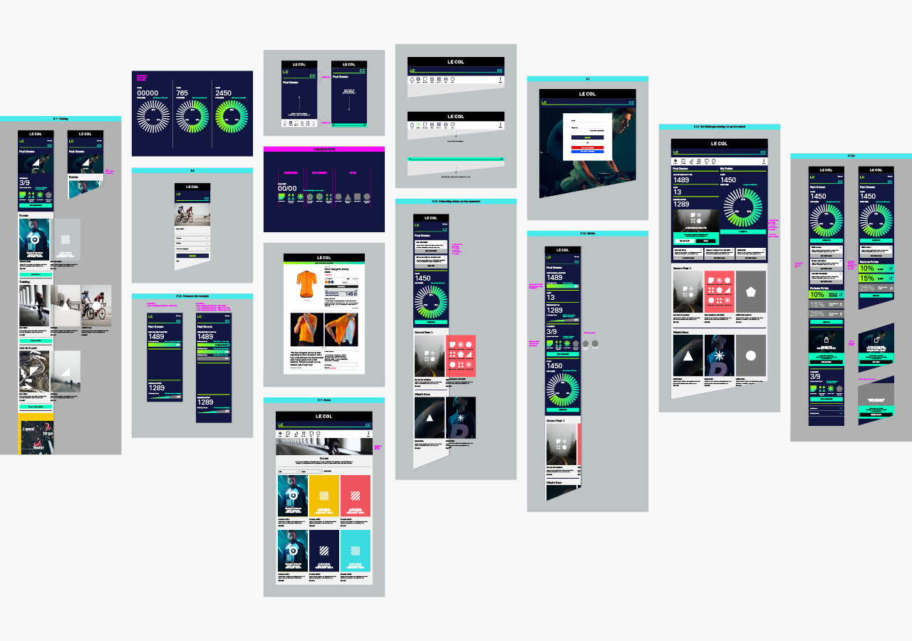
Limited Edition Design worked with the senior Le Col team, to develop a branding strategy, messaging and a dynamic new visual and verbal identity — including user interface and experience design across hundreds of items and details to enable development agency Savvy, and the internal team of developers, to bring the complex platform build to life. From the outset, the concept was a digital first approach, so the visual identity had to be flexible enough to work across multiple strands, whilst ensuring a sense of community and warmth.
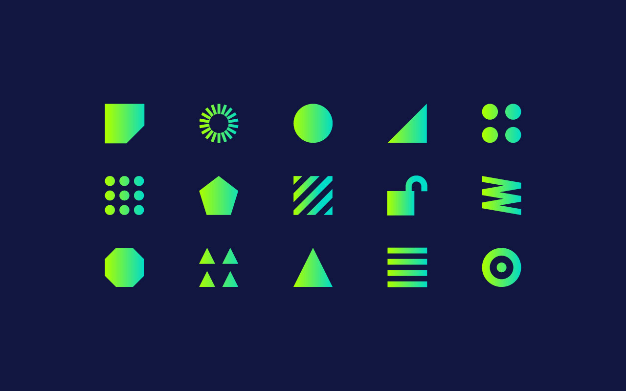
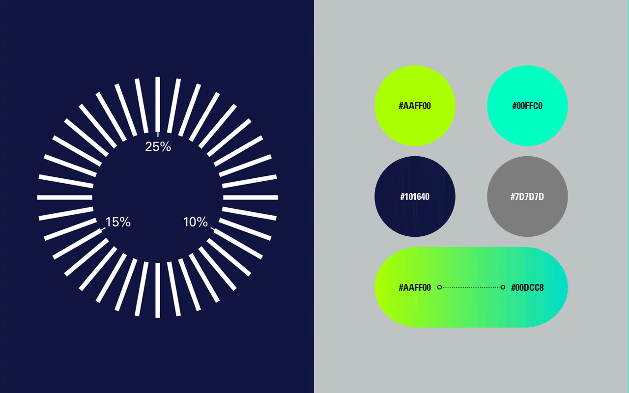
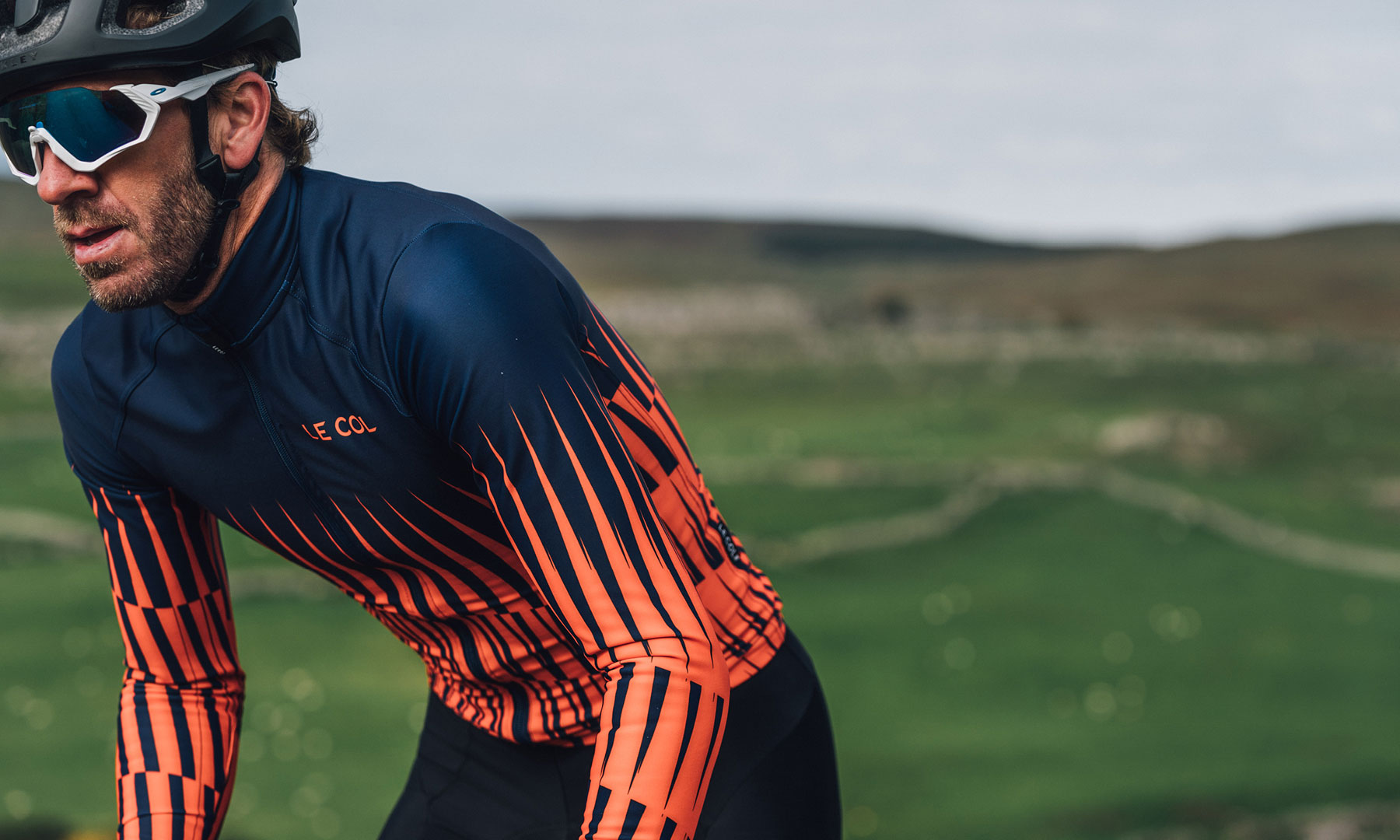
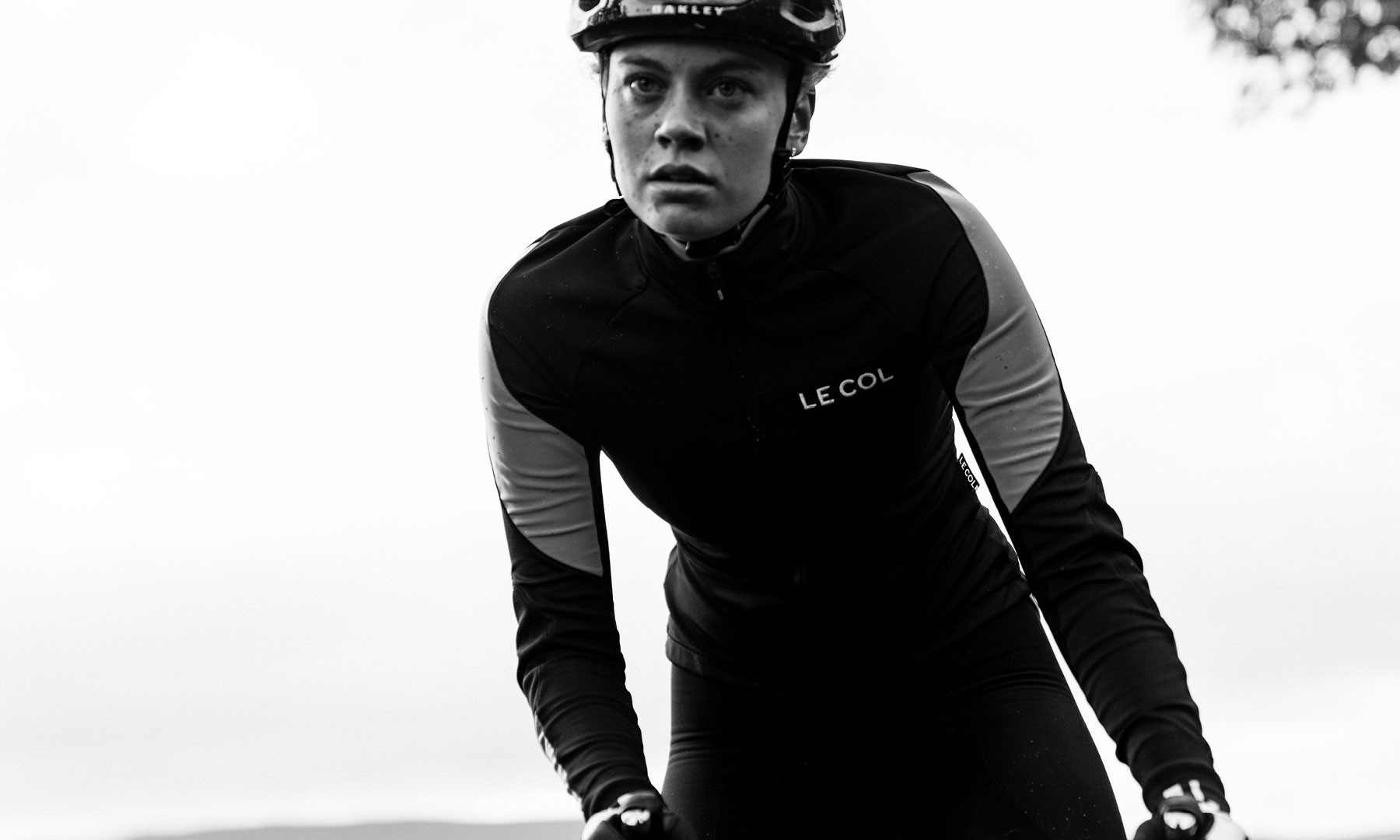
The visual design approach comprises of entirely new colour systems, photography, typography, iconography and signature graphic assets in both static and animated forms. The iconography plays a key role in creating a visual language and design system for the content, whilst typography plays to a fluid, more conversational tone to maintain that warmth.
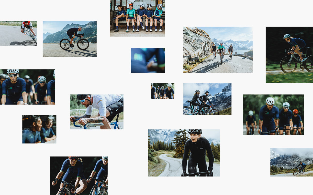
A small selection of our work below, with an update to follow soon.
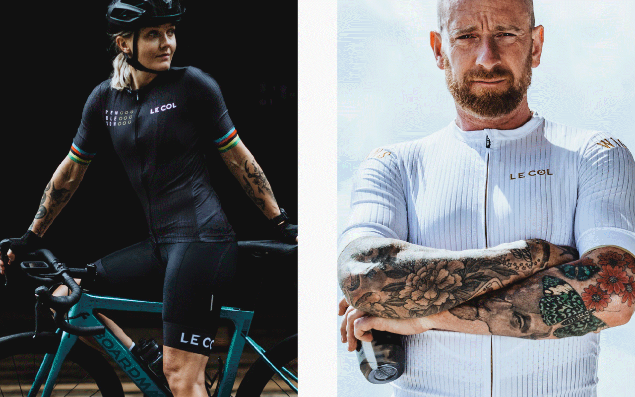
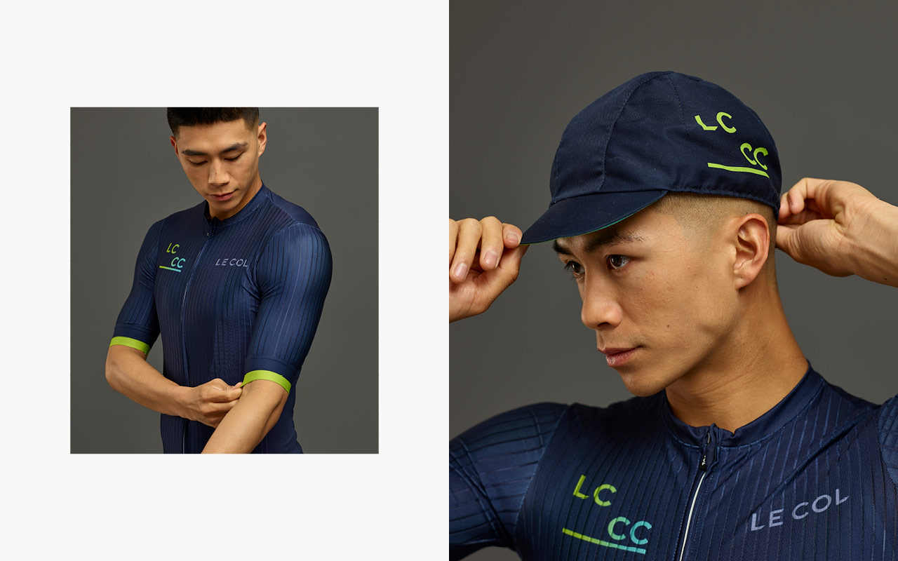
The identity also runs across mens and womens Kit design that is only available to members:
Wireframing and interaction design to integrate Club into the overall eCommerce design we’ve developed for the master brand. Maintaining enough of a unique feel that it can standout and be signposted as part of the customers user journey.
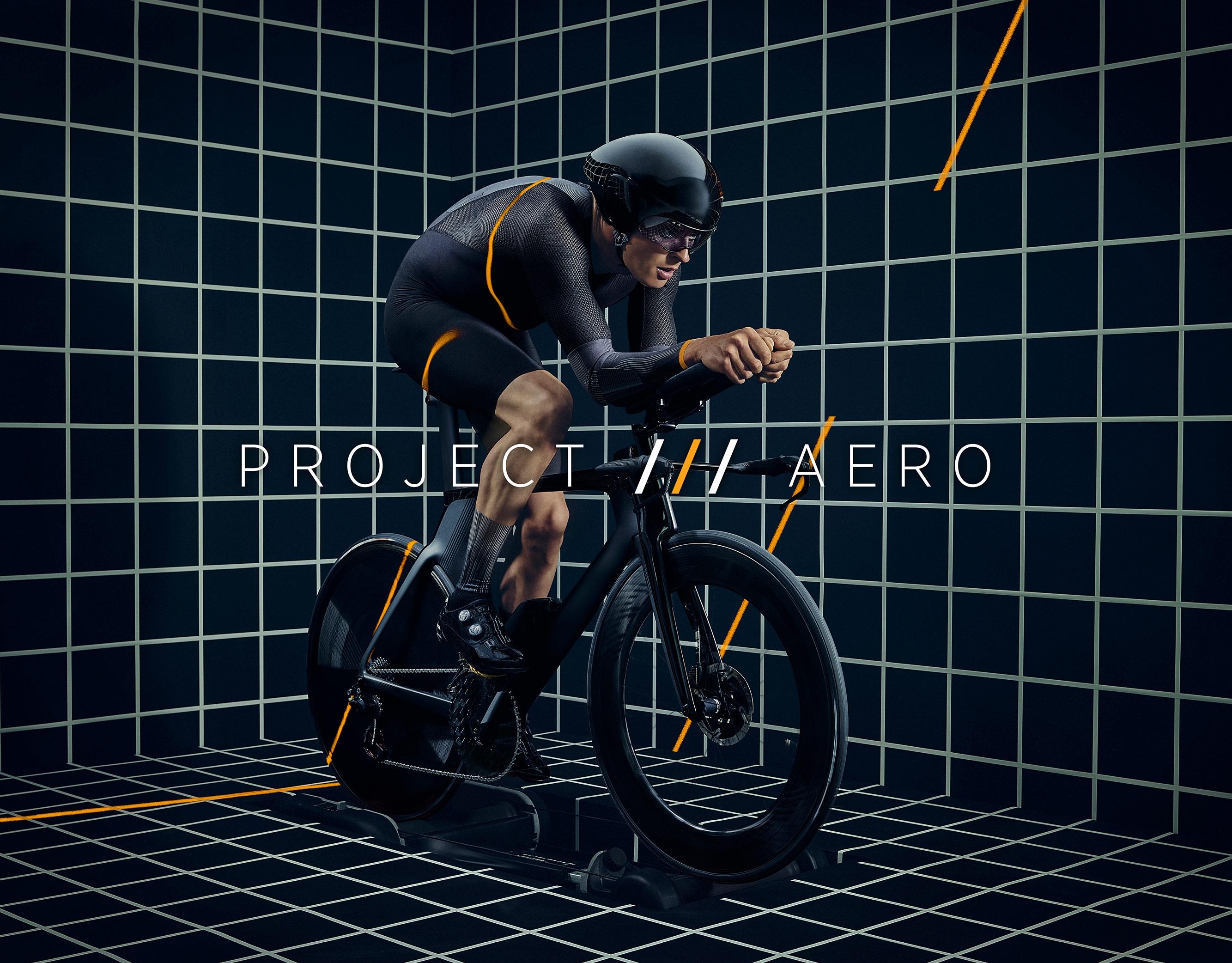
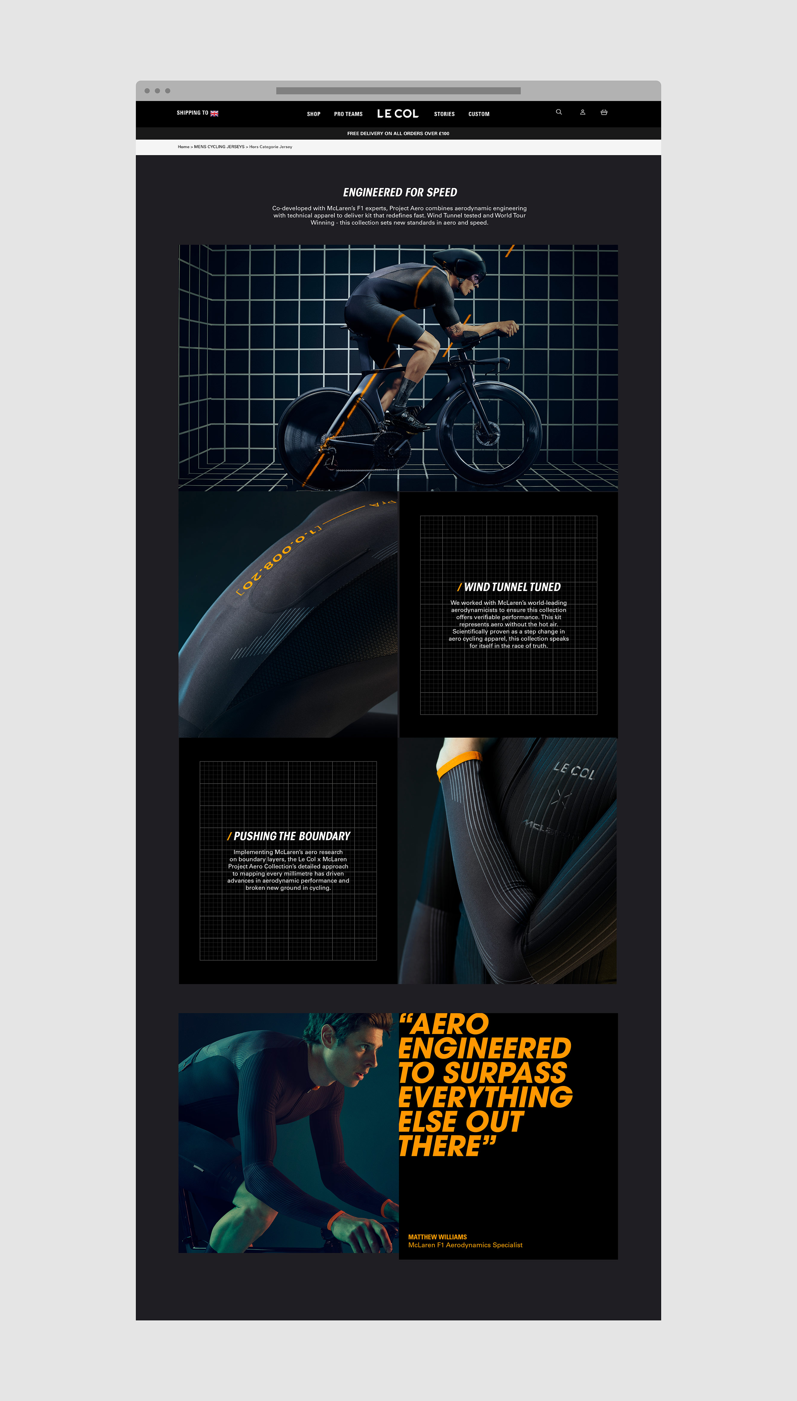
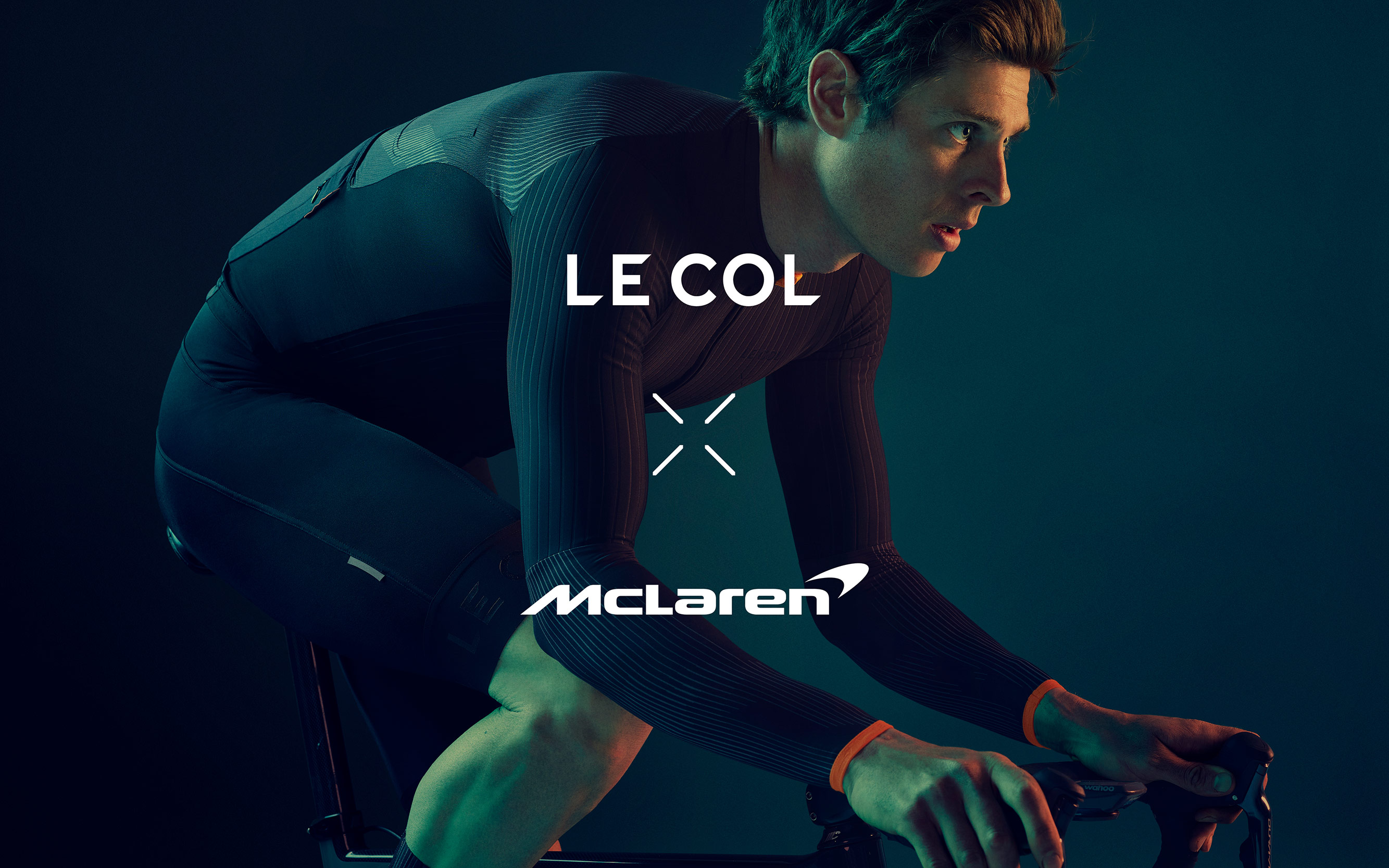
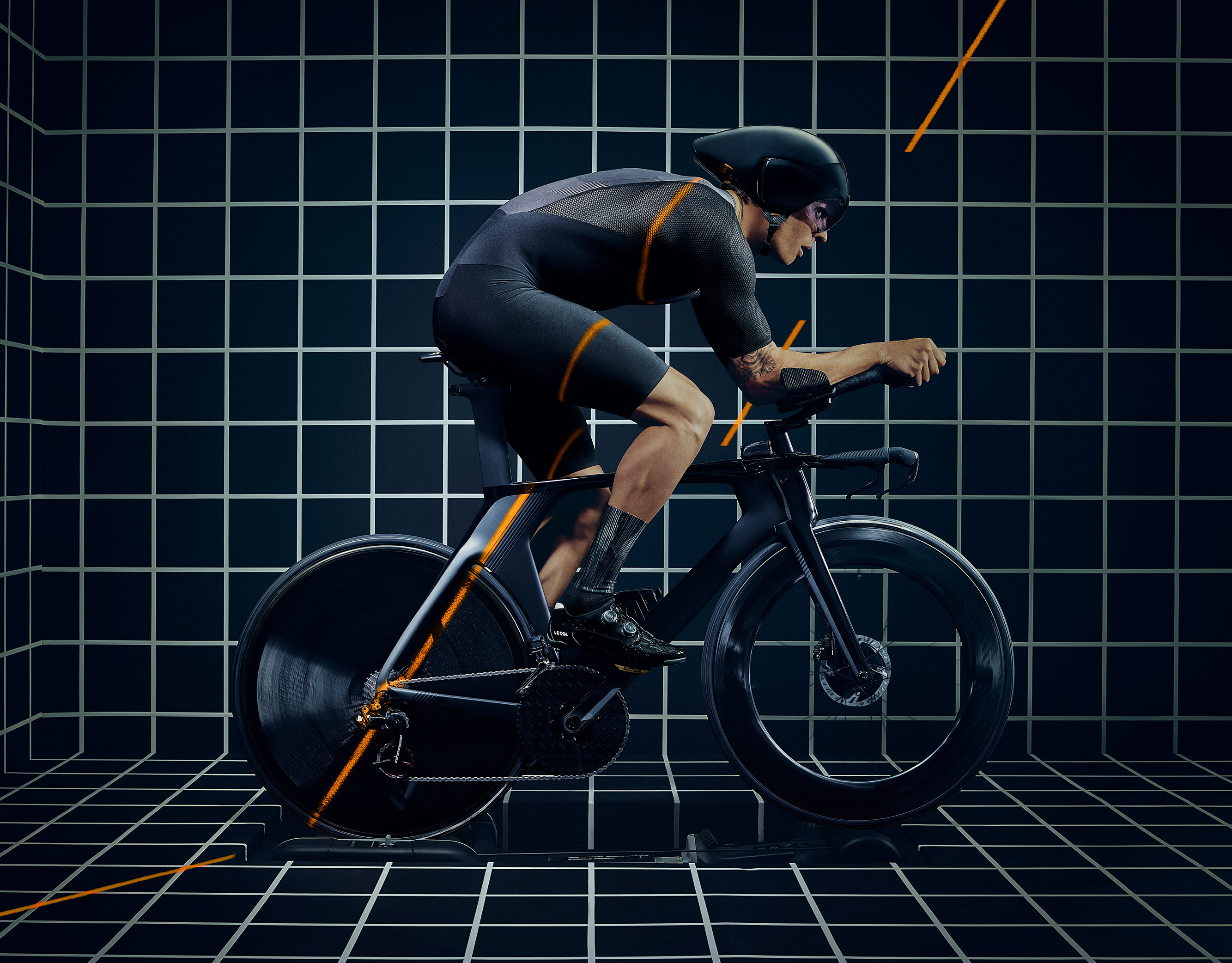
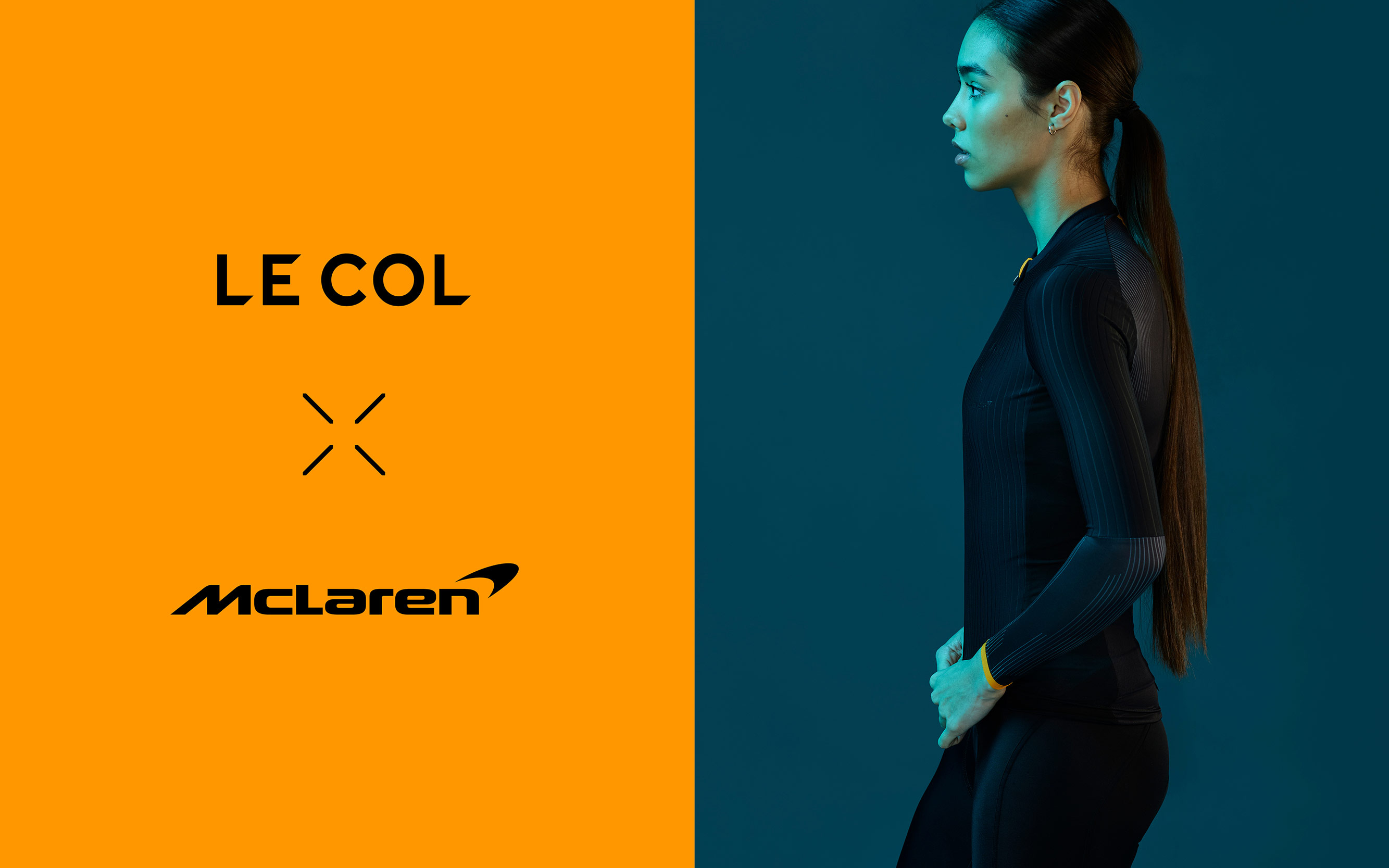
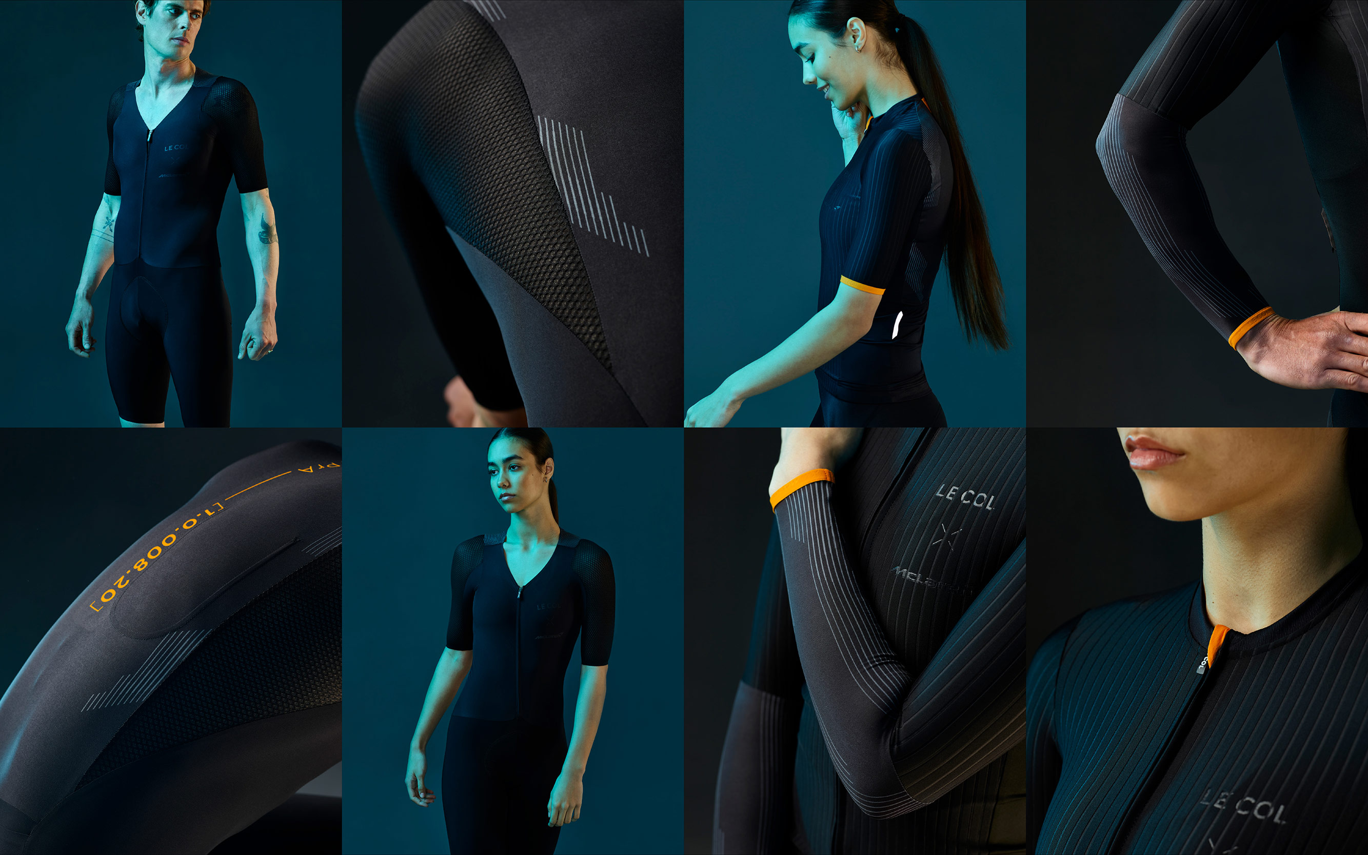
Le Col is focussed on creating the best performance cycling kit on the market, so to have a collaboration with a brand as iconic as McLaren was an opportunity to really push the limits. Meet Project Aero.
We’ve always looked outside of cycling and beyond what others in the sport are doing, and what this collaboration, and the technology allows us to do is to create an environment that shows the combination of performance and engineering in a unique way. Muybridge meets Tron, from building a bespoke set in the studio for our stills campaign, to using some of the most innovative virtual production technology using Unreal Engine to shoot the commercials, this project has been about pushing the boundaries at every level.
The concept for this shoot was about creating a hyper-real set that that reflects the hours of development, but without the obvious cliche of using a wind tunnel. Instead, we focussed on creating a cinematic experience that brings to life and stylises that process of capturing data. Project Aero – Engineered for Speed.
Client Le Col / McLaren
Production: Squire
Director: Jay Creagh
Dop: James Medcraft
Model: Adam Macrae
Photography: Michael Blann
3d/Animation: Greg Walker
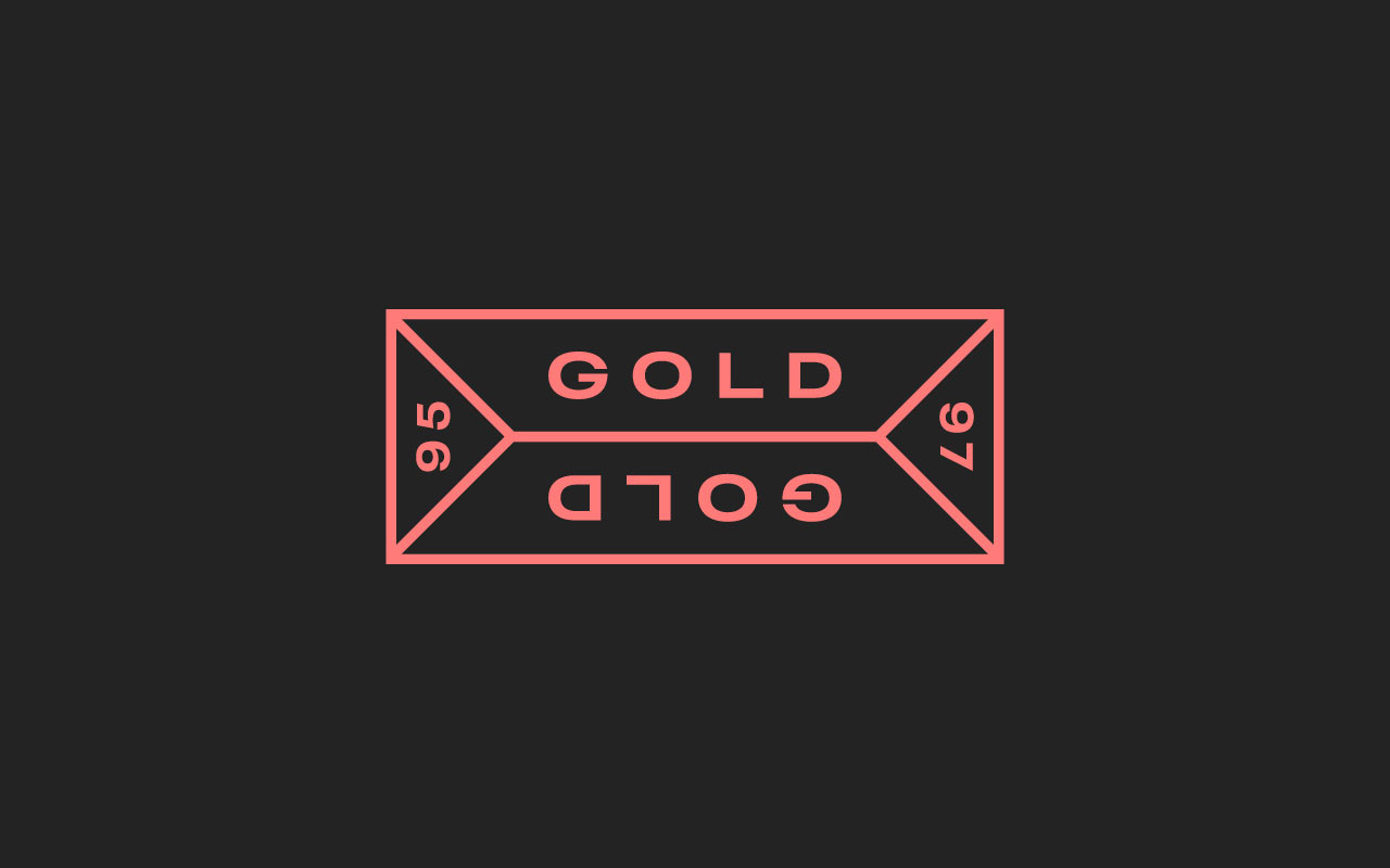
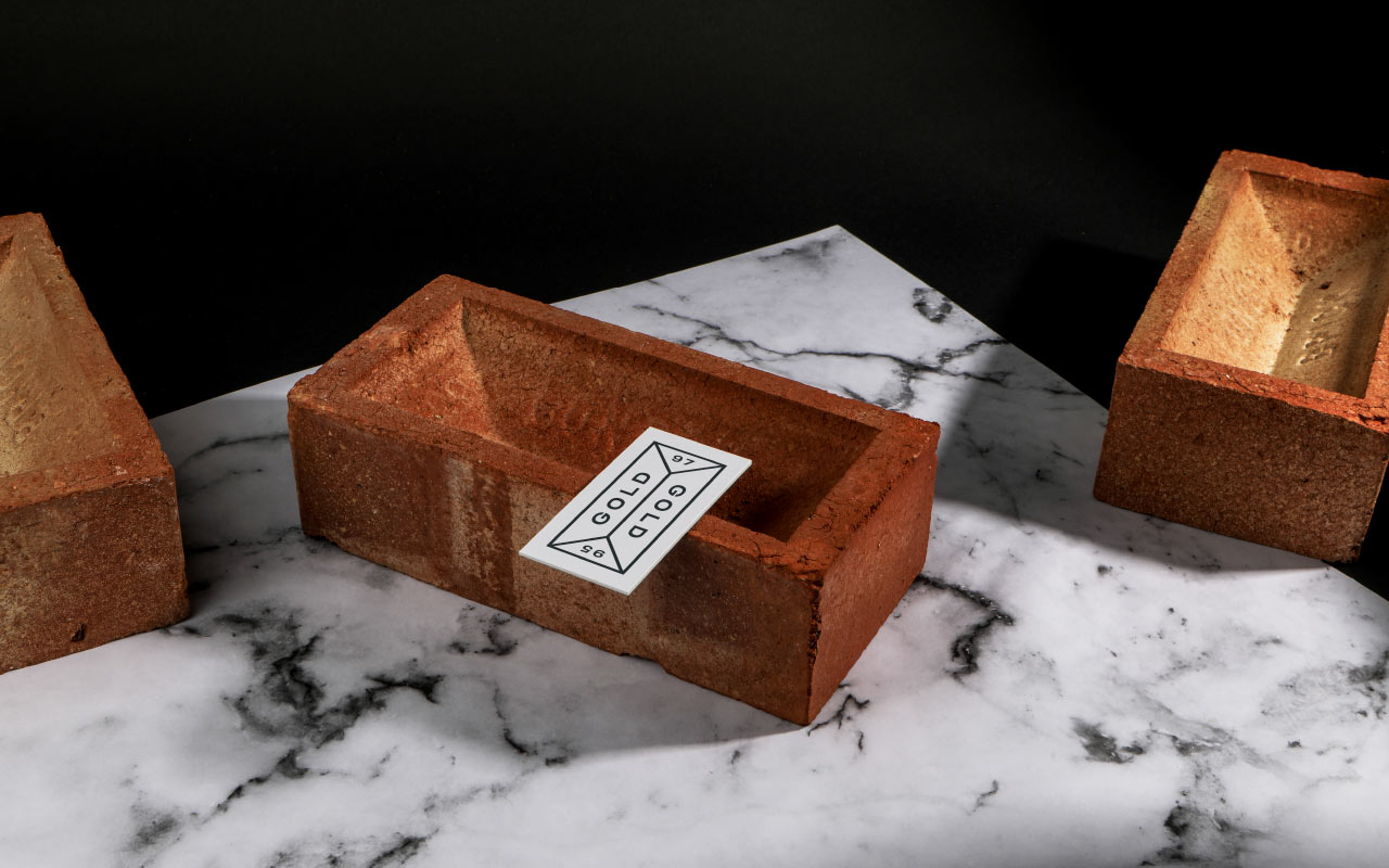
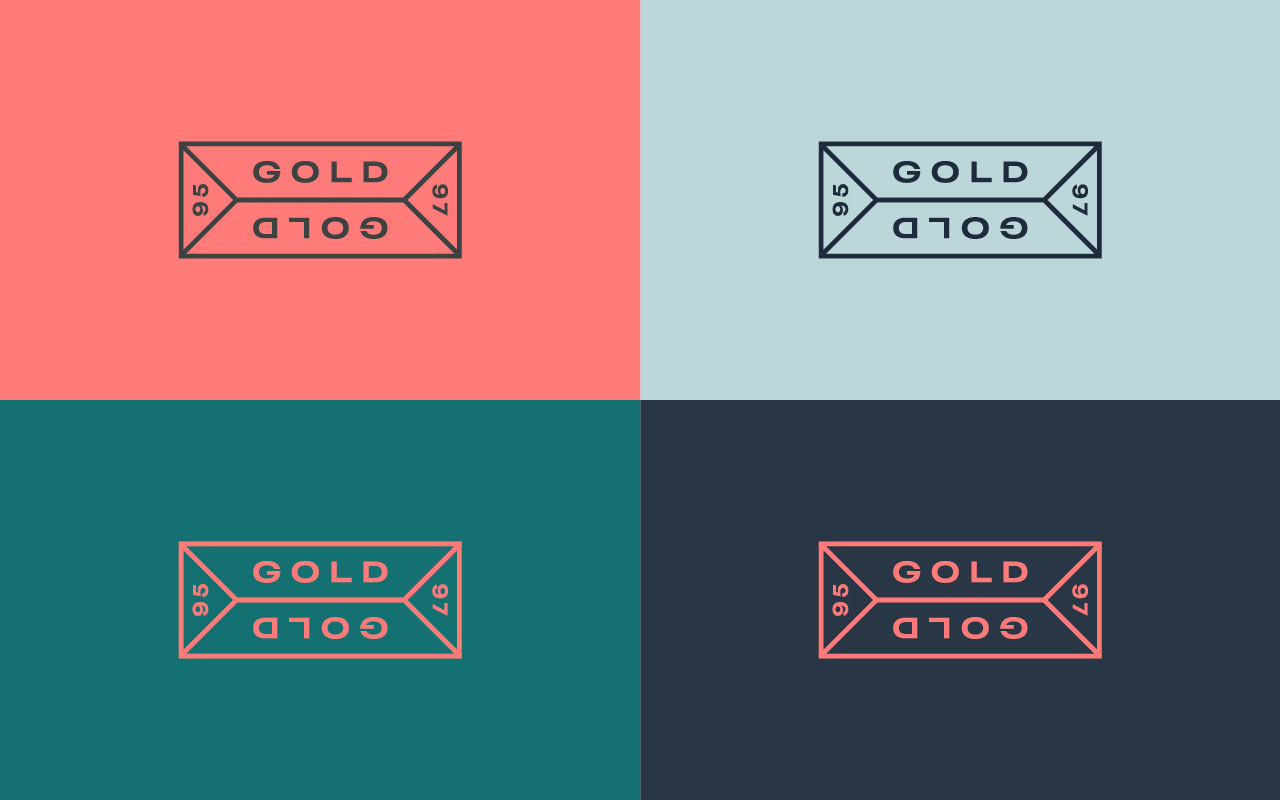
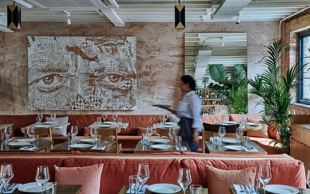
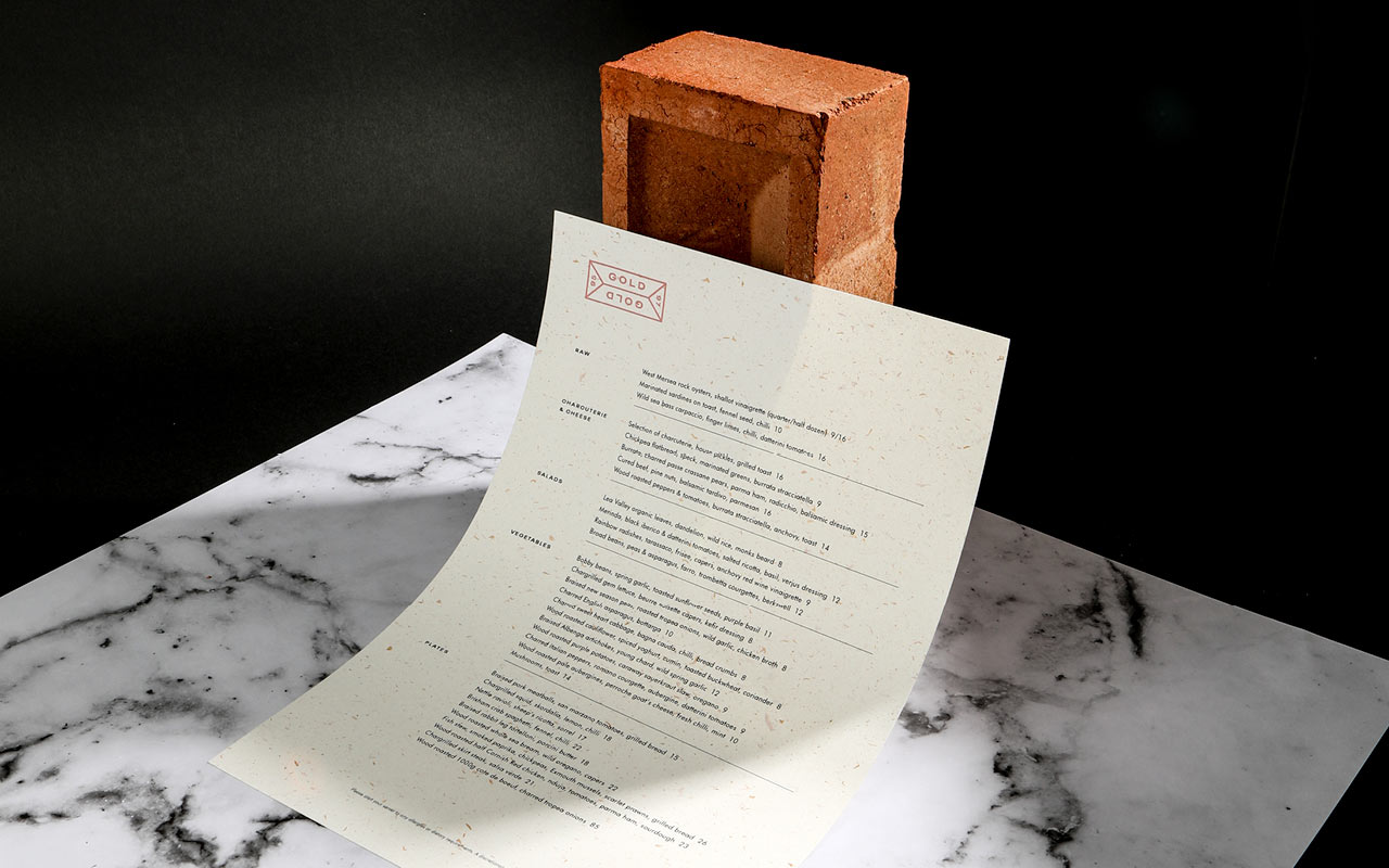
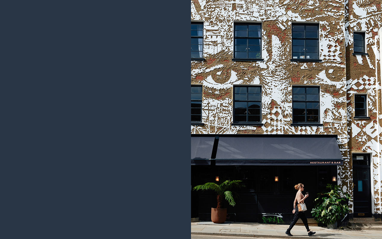
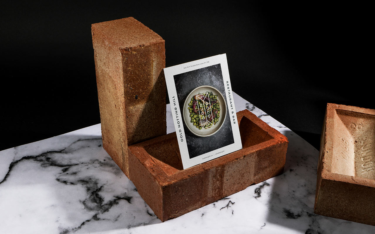
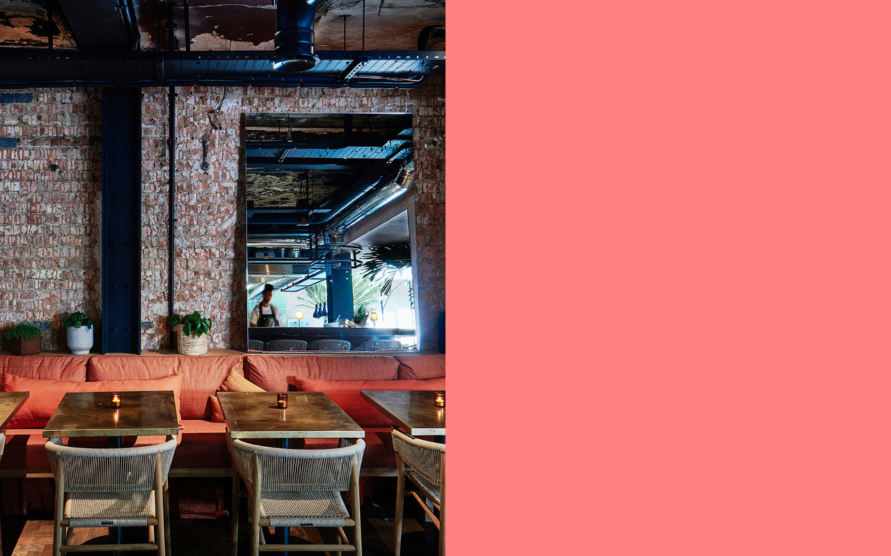
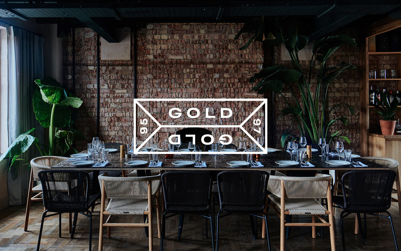
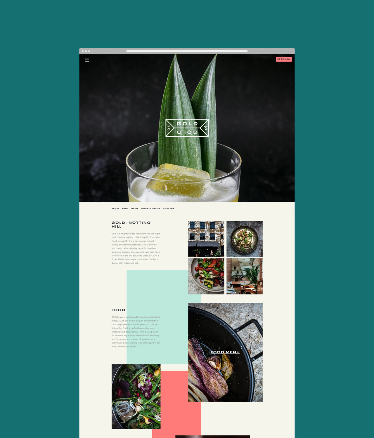
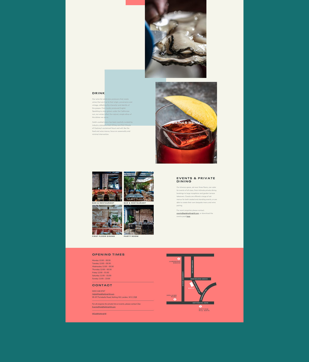
New restaurant branding project. Situated on the bustling Portobello Road, Gold Notting Hill is a vibrant new neighbourhood restaurant and late night bar. Inspired by the area’s diverse cultural history and artistic eclecticism, Gold is informal and honest, with a menu focussed on generous, seasonal plates cooked over open flame or in wood ovens and served to share. Set over 3 floors, Gold’s diverse space advocates laid-back dining, both indoor and out.
The concept itself is based on Notting Hill’s rich history. Long before gentrification set in, 1800s Notting Hill was a key brick making area. Using the London clay, workers would mould and fire the bricks that would build the buildings that stand there today. This idea influenced both the interior and the brand design – industrial elements paired with exposed brick are juxtaposed with contemporary natural woods and an abundance of plants to create a refined yet casual environment. The exterior facade by Portuguese street artist Vhils, further ties the concept together.
The bold logotype sits with refined typography and subtly nods to the brickmakers markings that still adorn bricks today. The rich colour palette is influenced by the painted buildings that are iconic to Portobello.
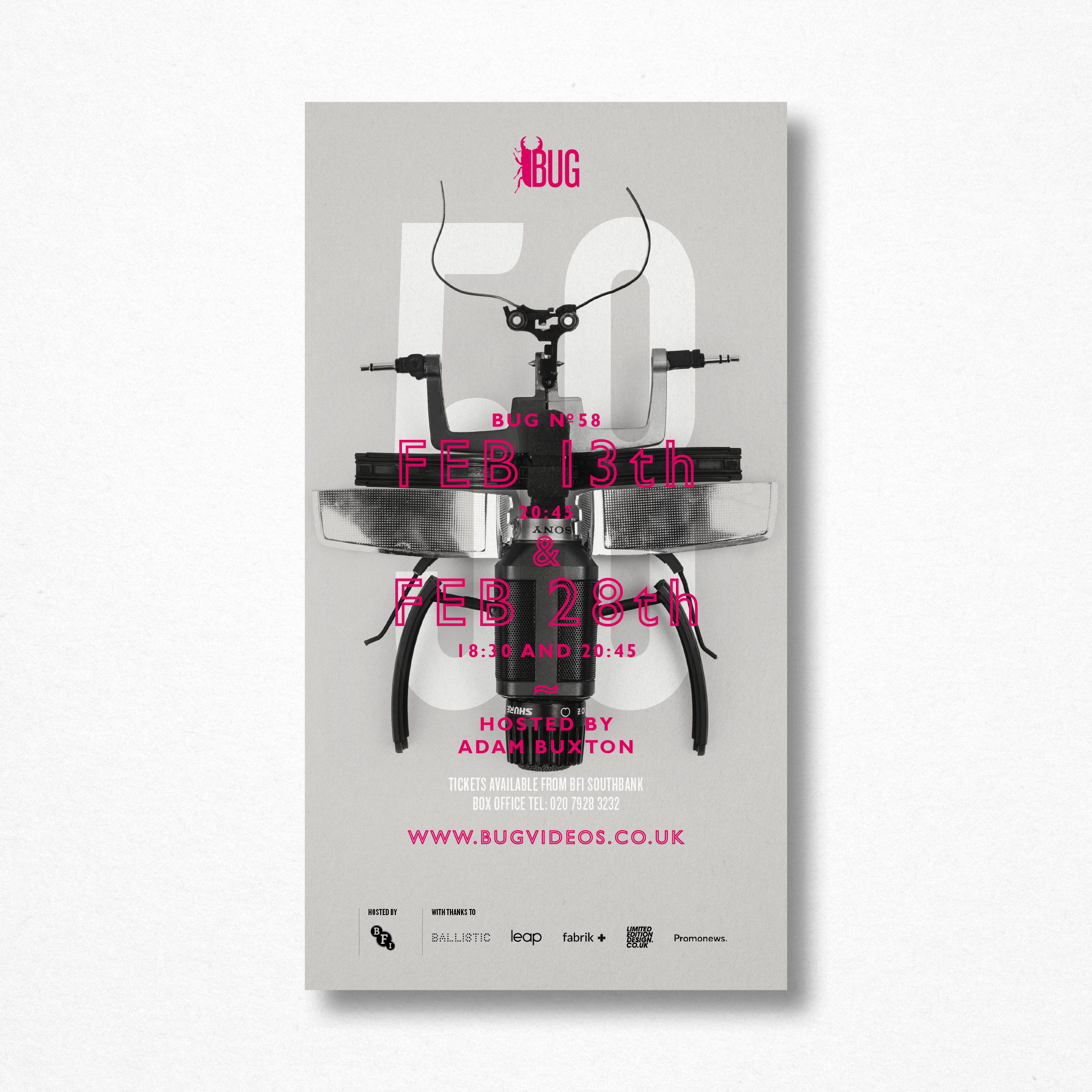
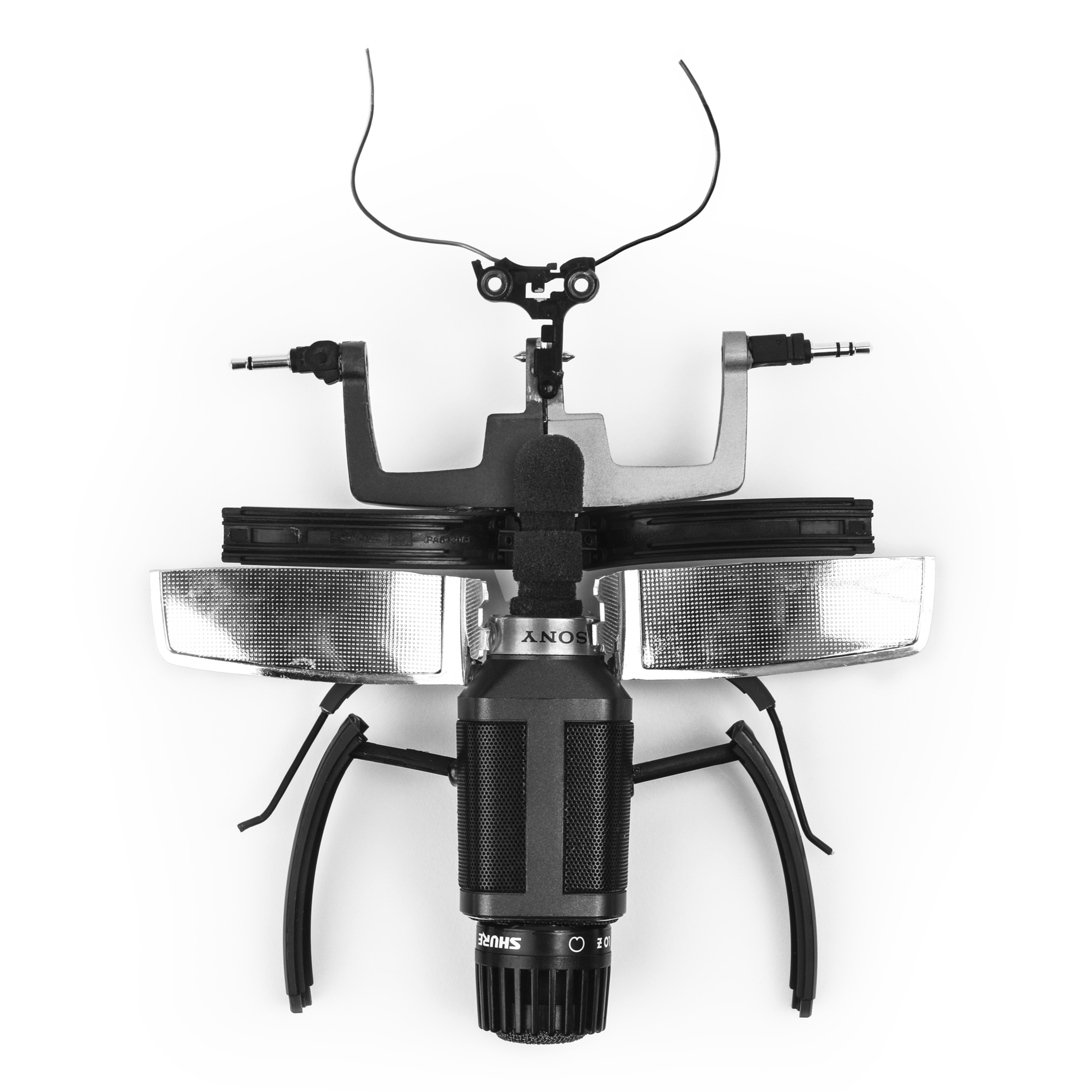
Bug is back, showcasing music videos on the big screen, hosted by Adam Buxton.
Each event has its own model bug crafted from pieces of dismantled film and music equipment. Each bug is photographed from overhead, mimicking old taxidermy, and is coupled with big bold typography and a paired back colour palette.
BUG’s objective is to give big-screen exposure to the most awe-inspiring new work in music videos. That means everything from work by well-known masters of the medium to young newcomers working on zero budgets. The sub-heading of BUG – The Evolution of Music Video – refers to the new democracy in videomaking created by the digital revolution – both in creating and distributing work. BUG is all about brilliant visual ideas, and as such BUG consistently unearths amazing new filmmaking talent. See more here.
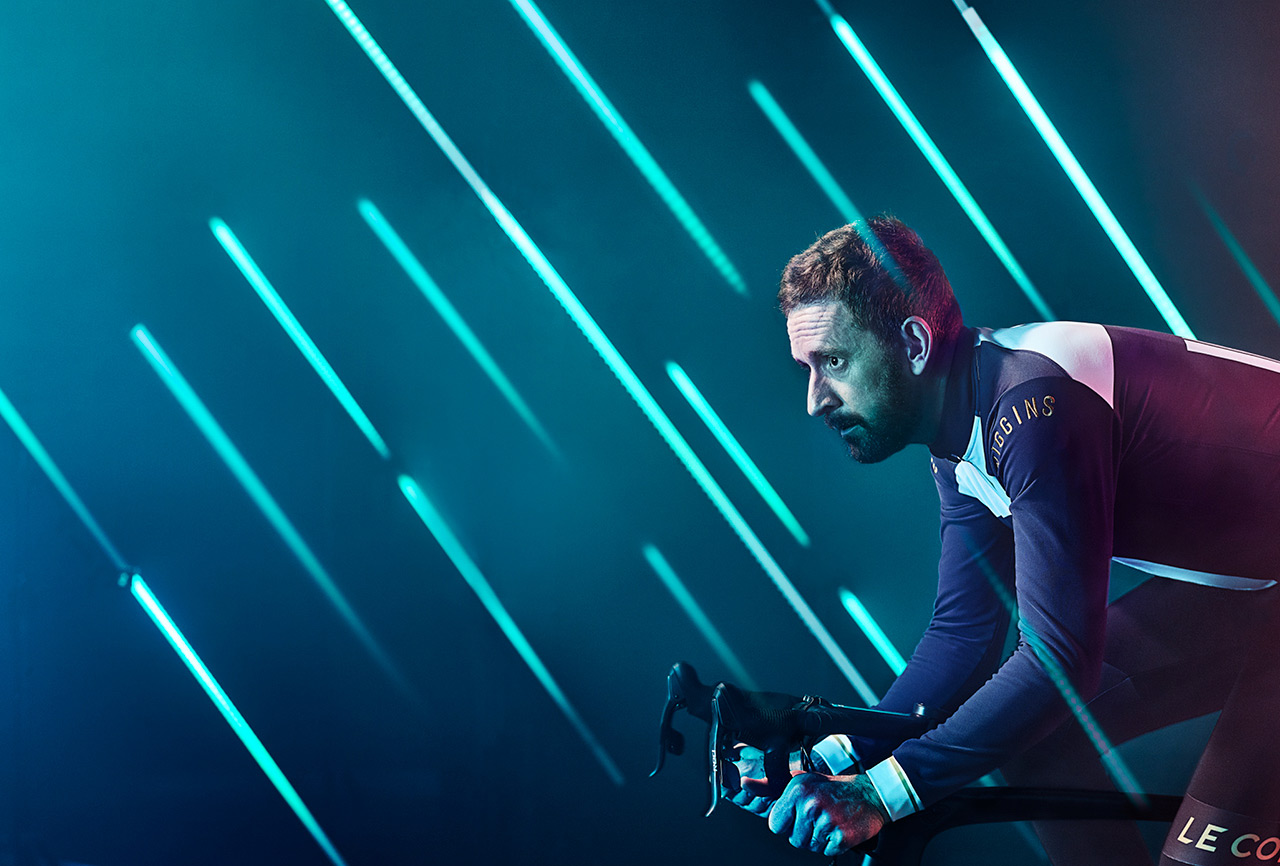
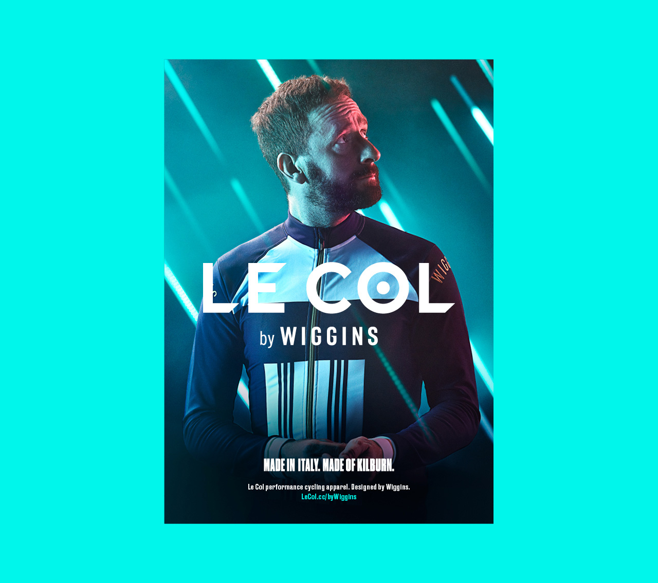
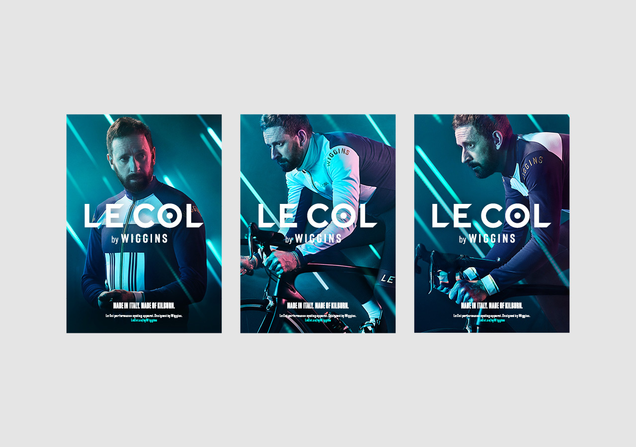
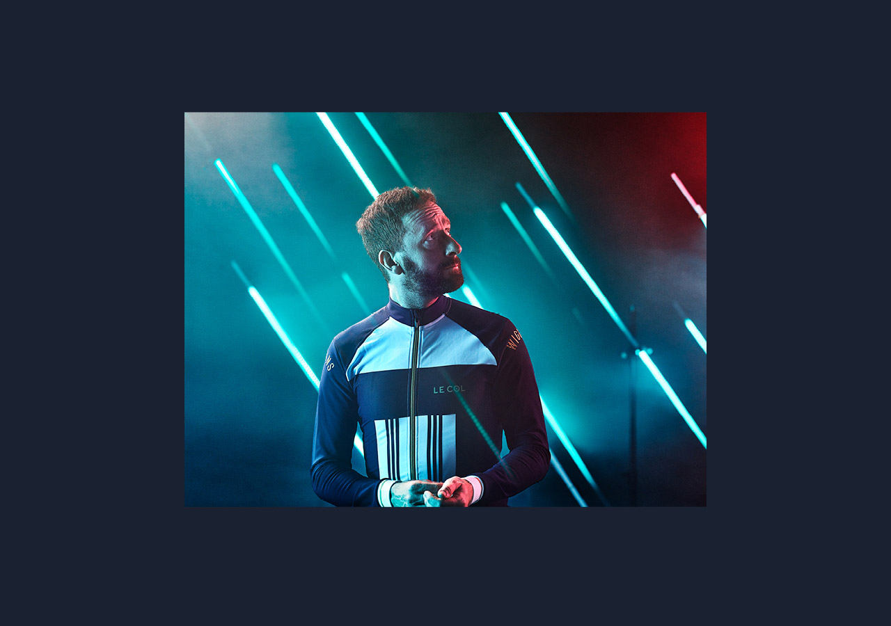
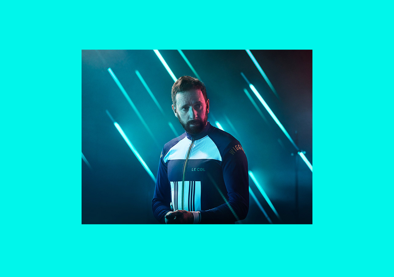
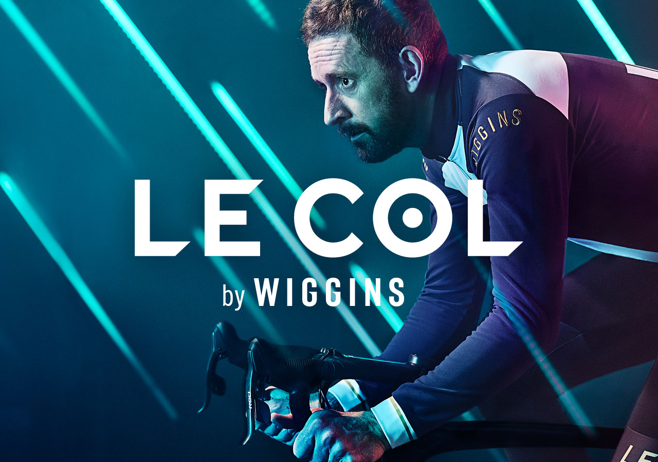
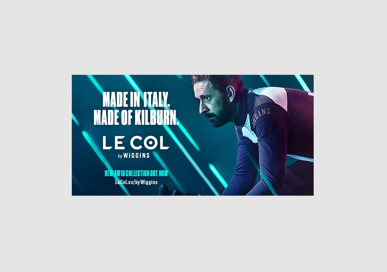
Our new campaign for the launch of the Autumn Winter collection from Le Col by Wiggins. The concept uses lighting strips to graphically represent rain, with the blue tones and use of gels further emphasising a wintery feel. Le Col’s range of kit uses technically enhanced fabrics to ensure riders are protected from the elements, whatever the weather.
Tour de France champion and Olympic cycling legend, Sir Bradley Wiggins, joined forces with Le Col to create the ‘Le Col by Wiggins’ range earlier this year. The Autumn Winter range is the second collection in the partnership and compliments the work we’ve done to date.
The aim was to build and shoot the concept in camera. We worked with photographer by Michael Blann to execute the studio shots, with Machine Shop bought in to build the computer controlled lighting rig. Our work covered the concept creation and implementation across outdoor advertising, instore collateral, print and digital marketing including art direction of photography.