menu

Urchin Japanese

Brand Identity for Notting HIll's latest gastronomic hotspot

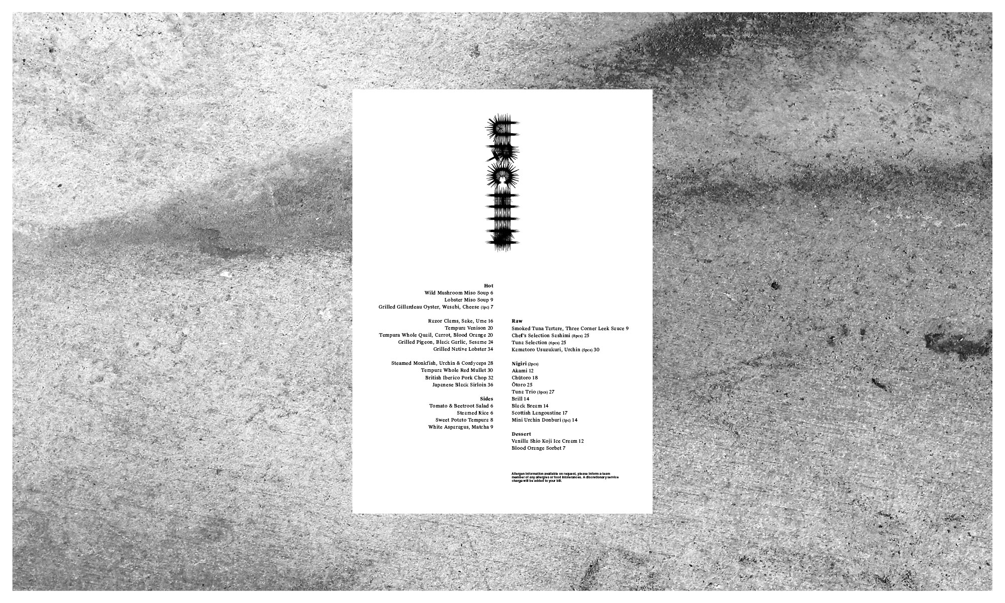
Urchin Japanese is the latest culinary hotspot from the team behind Dorian, Notting Hill Fish Shop, Tuna Fight Club and debuts in their Supermarket of Dreams location in Holland Park. With an upgraded open restaurant kitchen, multi-level wood grill and rotisserie, the killer team have hit the ground running.

The identity pairs a unique Kaiju-inspired character with experimental typography for the wordmark that echoes the spiky nature of urchins. The monster is a quiet nod to the slang term, embracing a Mischievous and dark persona, a foreboding creature emphasised with the barbed and schizophrenic exterior.

It’s a deliberate shift from the sterile and conservative cues that underly the category. There is still a sense of elegance and sophistication, but with such a dynamic and passionate team, this was never about fitting in.

Head chef Yuji Shimokawa has quickly made this new venture a runaway hit, alongside the infamous Tuna Fight Club shenanigans. Authentic cooked Japanese produced with superior produce, meet Hot Japanese.

Expect classic dishes alongside the likes of; Orkney Scallop tempura layered with black truffle dusted with maituke powder garnished with tempura flakes, shaved ceps, ginger sauce and house Dirty Tendashi. Fresh Sea Urchin Donburi with fresh wasabi and Minina leaf.


Urchin_Japanese_Branding_

Urchin_Japanese_Branding_2

Urchin_Japanese_Branding_3

Urchin_Japanese_Branding_5

Urchin_Japanese_Branding_4

Urchin_Japanese_Branding_6

Urchin_Japanese_Branding_7

Urchin_Japanese_Branding_8

Urchin_Japanese_Branding_9

Urchin_Japanese_Branding_10

Urchin_branding

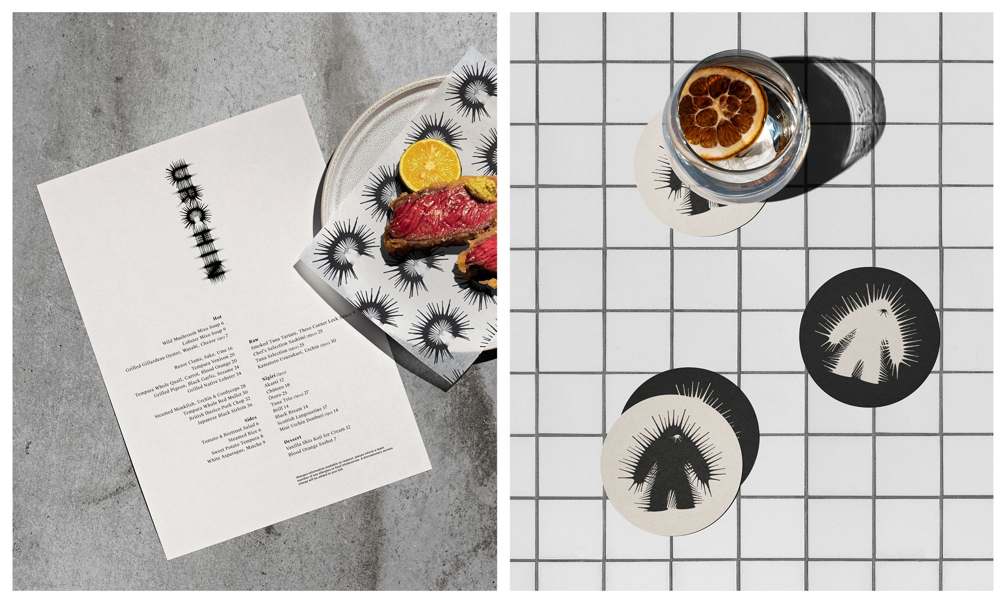
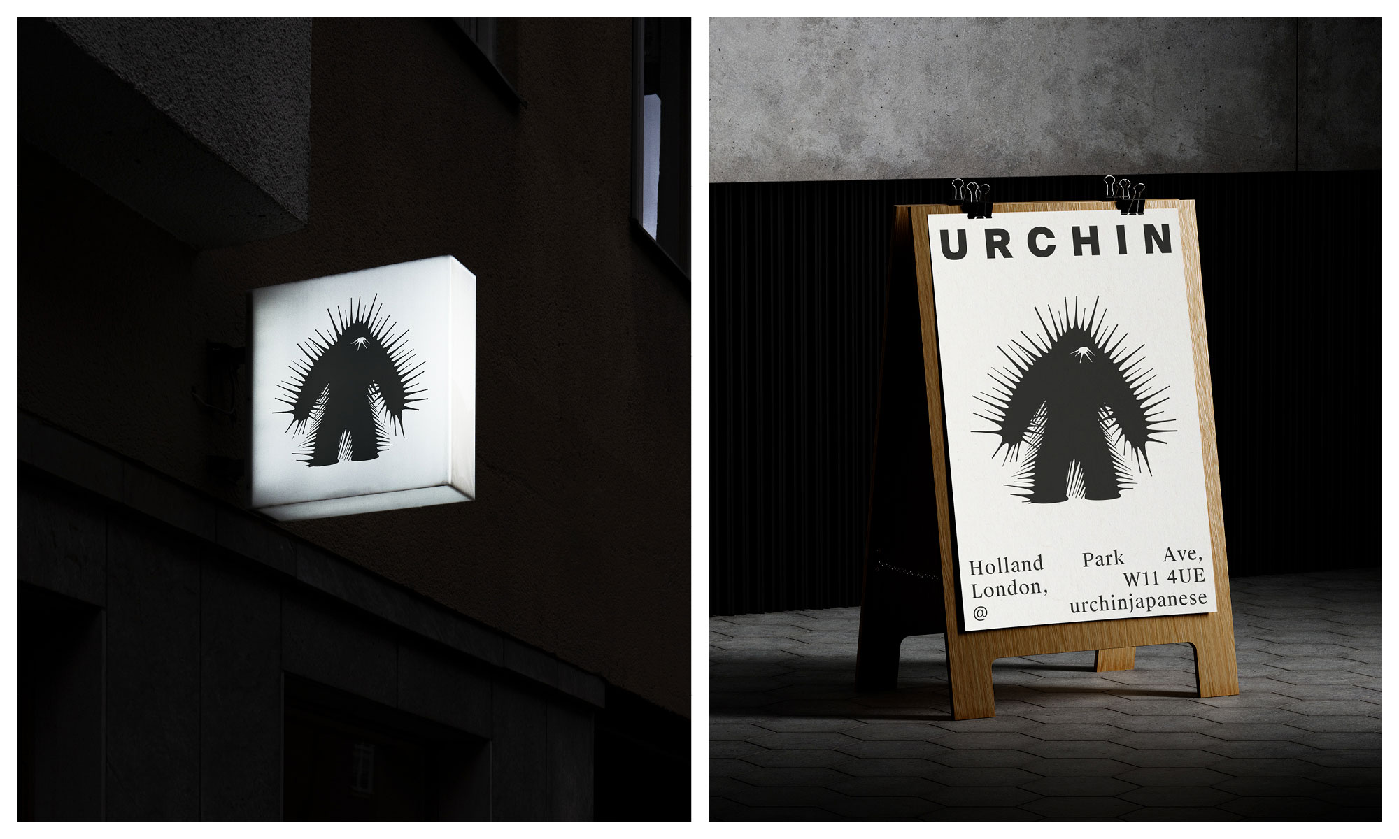
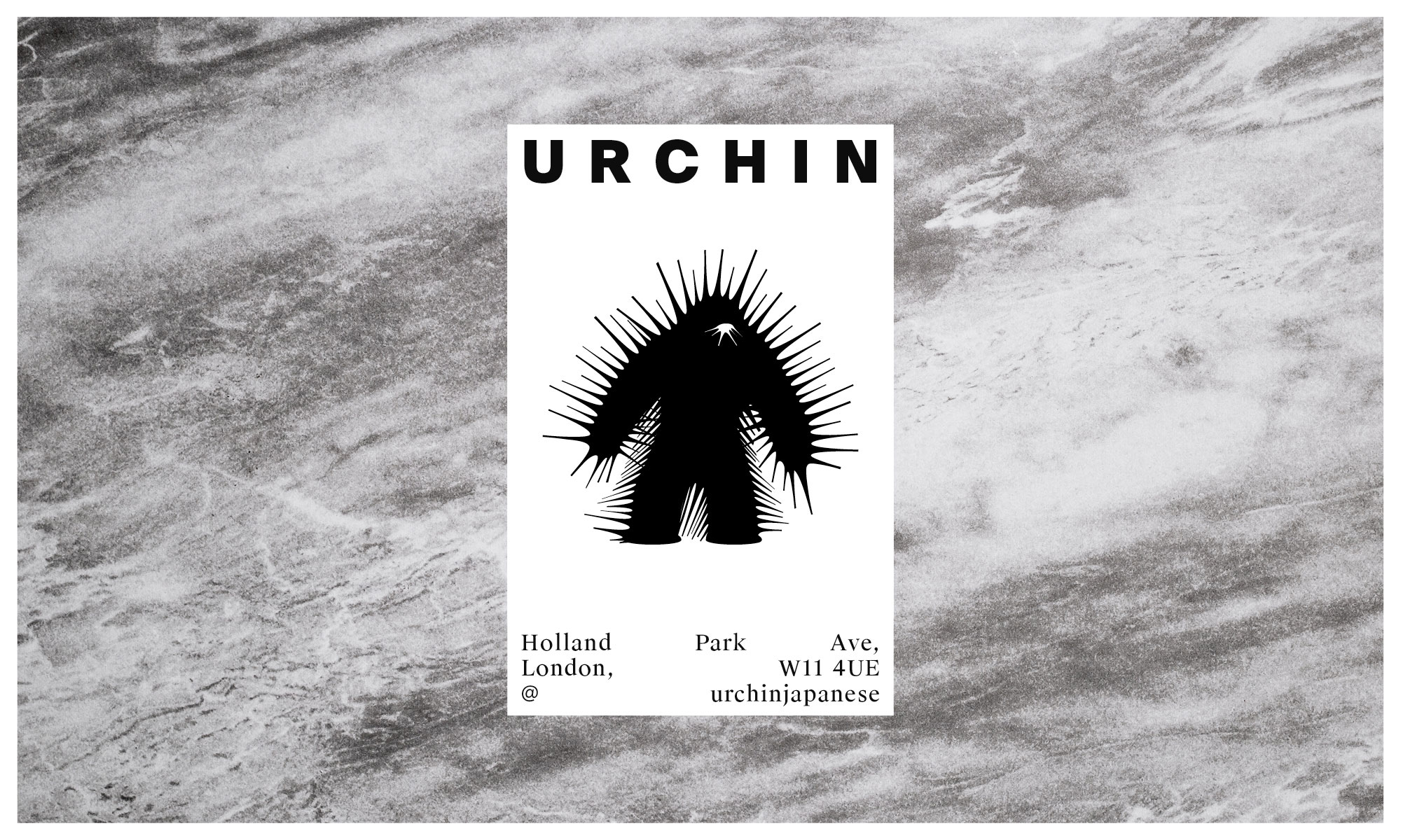
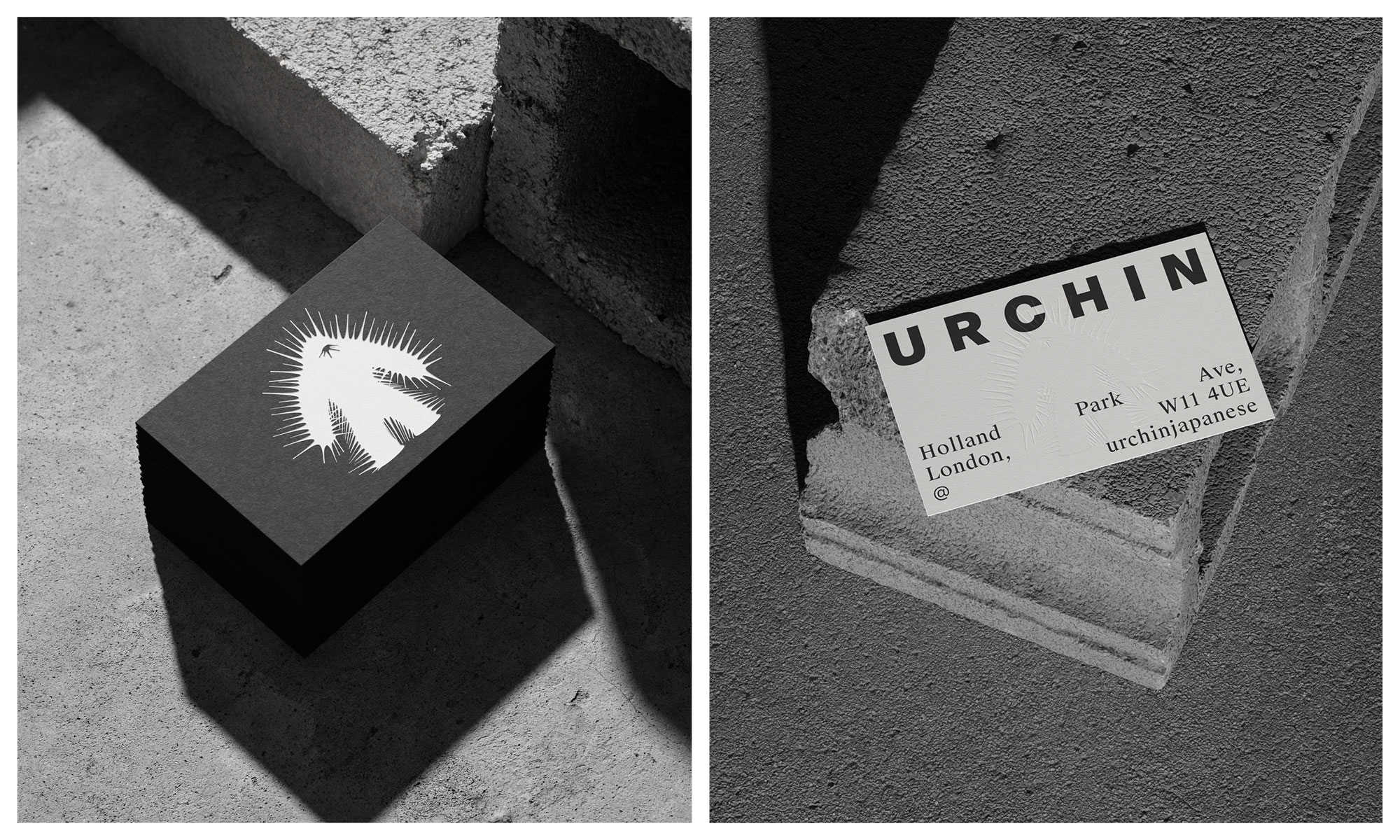
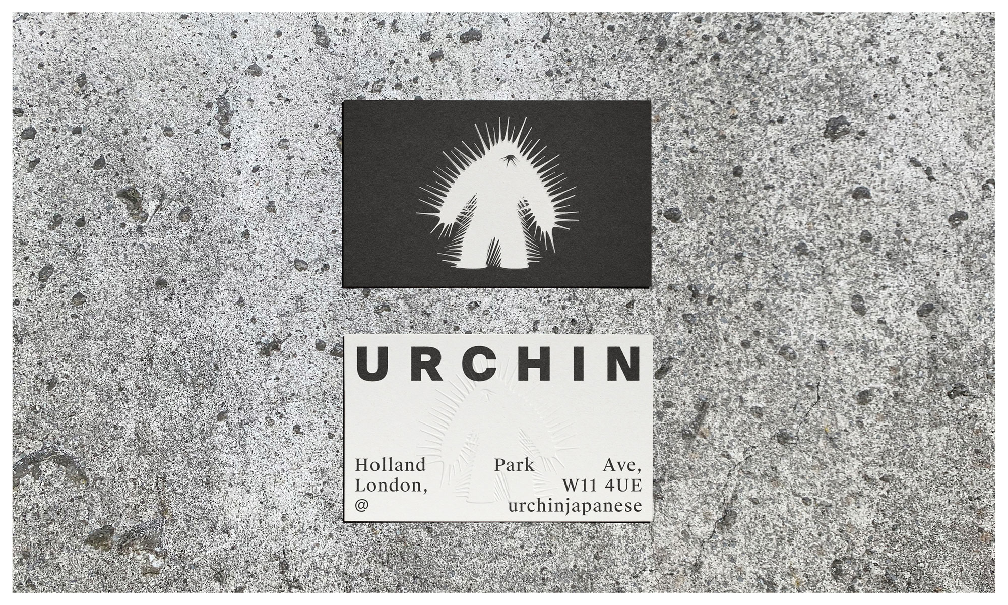
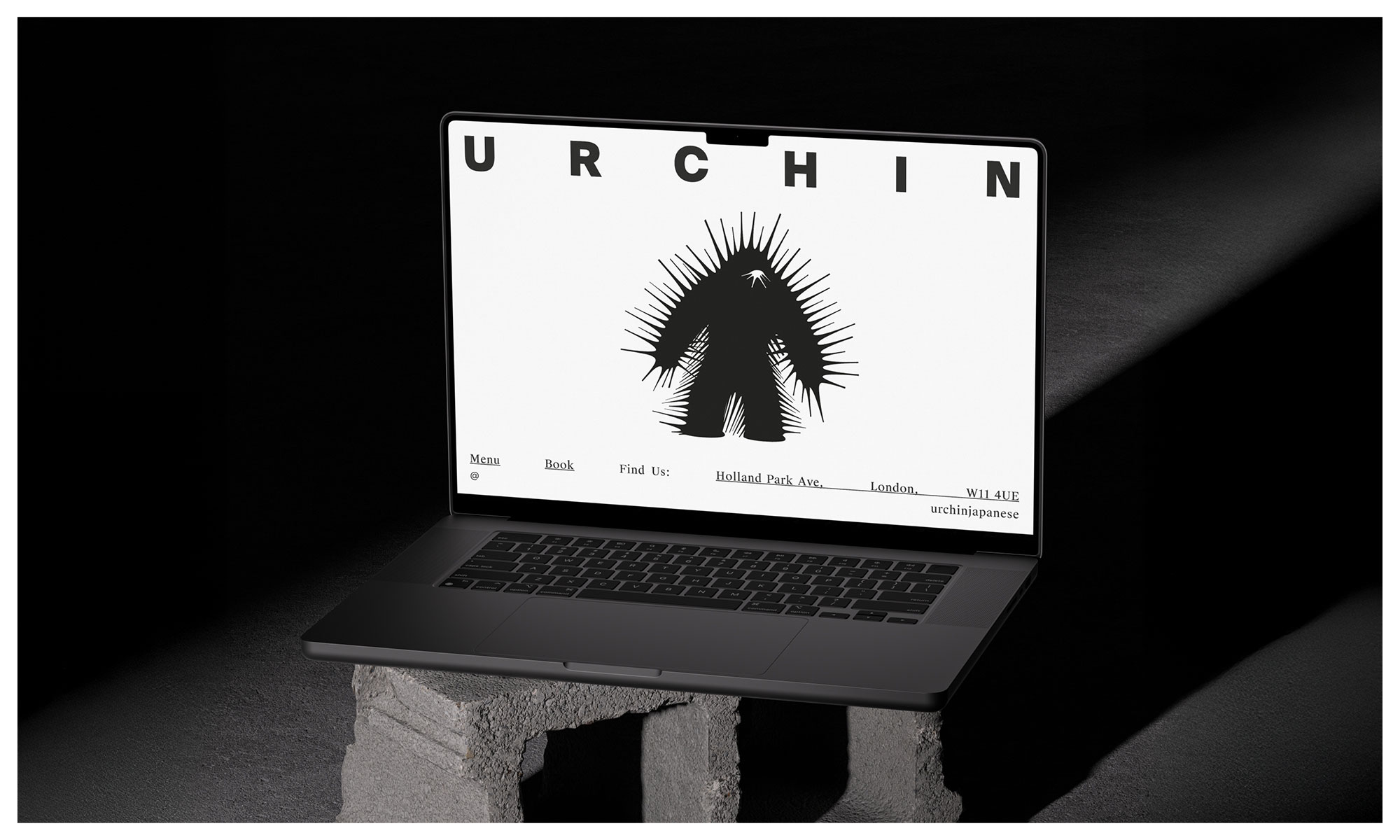
Typography and illustration experiments:

Urchin_Experimental_typography

Urchin_Experimental_typography_6

SunGod Photography