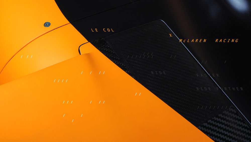
AW & SS/23 Brand Identity
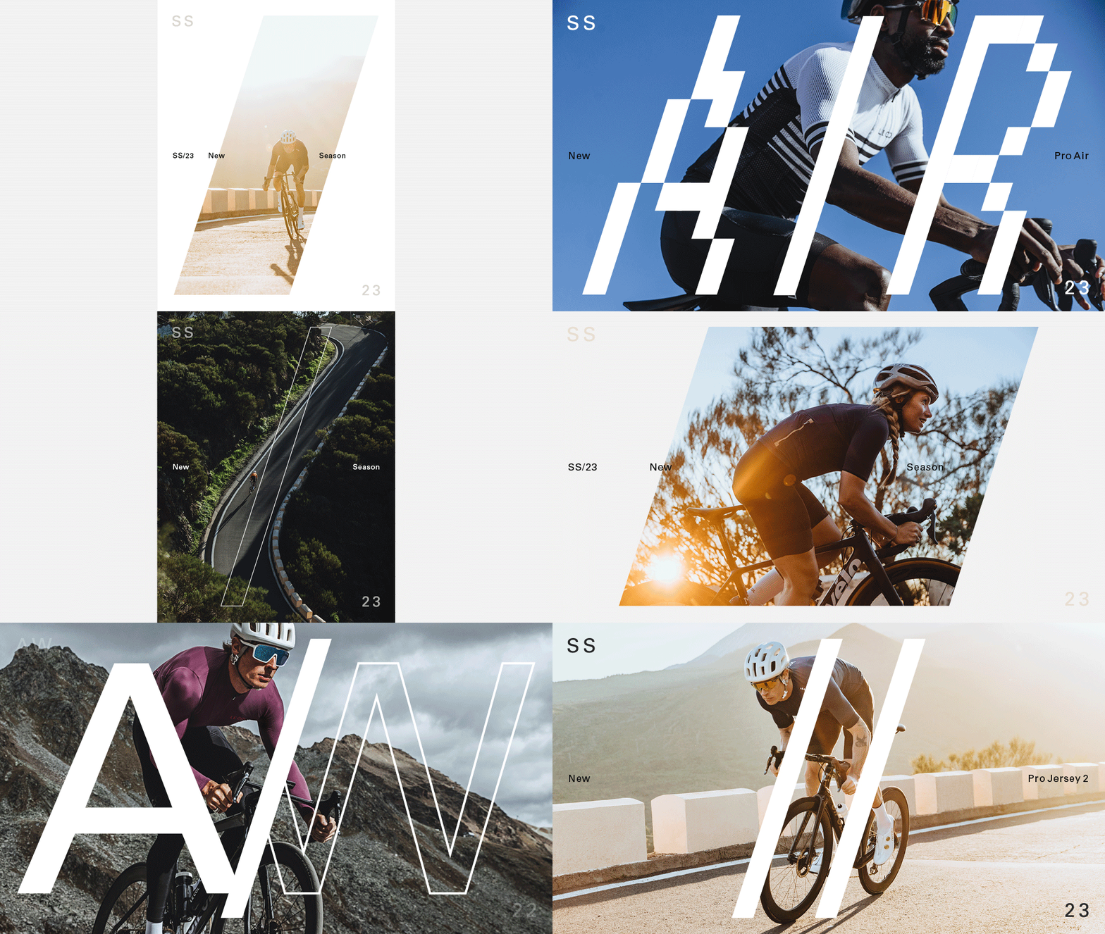
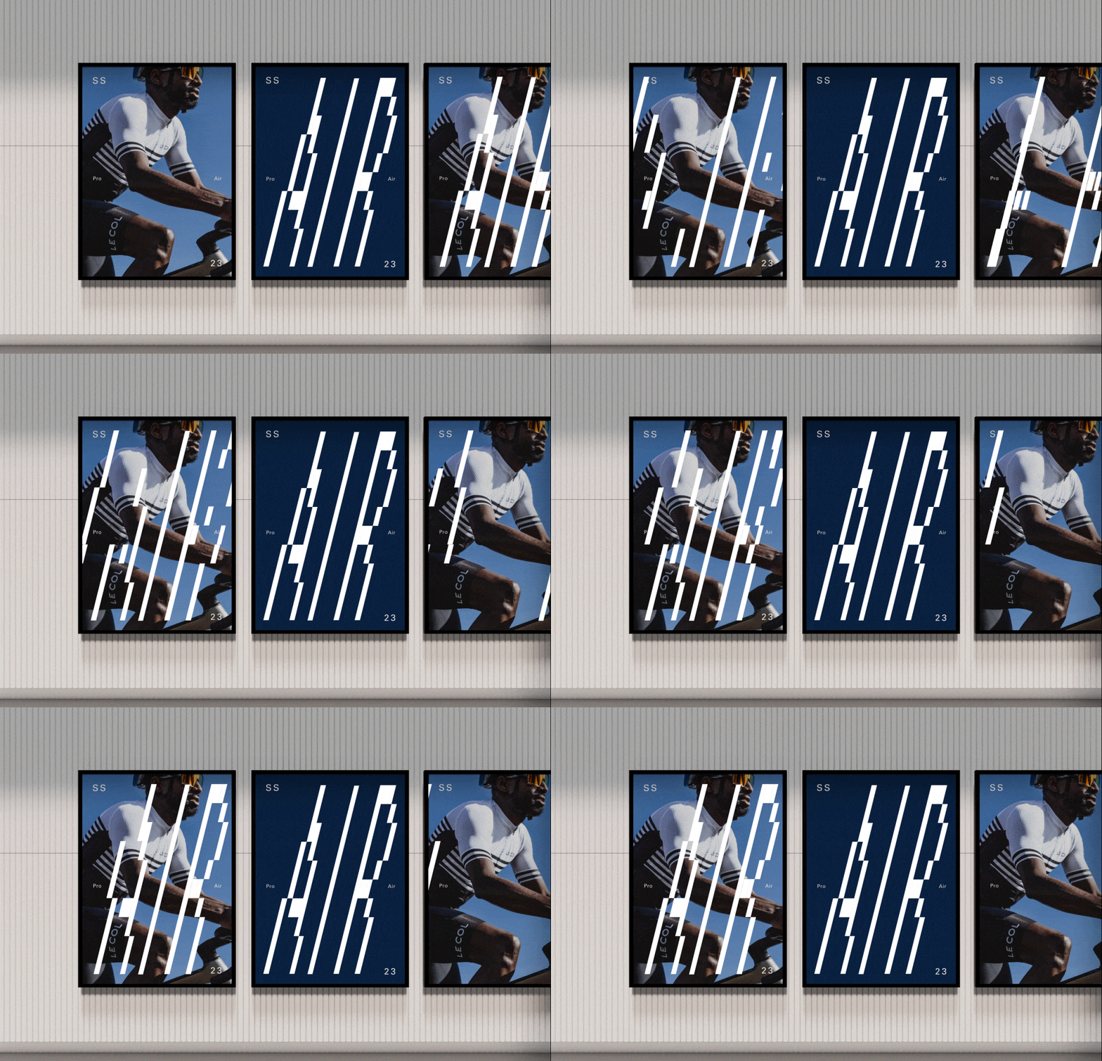
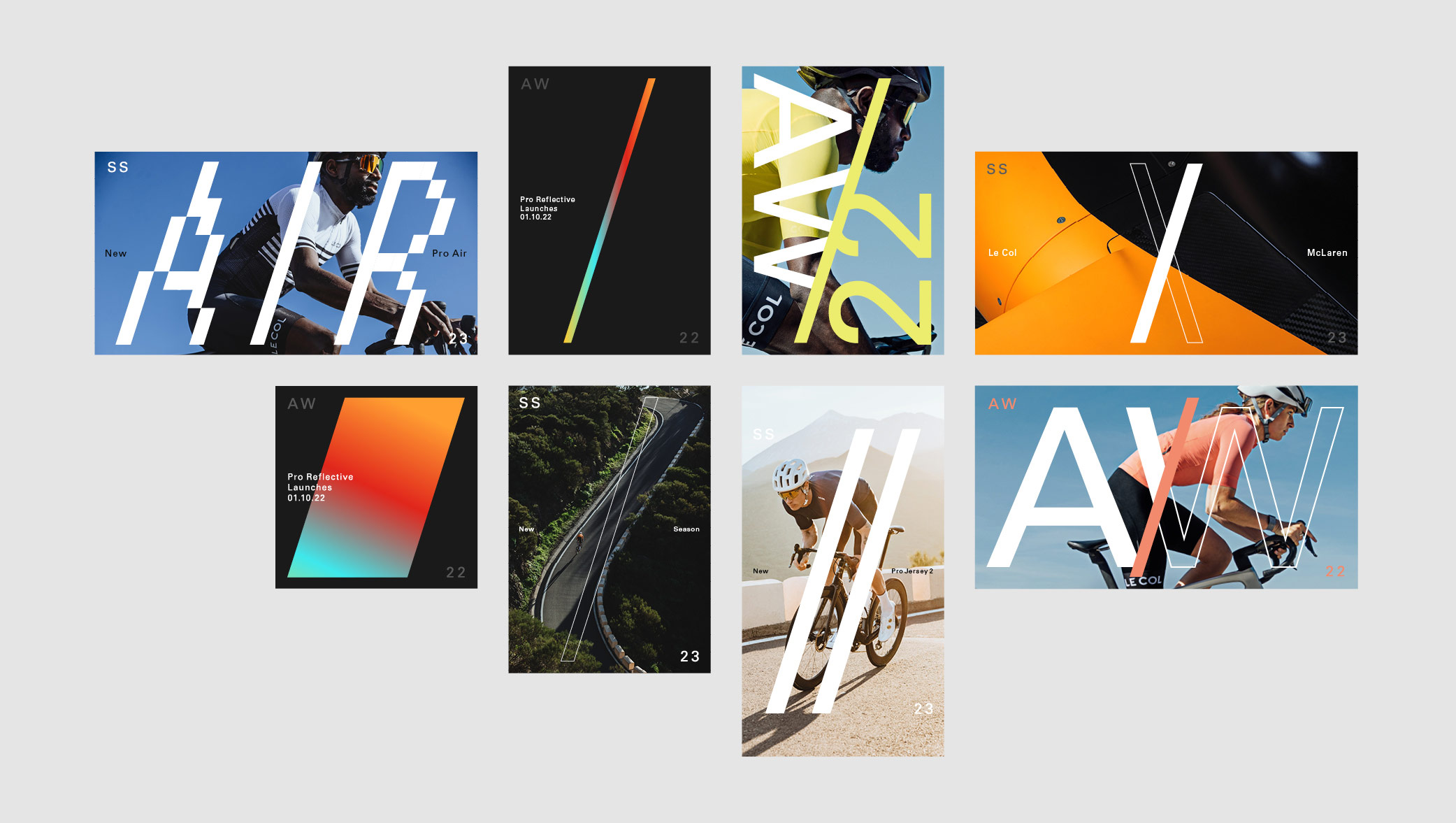
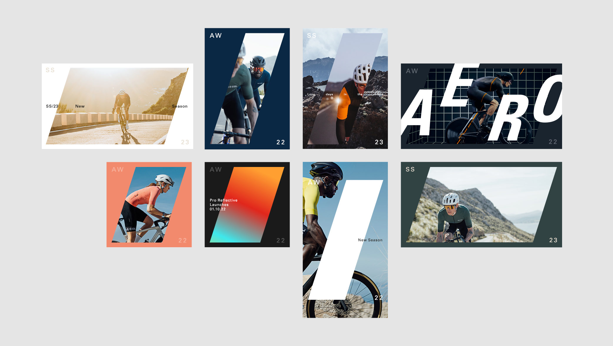
Having audited the brand development from previous seasons, we created a flexible identity system that would streamline internal resource without impacting on the quality of the output. By producing an over-arching design system, we were able to build an identity that was dynamic enough to deliver simpler, more templated, solutions when the deadlines are tight, whilst having the ability to be flexible on larger campaigns. We also delivered a large proportion of the output and art direction across all platforms.
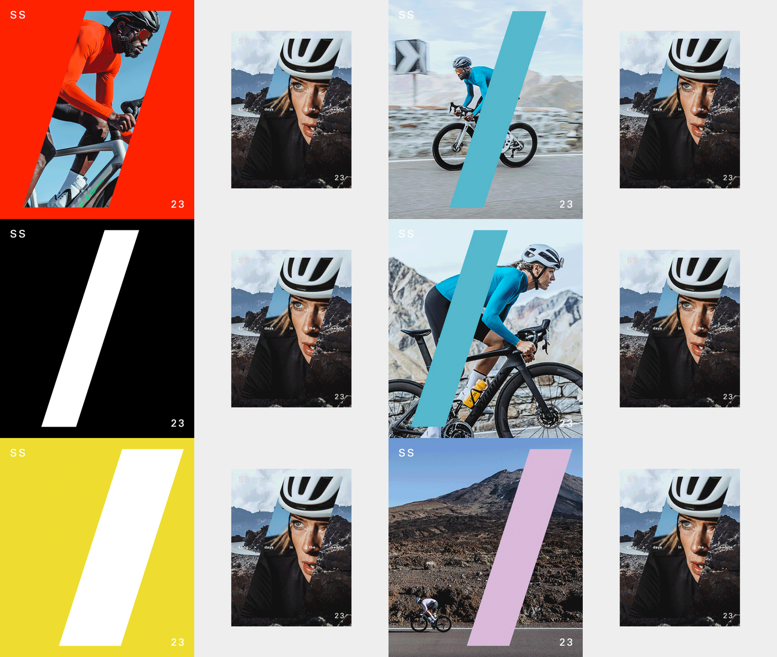
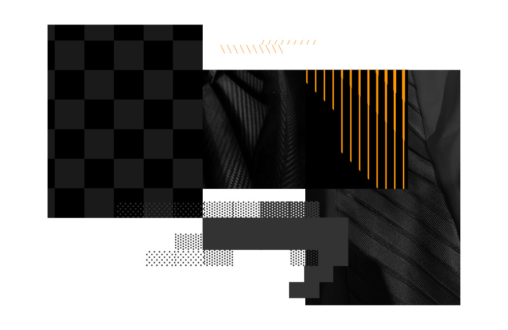
The forward slash solution and frame device allowed room for creativity, maintaining a consistent look and feel across multiple products and ranges. The key was to find a solution that enabled typography, a key brand pillar, to work effectively as well as leave room to be playful without stringent rules that would stifle exploration.
As part of the brand audit, we also gave recommendations on shoot direction and photography approaches for social media and all digital platforms. As well as creating a new set of brand guidelines across eCrm, to again, pull back valuable time that was being lost, but also to raise the bar on the quality of output. We overhauled the teams approach to studio & model photography that considers UI and UX work that is in progress.
Our unique position allows us to really understand where the internal team can make better use of resources, driving competitive edge and deliver across multiple channels effectively. A future-proofed approach that can be built on for the next season.
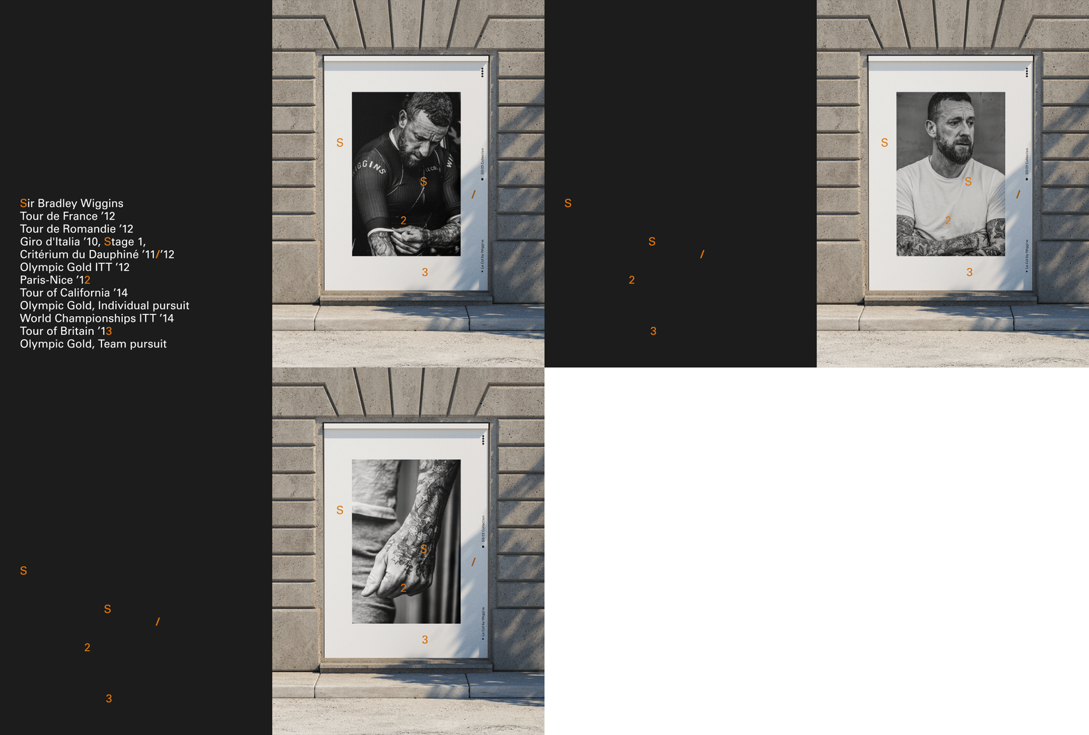
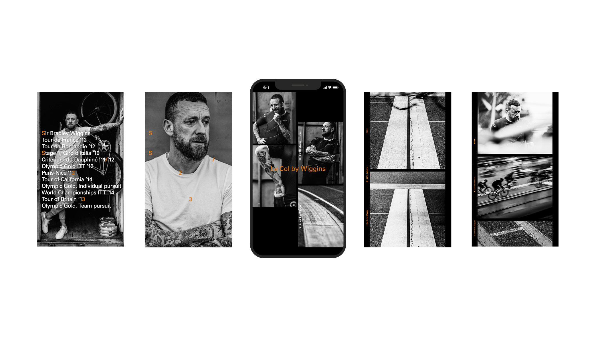
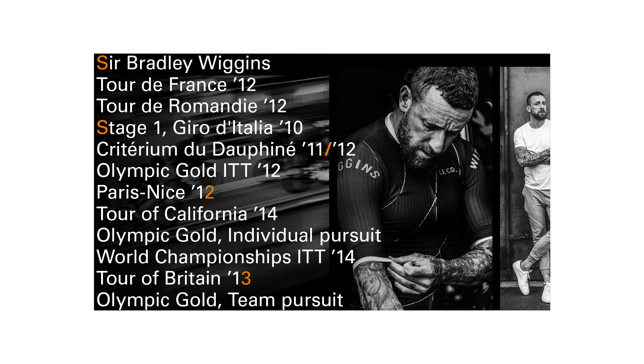
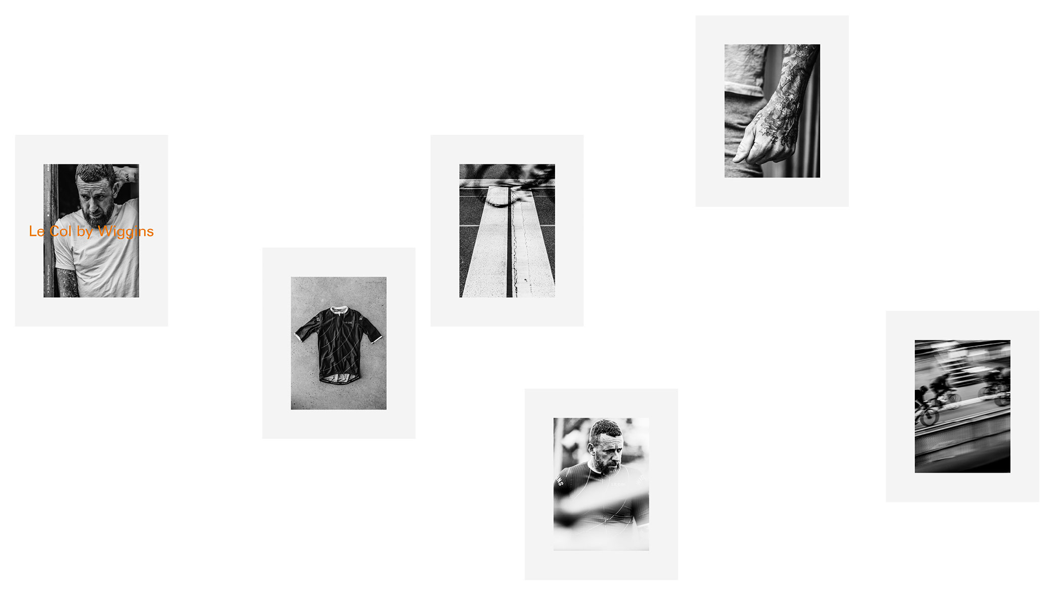
Adapted and applied to the Le Col x Wiggins launch:
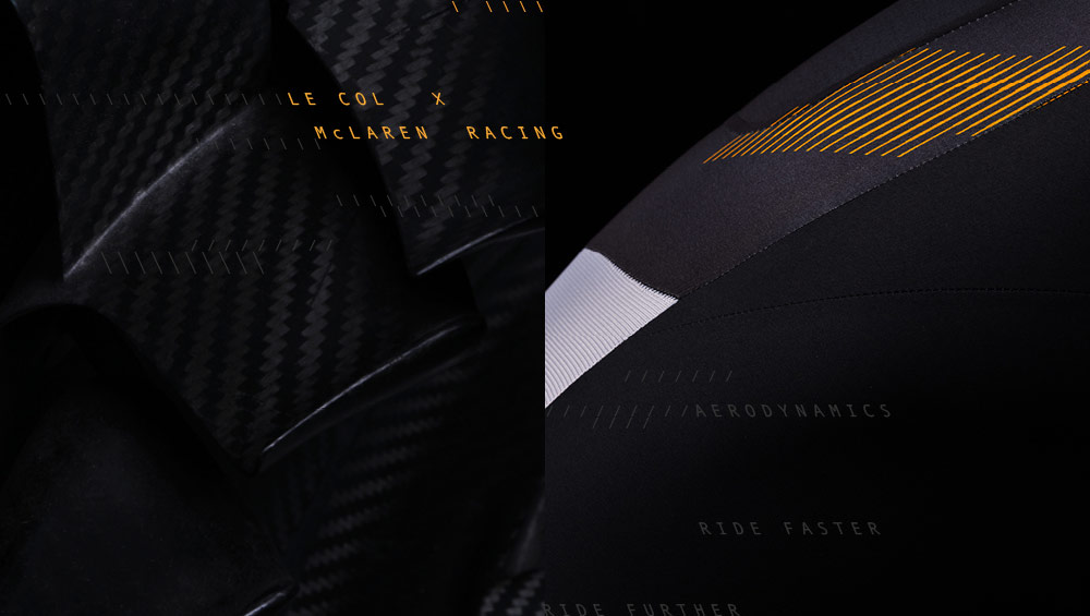
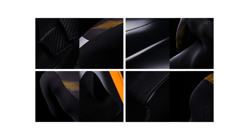
Ascii style approach for Le Col x McLaren

