Urchin Japanese is the latest culinary hotspot from the team behind Dorian, Notting Hill Fish Shop, Tuna Fight Club and debuts in their Supermarket of Dreams location in Holland Park. With an upgraded open restaurant kitchen, multi-level wood grill and rotisserie, the killer team have hit the ground running.
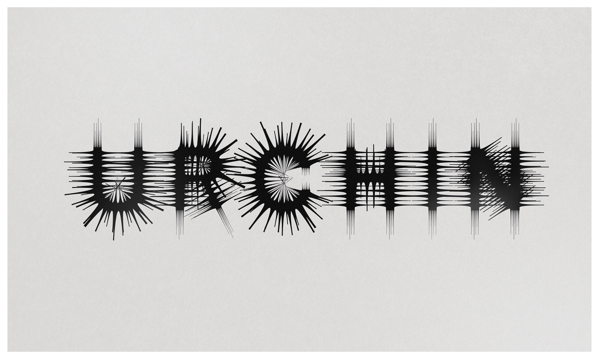
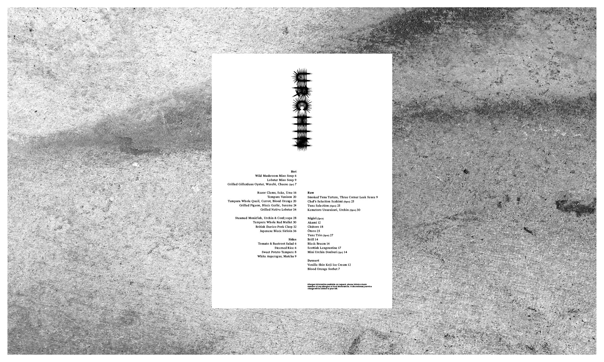
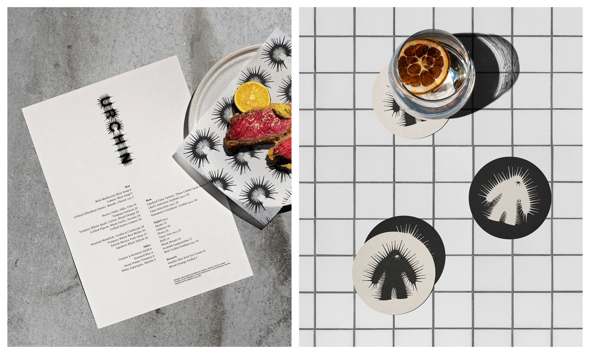
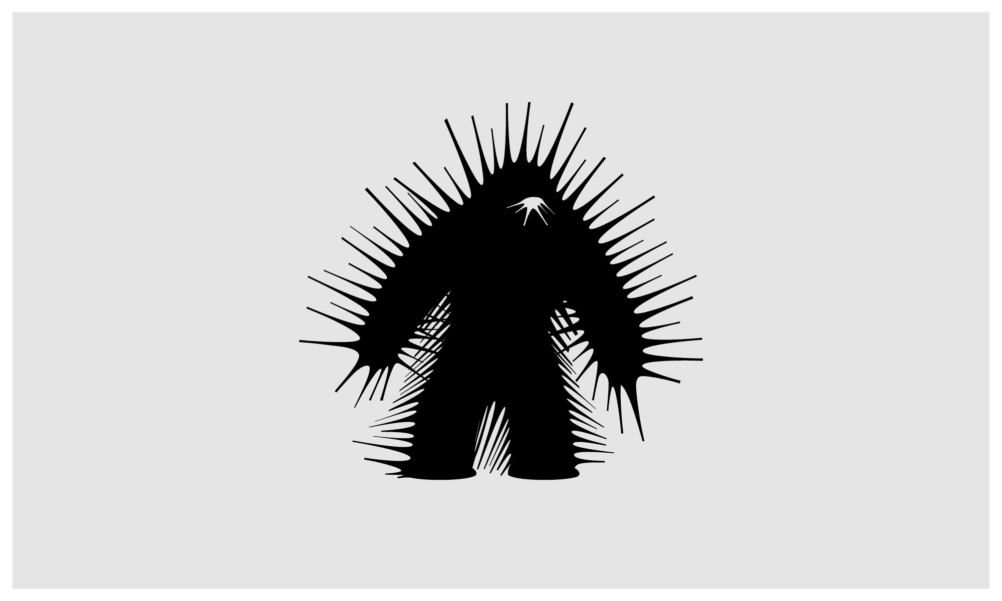
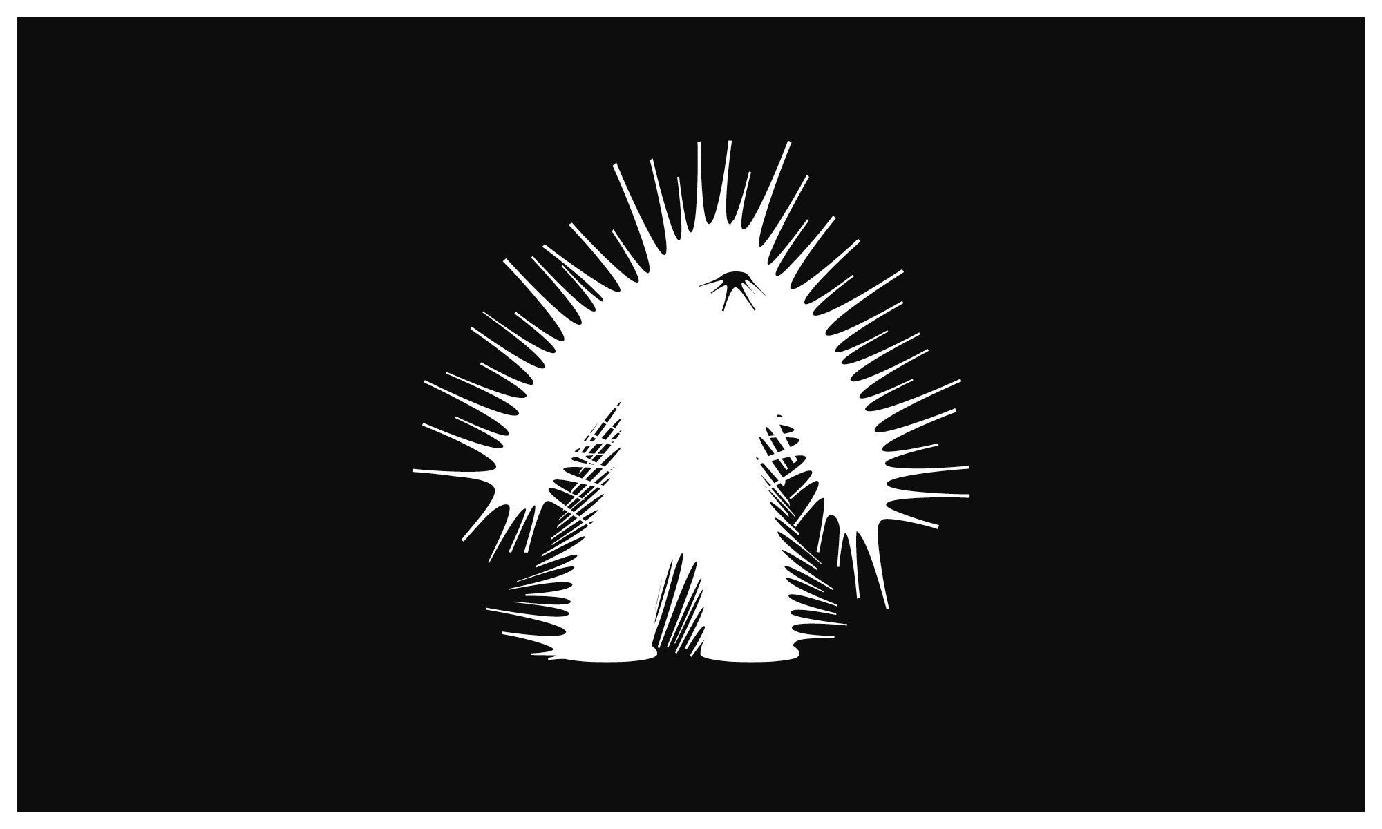
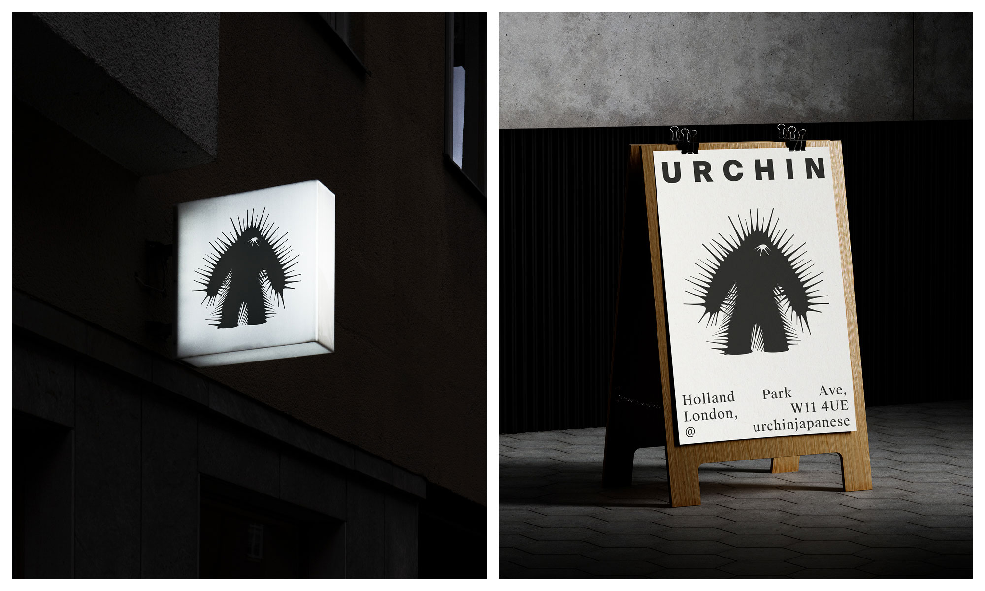
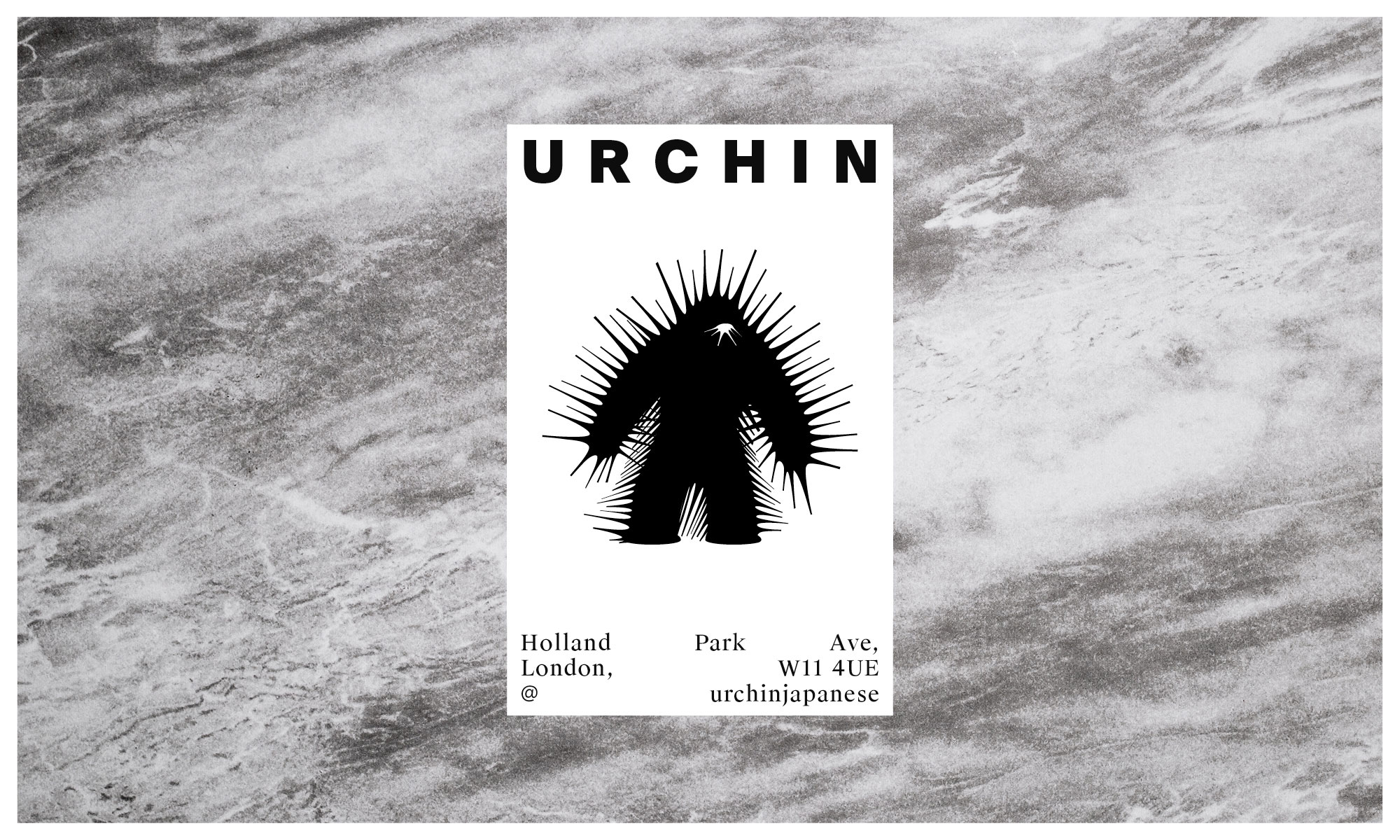
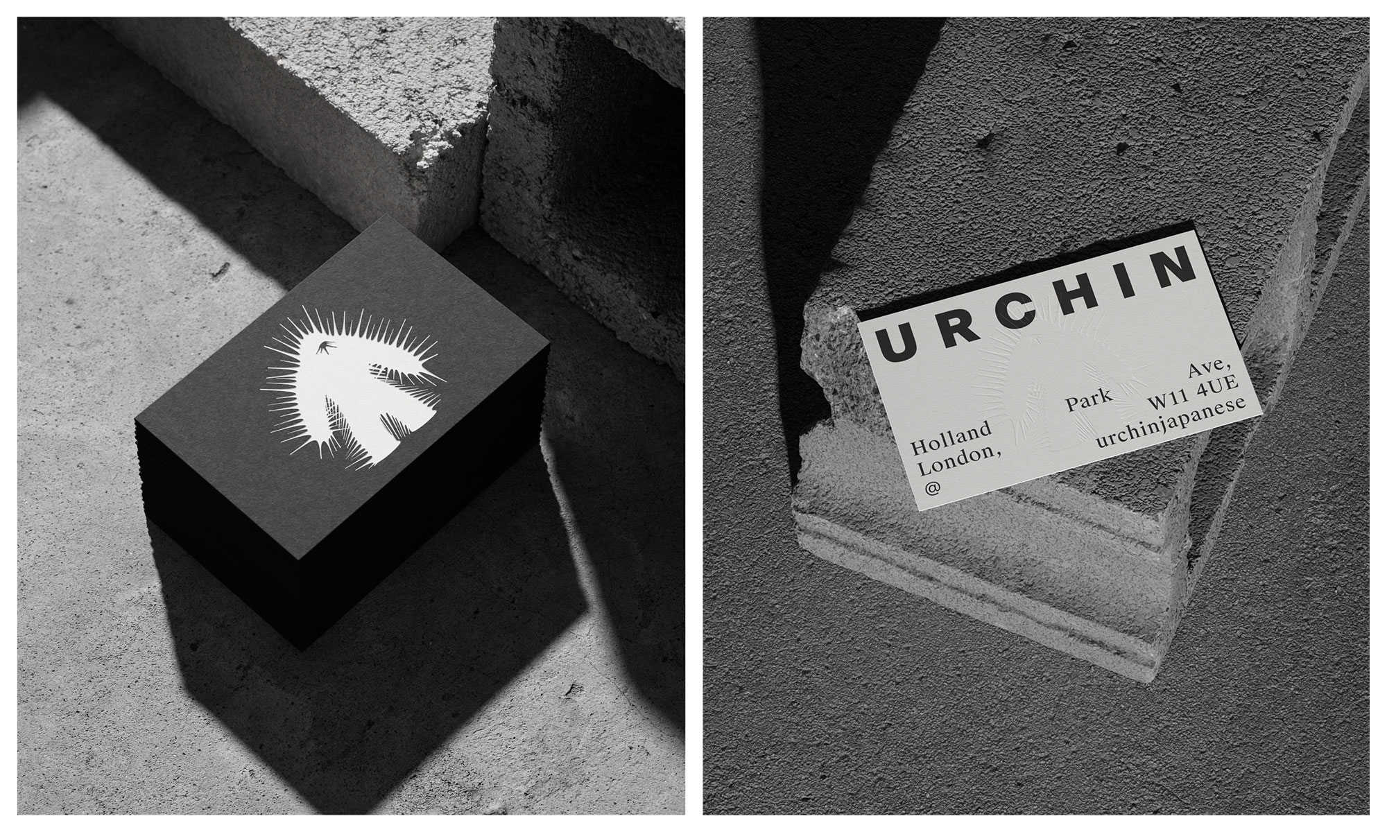
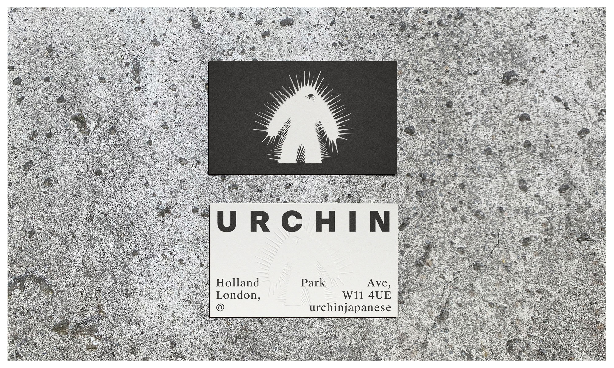
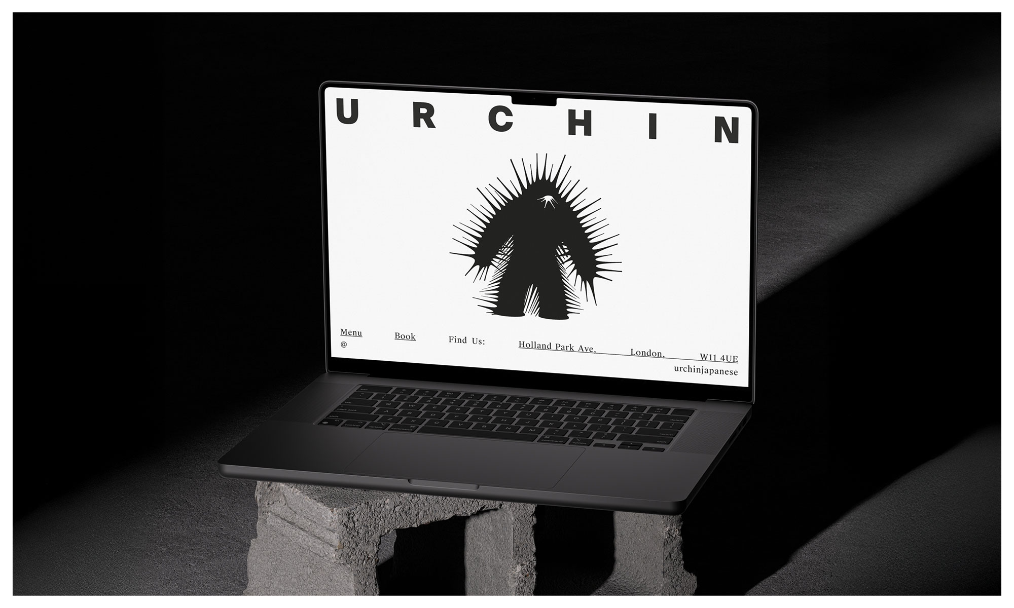
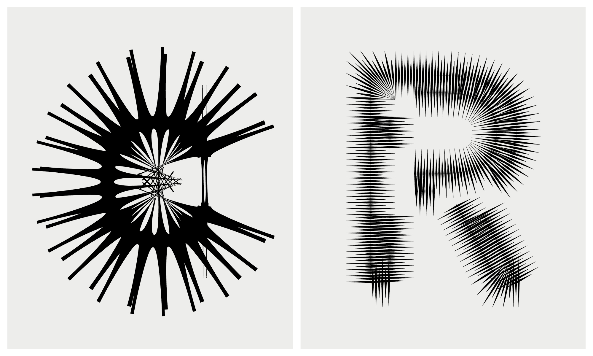
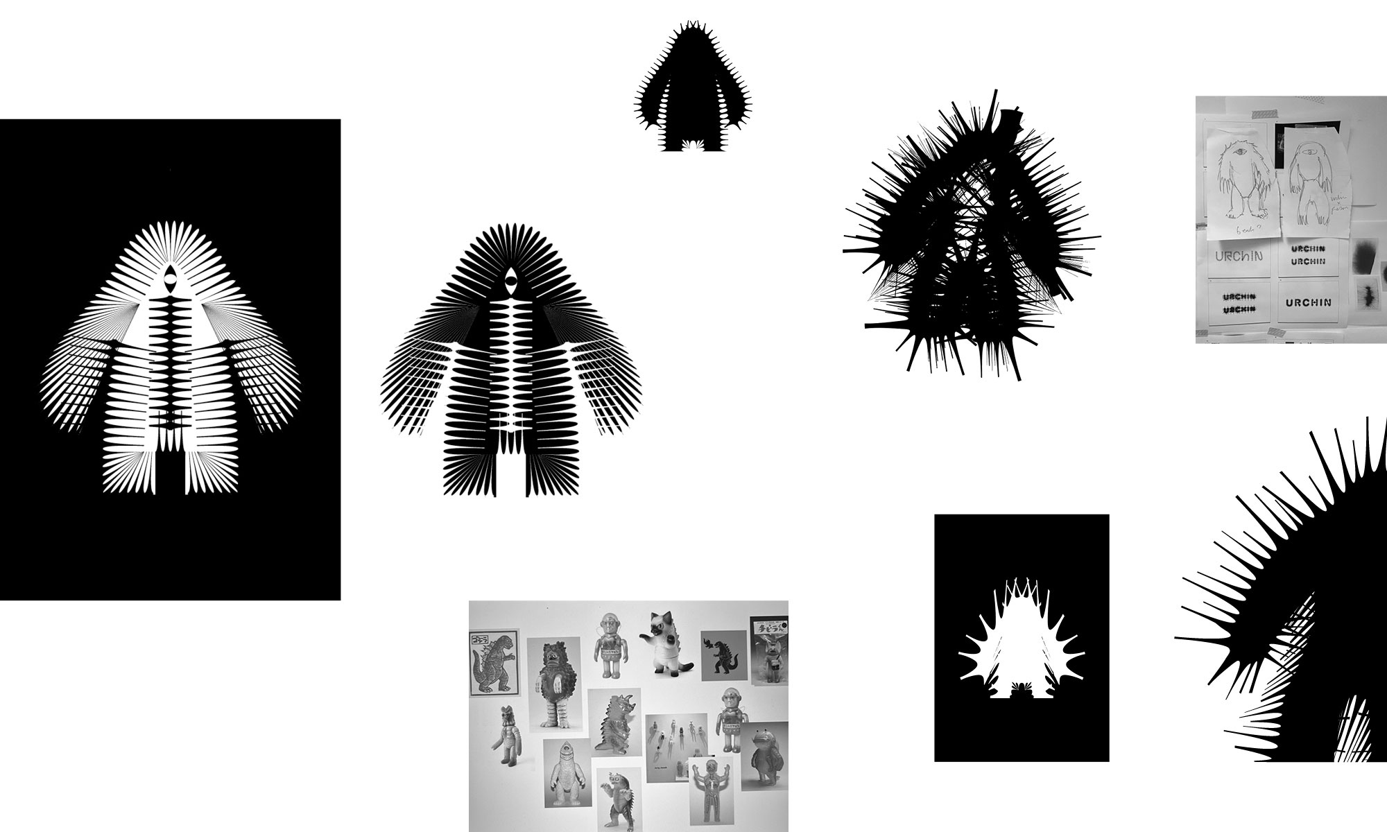
The identity pairs a unique Kaiju-inspired character with experimental typography for the wordmark that echoes the spiky nature of urchins. The monster is a quiet nod to the slang term, embracing a Mischievous and dark persona, a foreboding creature emphasised with the barbed and schizophrenic exterior.
It’s a deliberate shift from the sterile and conservative cues that underly the category. There is still a sense of elegance and sophistication, but with such a dynamic and passionate team, this was never about fitting in.
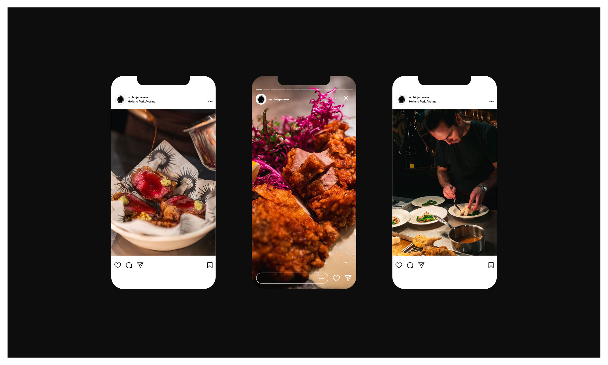
Head chef Yuji Shimokawa has quickly made this new venture a runaway hit, alongside the infamous Tuna Fight Club shenanigans. Authentic cooked Japanese produced with superior produce, meet Hot Japanese.
Expect classic dishes alongside the likes of; Orkney Scallop tempura layered with black truffle dusted with maituke powder garnished with tempura flakes, shaved ceps, ginger sauce and house Dirty Tendashi. Fresh Sea Urchin Donburi with fresh wasabi and Minina leaf.
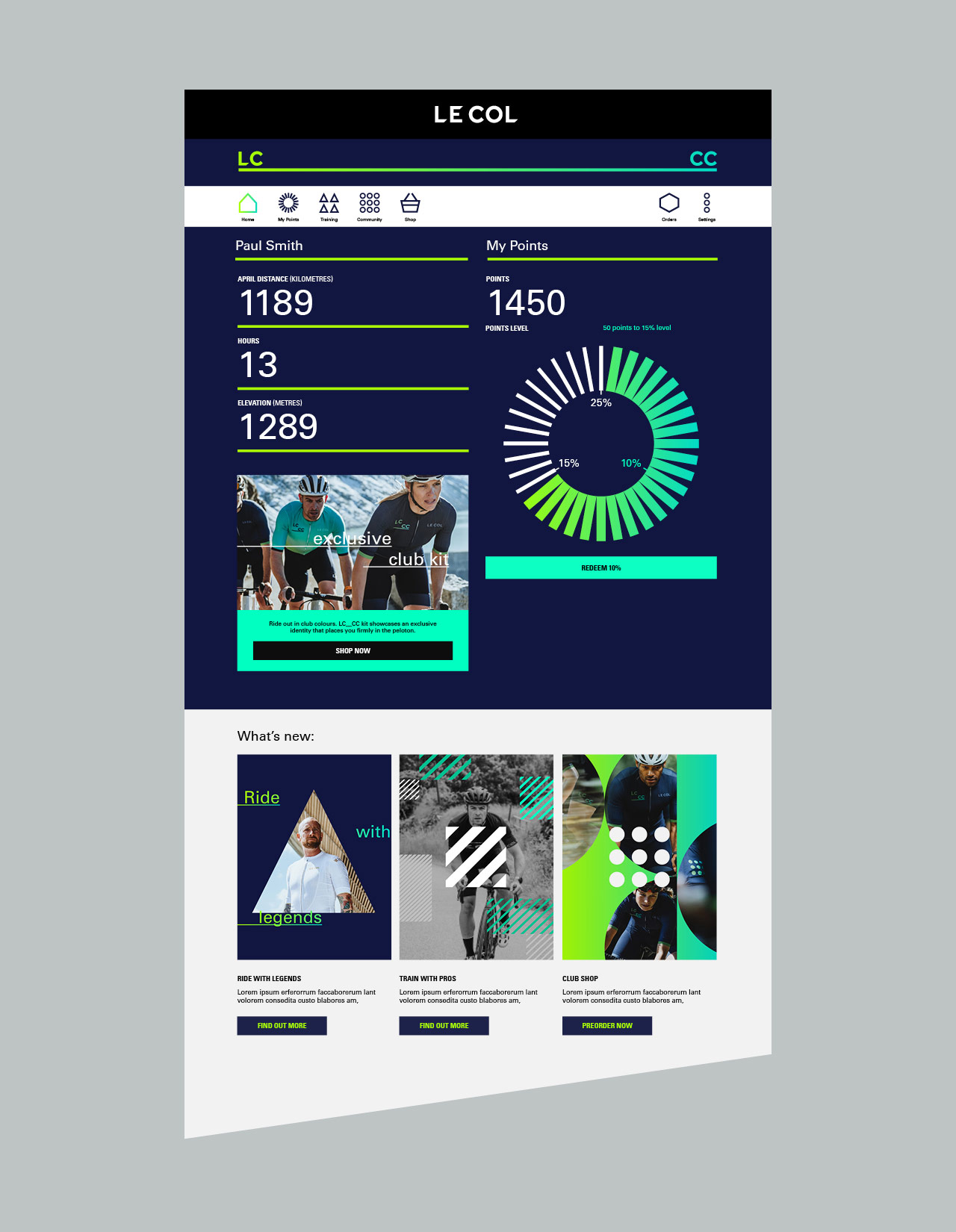
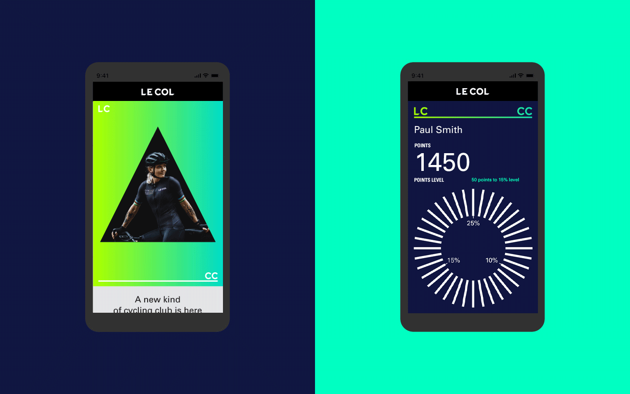
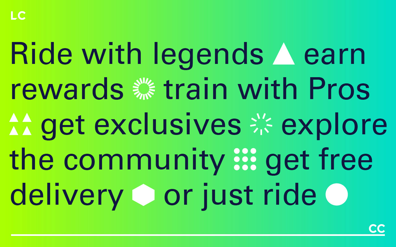
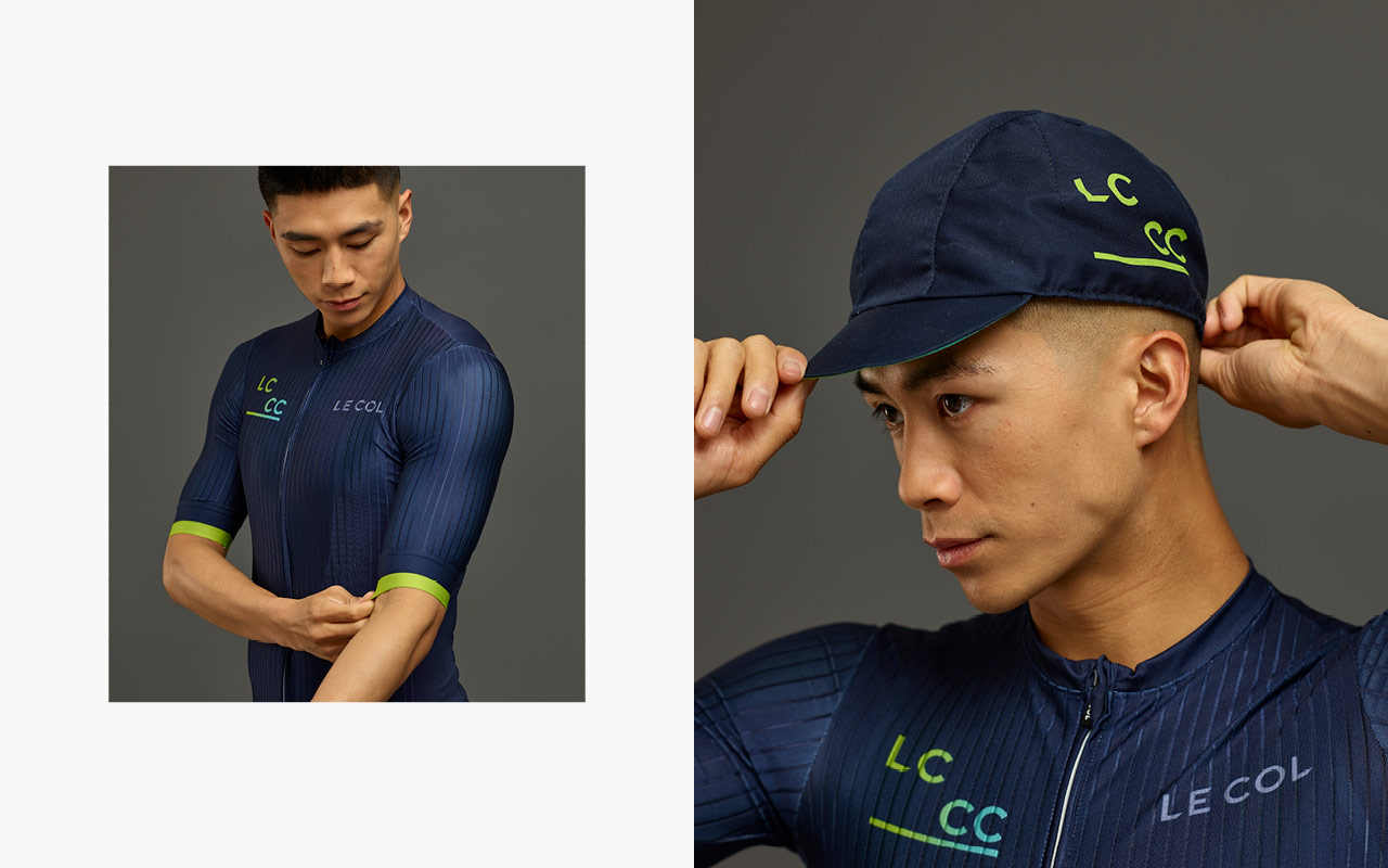
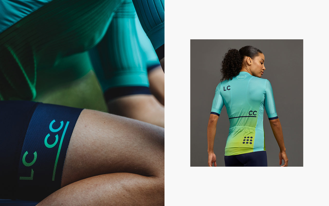
Welcome to LC___CC – Le Col Cycling Club. Ride with legends, train with Pros and turn your effort into rewards. A community united by stories, shared goals and hard-and-fast ambition. The most rewarding club in cycling.
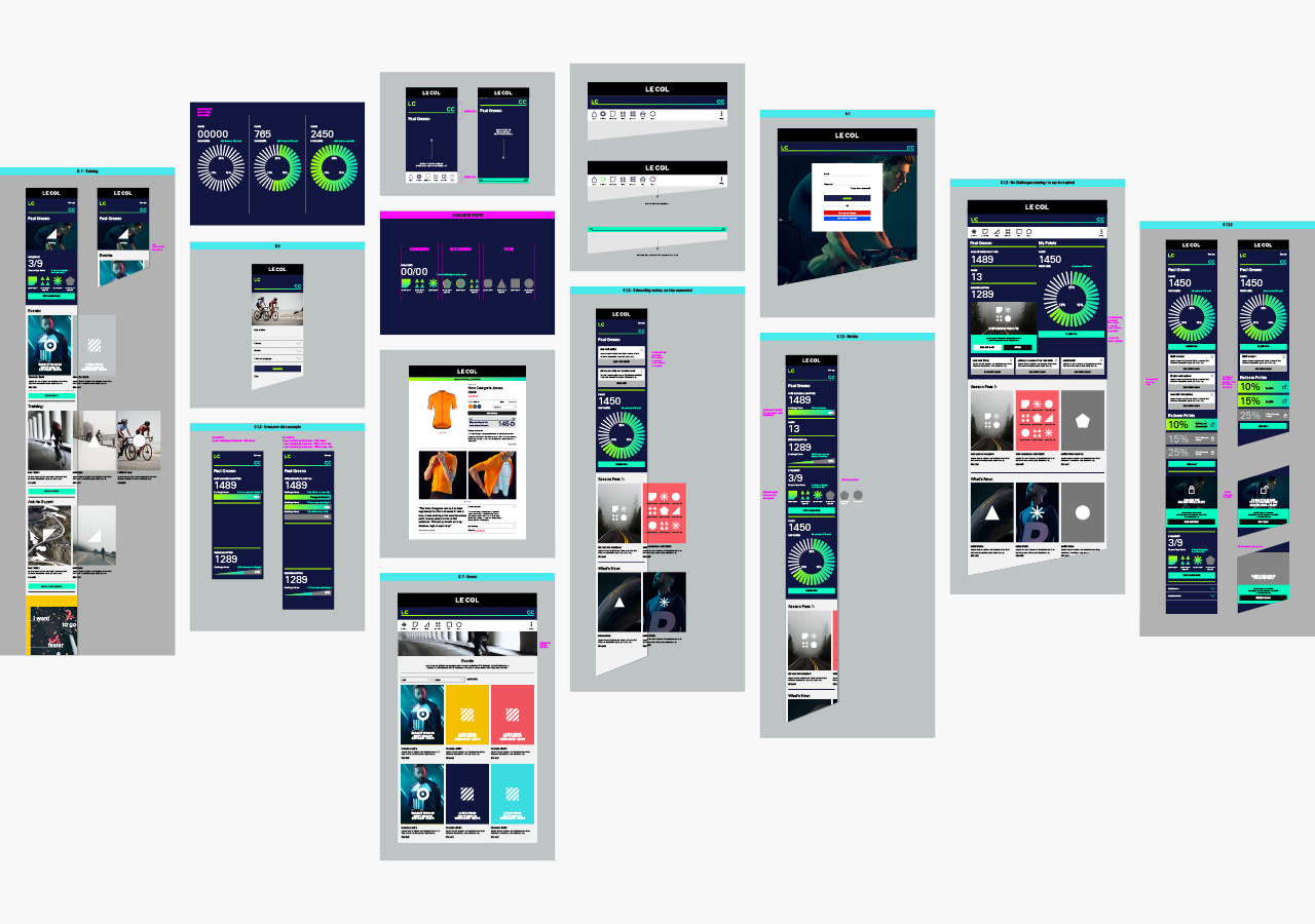
Limited Edition Design worked with the senior Le Col team, to develop a branding strategy, messaging and a dynamic new visual and verbal identity — including user interface and experience design across hundreds of items and details to enable development agency Savvy, and the internal team of developers, to bring the complex platform build to life. From the outset, the concept was a digital first approach, so the visual identity had to be flexible enough to work across multiple strands, whilst ensuring a sense of community and warmth.
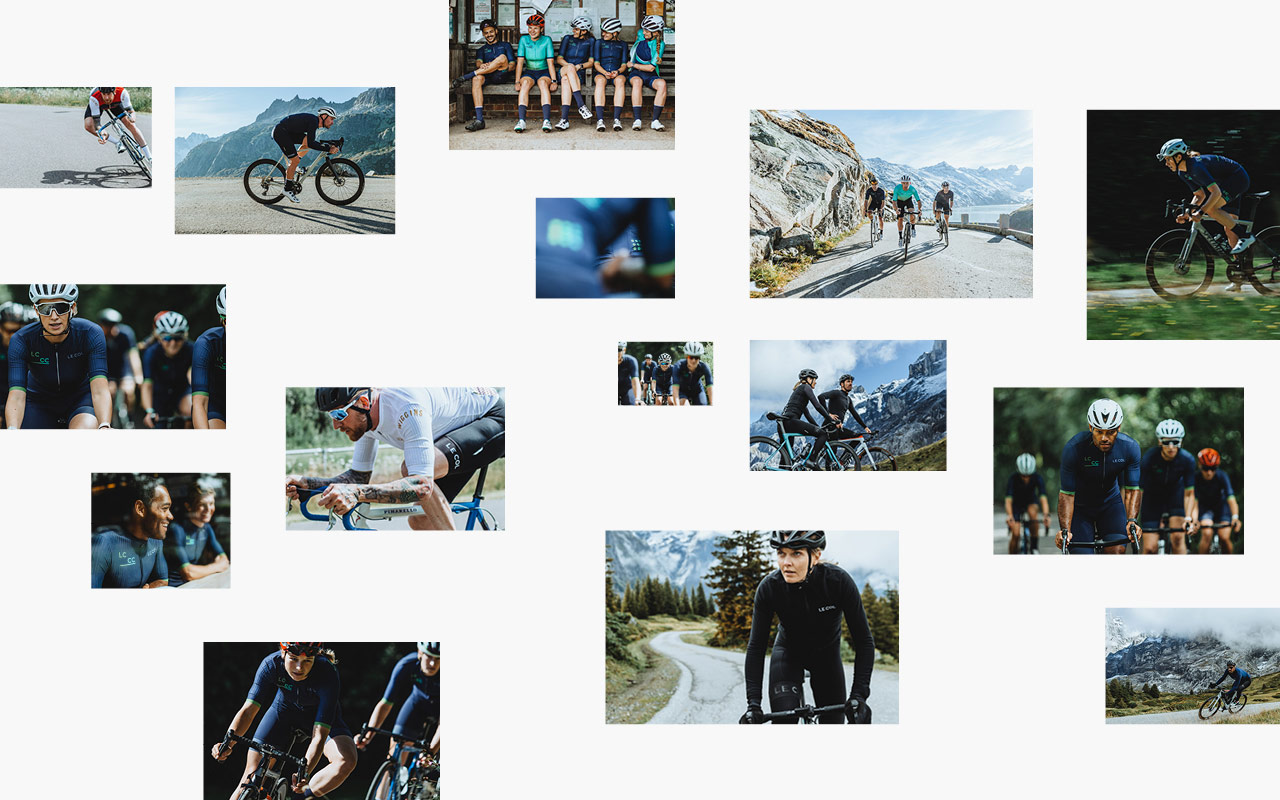
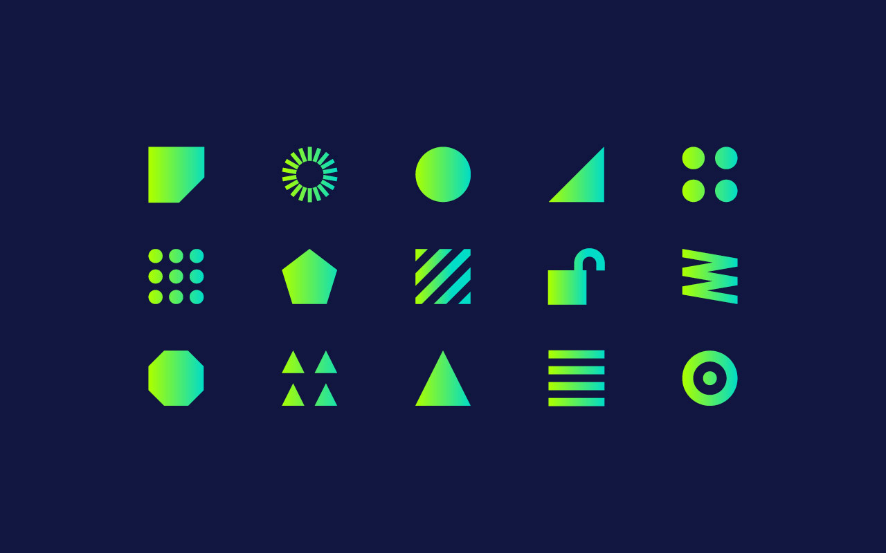
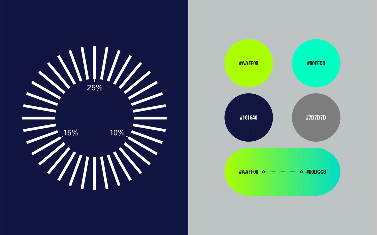
The visual design approach comprises of entirely new colour systems, photography, typography, iconography and signature graphic assets in both static and animated forms. The iconography plays a key role in creating a visual language and design system for the content, whilst typography plays to a fluid, more conversational tone to maintain that warmth.
A small selection of our work below, with an update to follow soon.
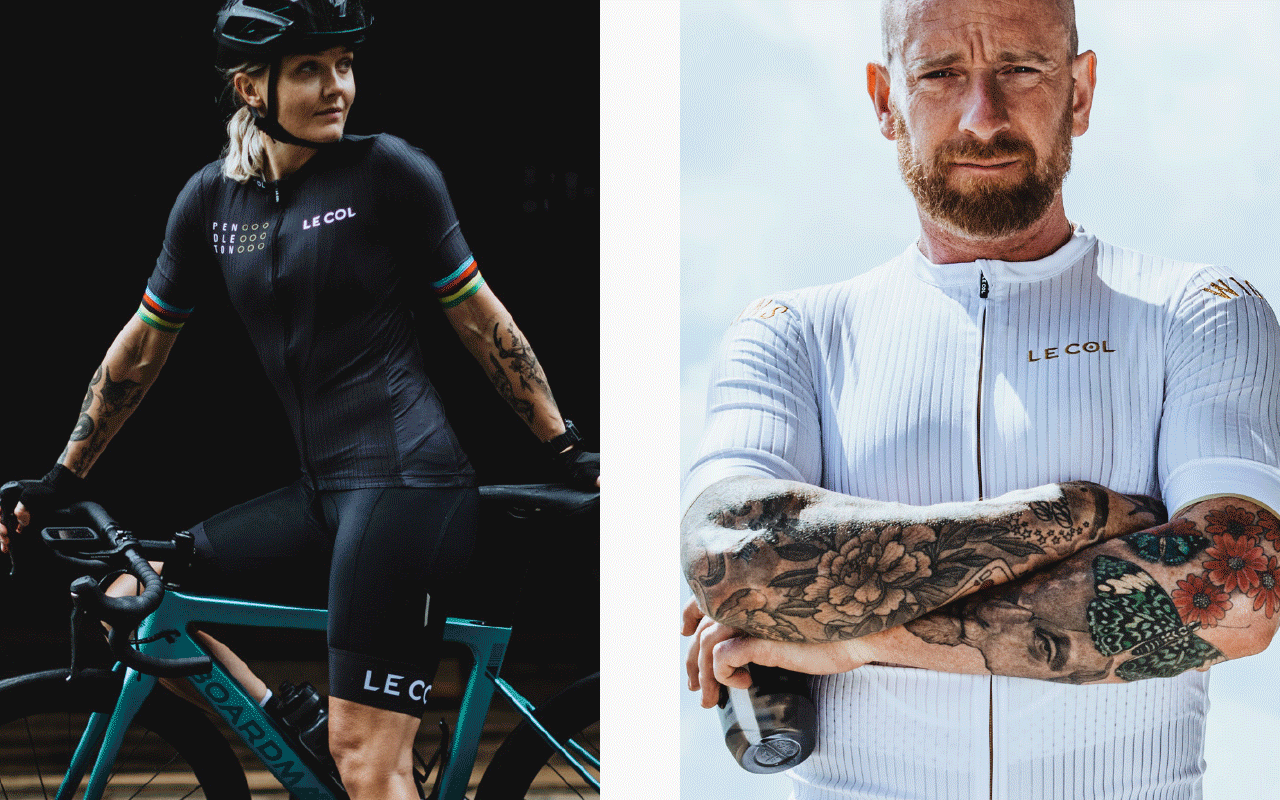
The identity also runs across mens and womens Kit design that is only available to members:
Wireframing and interaction design to integrate Club into the overall eCommerce design we’ve developed for the master brand. Maintaining enough of a unique feel that it can standout and be signposted as part of the customers user journey.