Urchin Japanese
Urchin Japanese is the latest culinary hotspot from the team behind Dorian, Notting Hill Fish Shop, Tuna Fight Club and debuts in their Supermarket of Dreams location in Holland Park. With an upgraded open restaurant kitchen, multi-level wood grill and rotisserie, the killer team have hit the ground running.
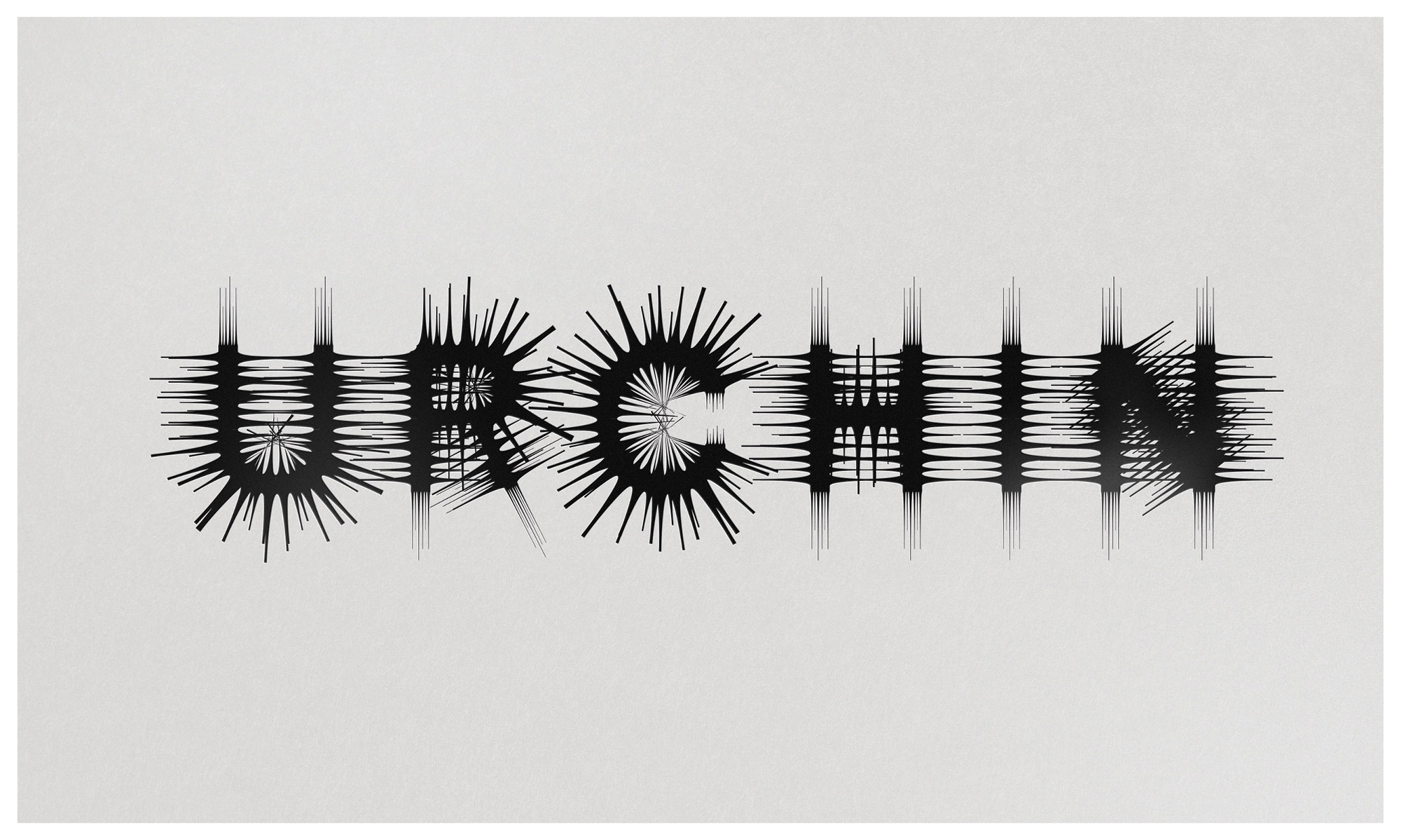
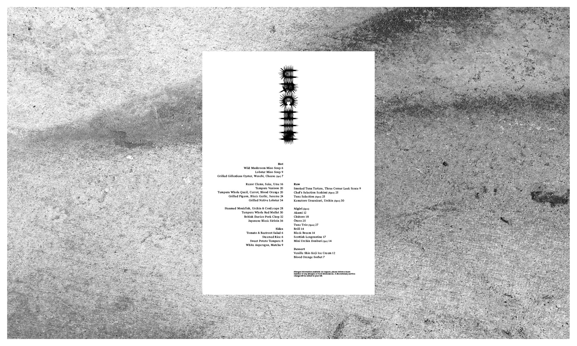
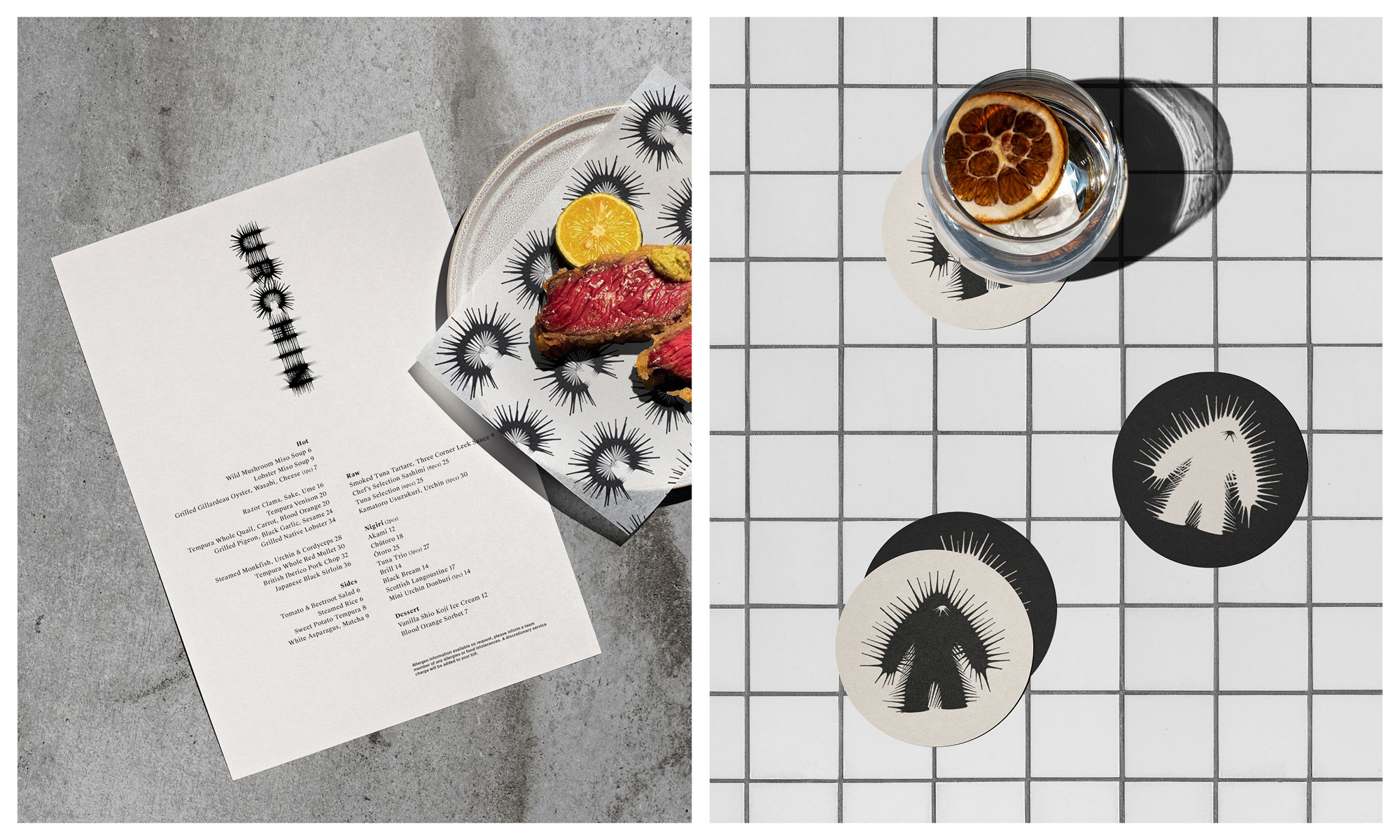
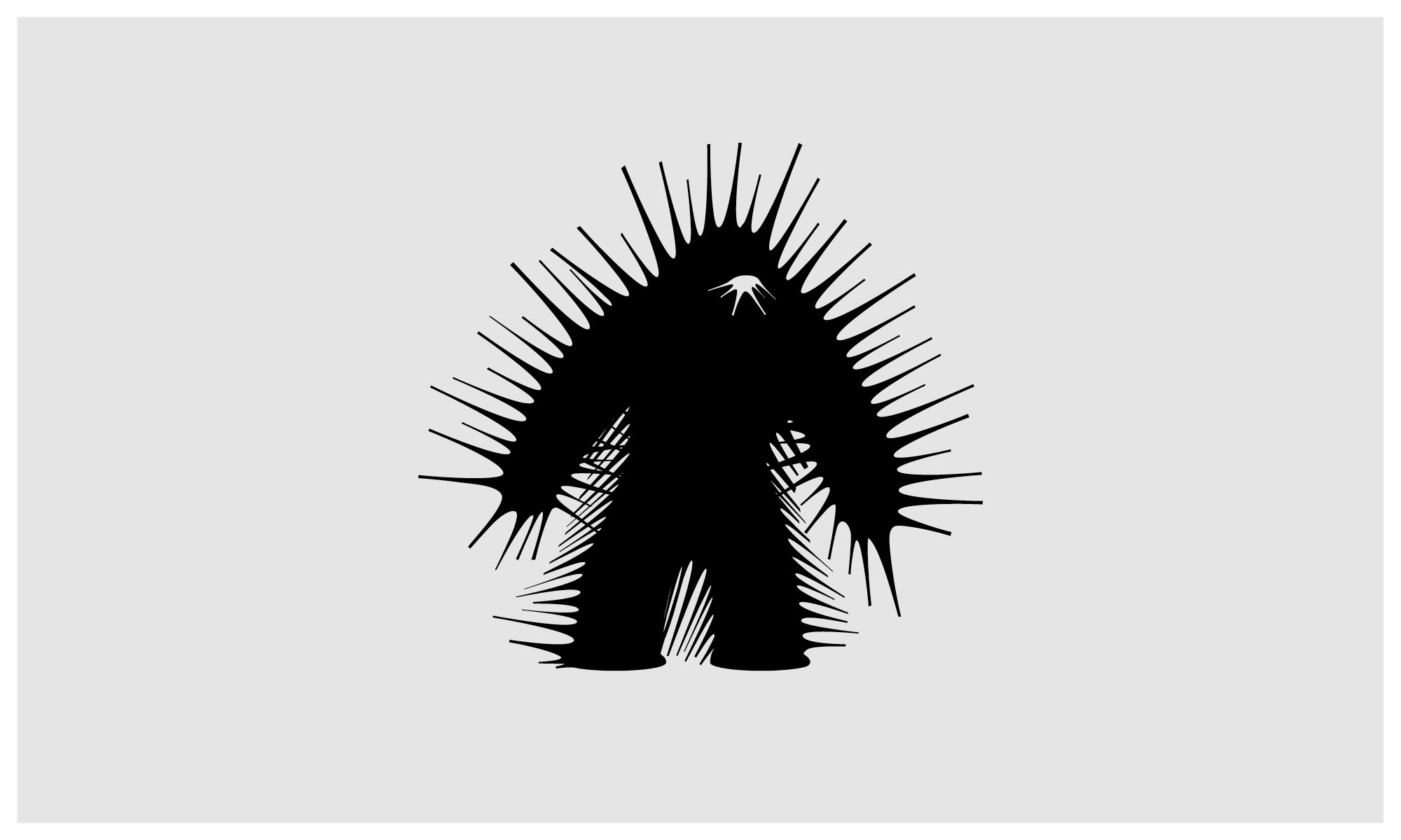
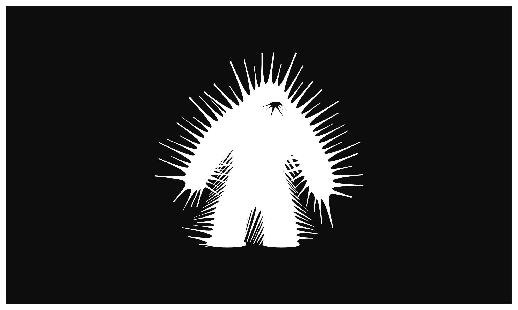
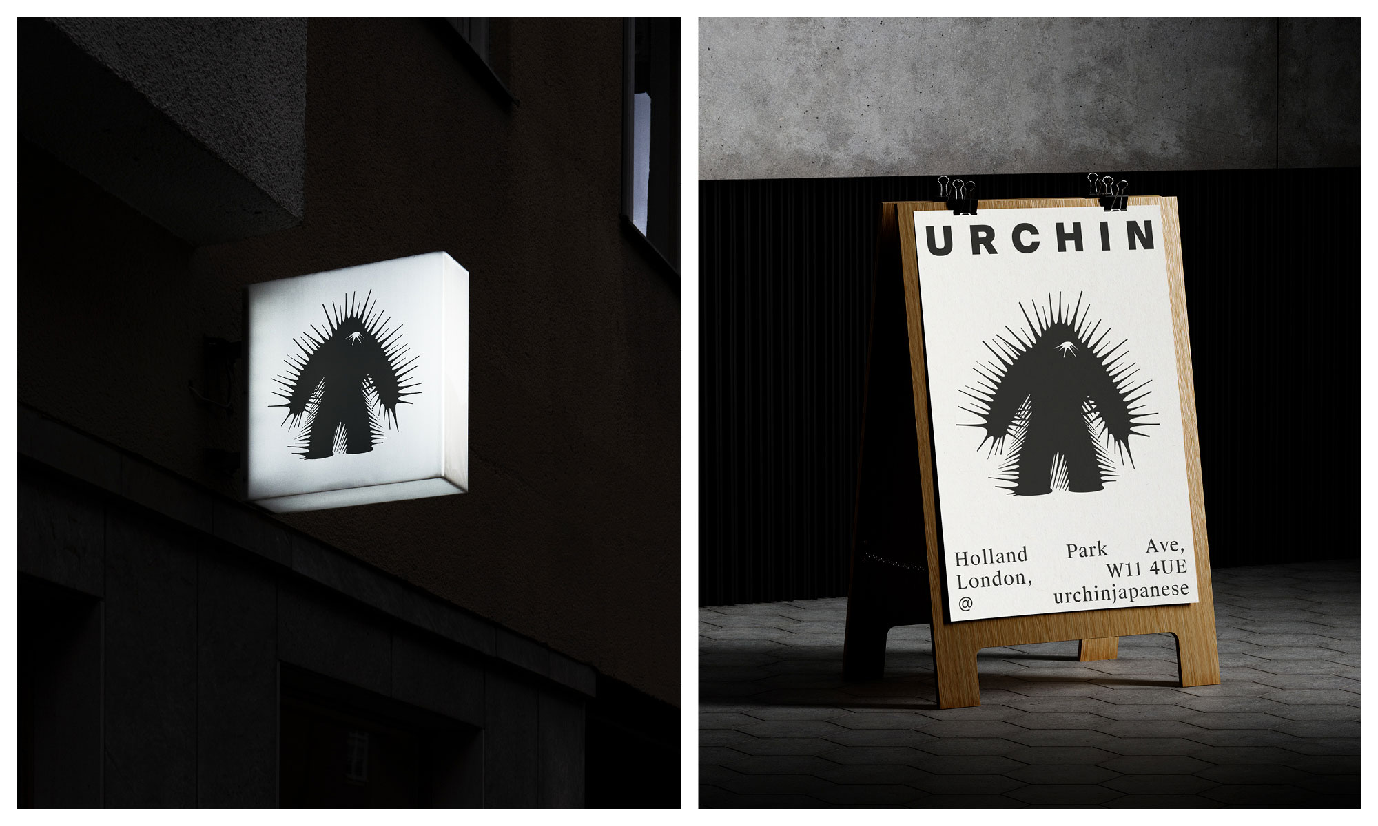
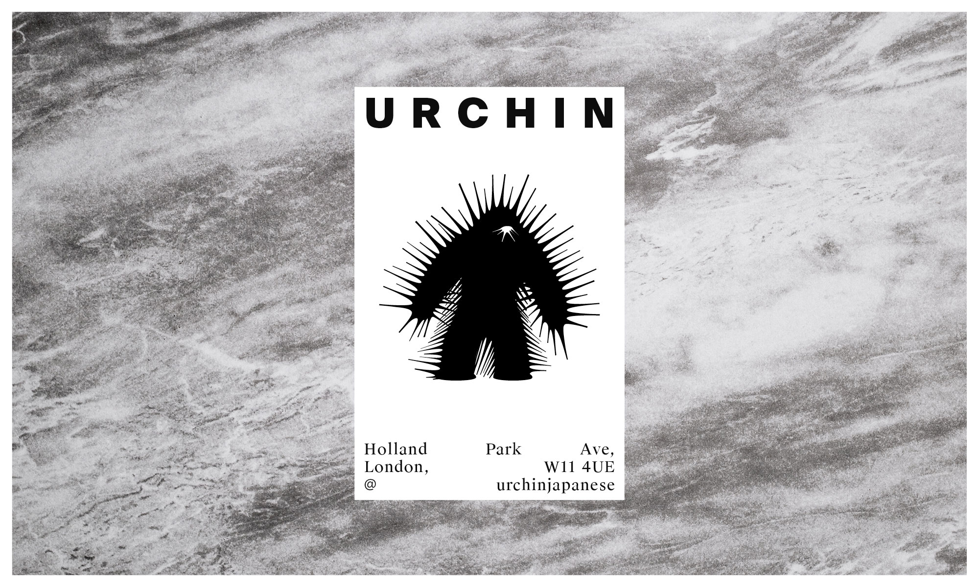
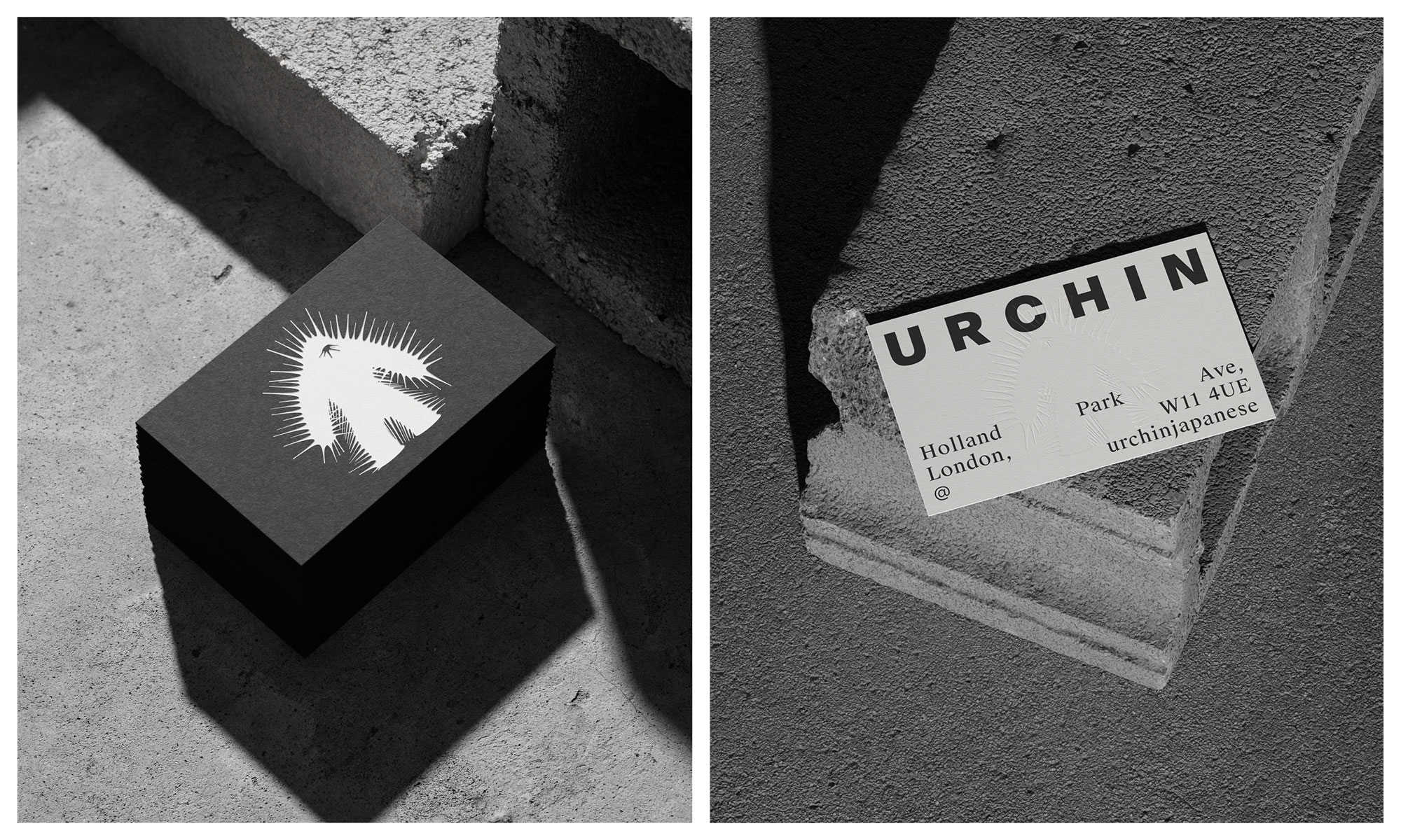
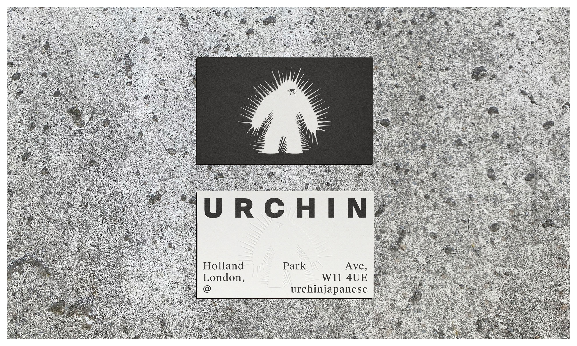
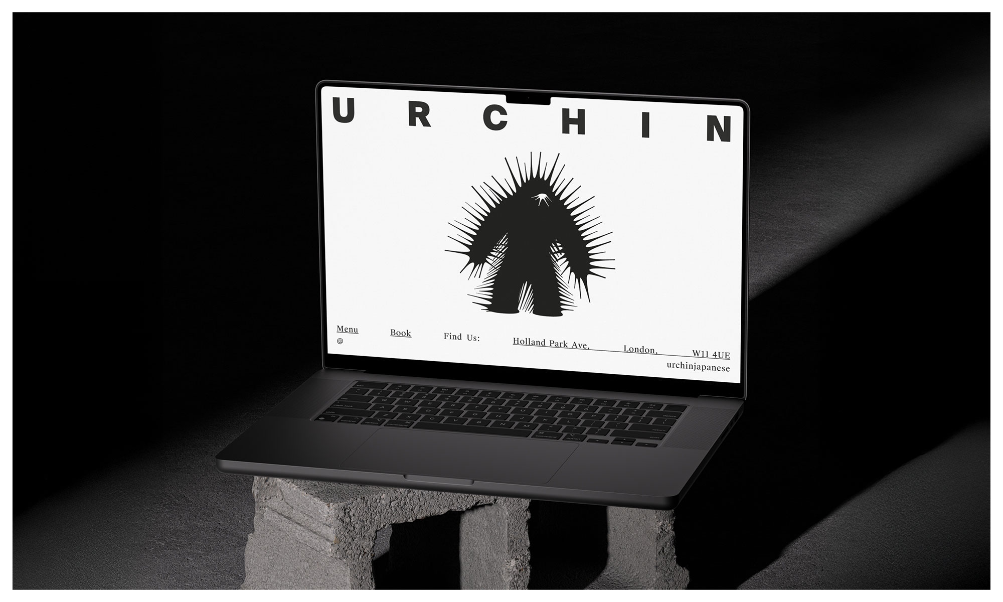
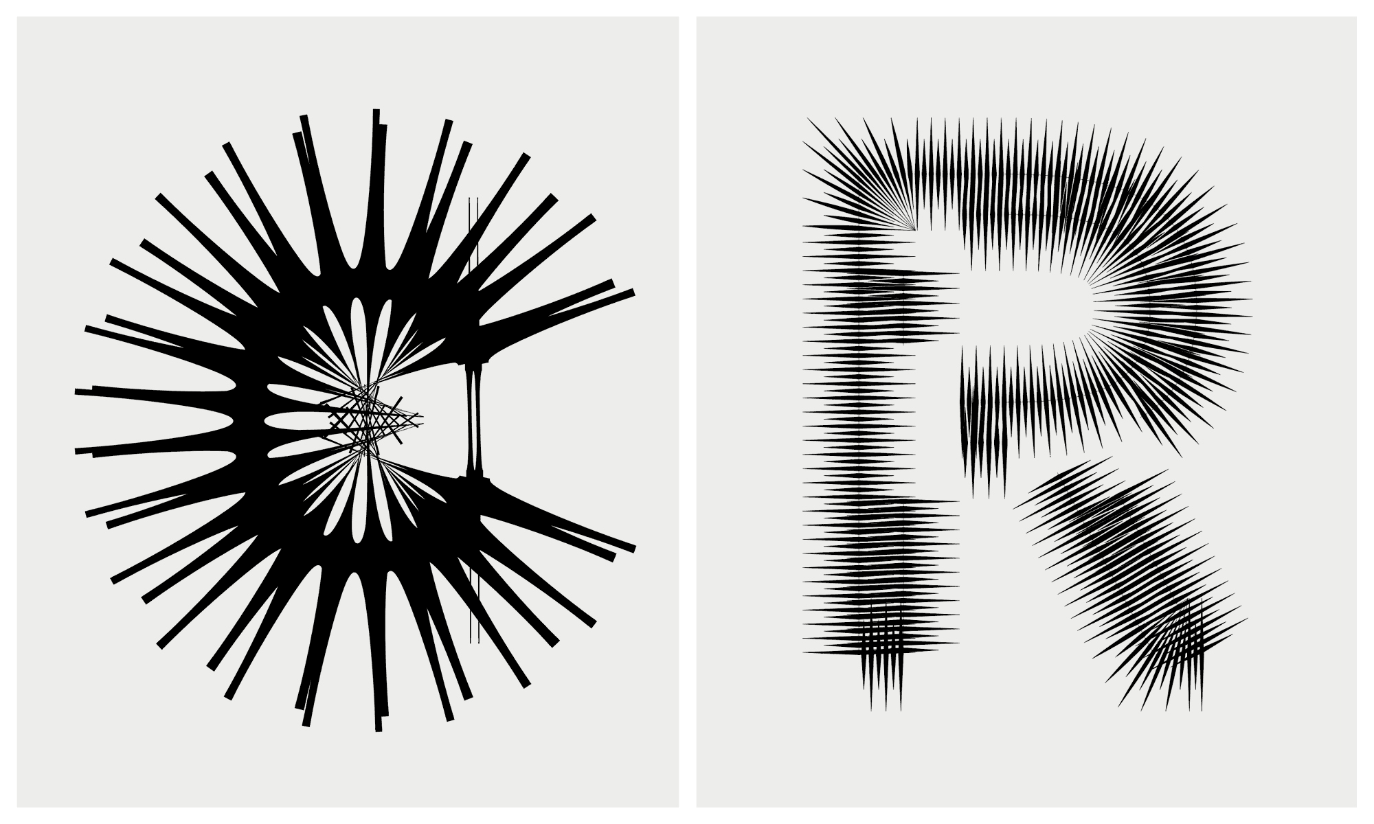
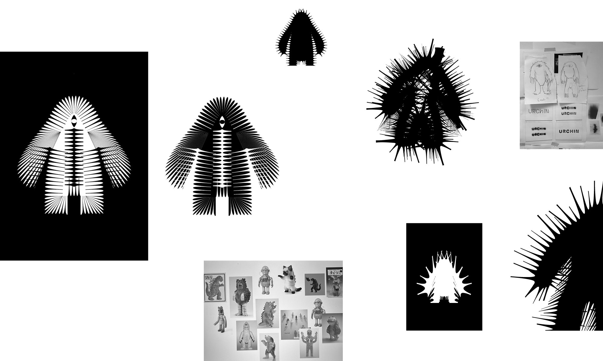
The identity pairs a unique Kaiju-inspired character with experimental typography for the wordmark that echoes the spiky nature of urchins. The monster is a quiet nod to the slang term, embracing a Mischievous and dark persona, a foreboding creature emphasised with the barbed and schizophrenic exterior.
It’s a deliberate shift from the sterile and conservative cues that underly the category. There is still a sense of elegance and sophistication, but with such a dynamic and passionate team, this was never about fitting in.
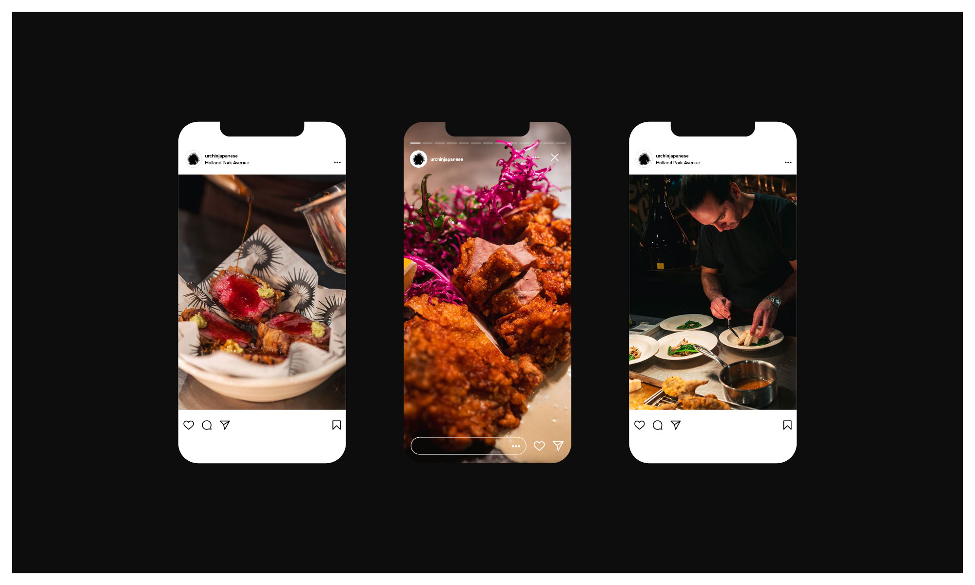
Head chef Yuji Shimokawa has quickly made this new venture a runaway hit, alongside the infamous Tuna Fight Club shenanigans. Authentic cooked Japanese produced with superior produce, meet Hot Japanese.
Expect classic dishes alongside the likes of; Orkney Scallop tempura layered with black truffle dusted with maituke powder garnished with tempura flakes, shaved ceps, ginger sauce and house Dirty Tendashi. Fresh Sea Urchin Donburi with fresh wasabi and Minina leaf.
Typography and illustration experiments:
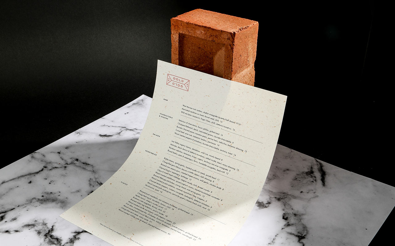
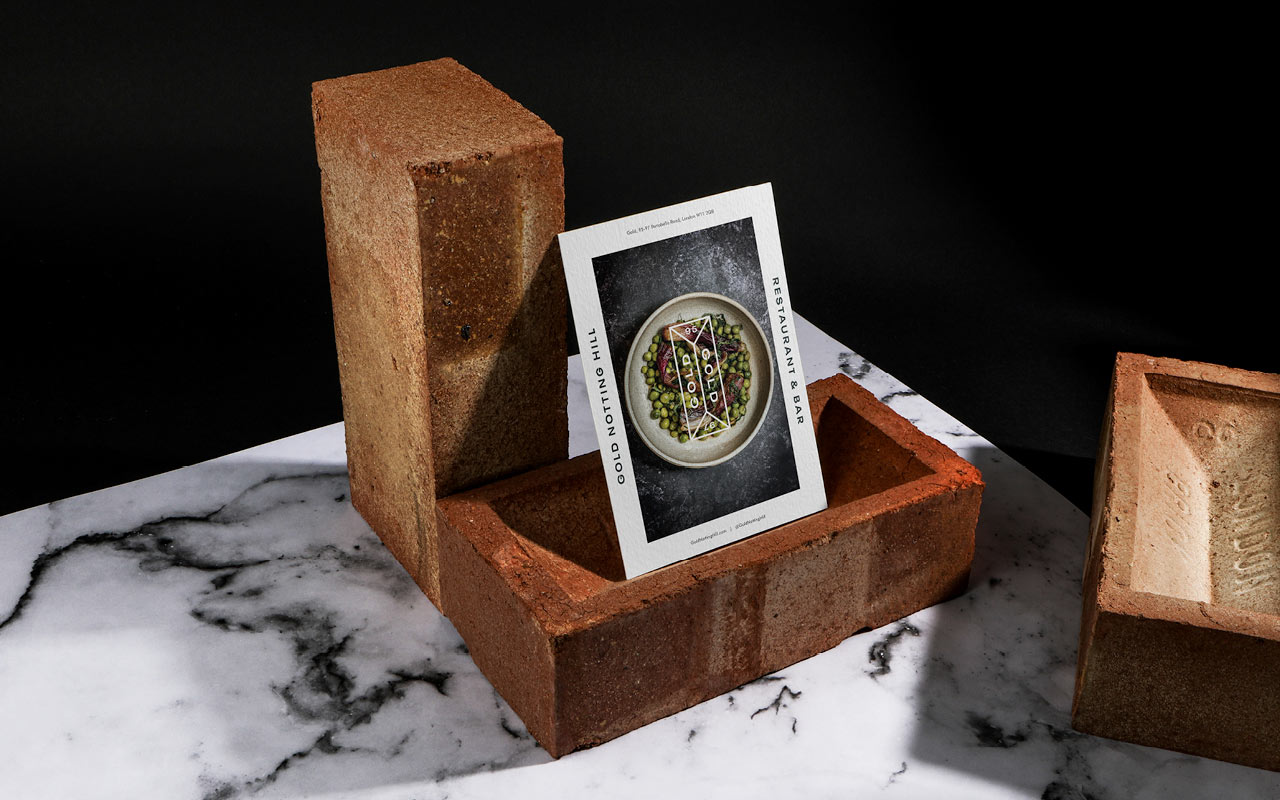
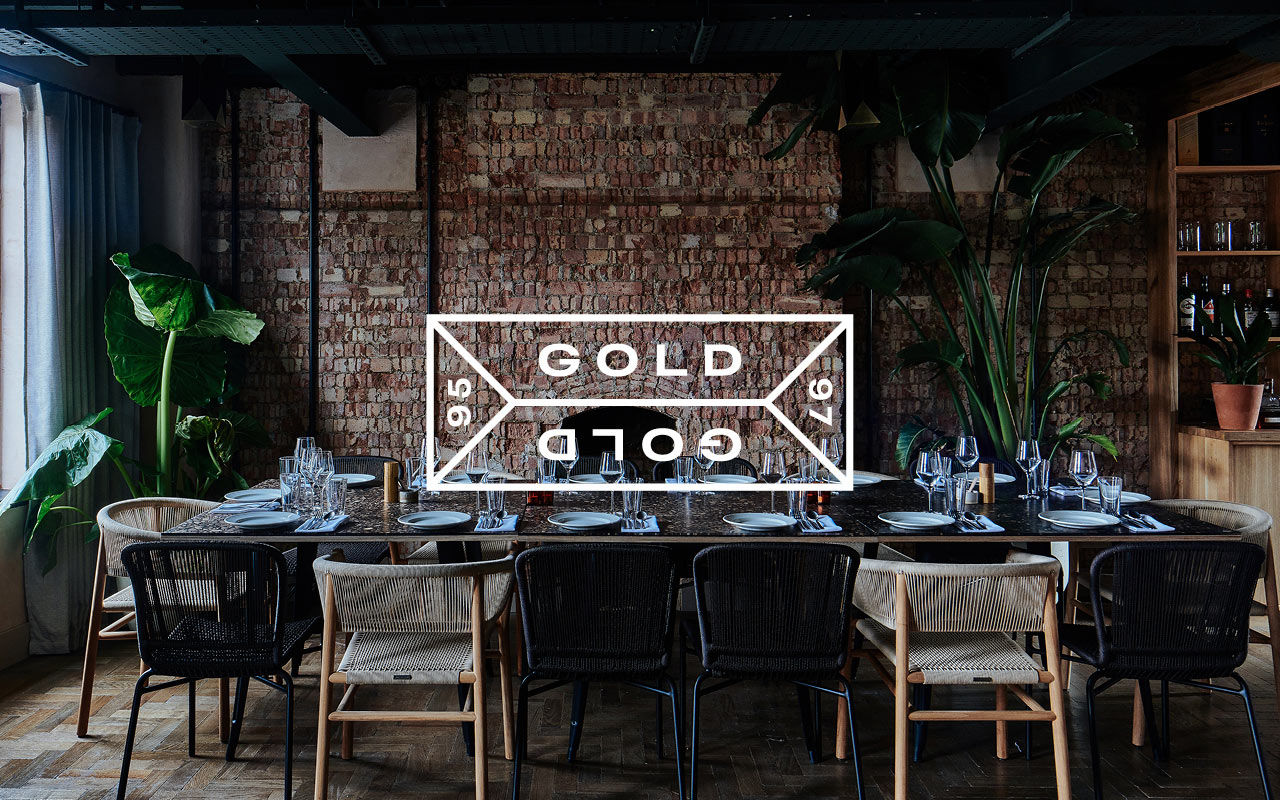
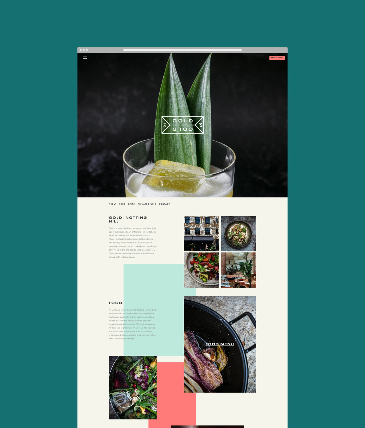
Gold Notting Hill restaurant branding
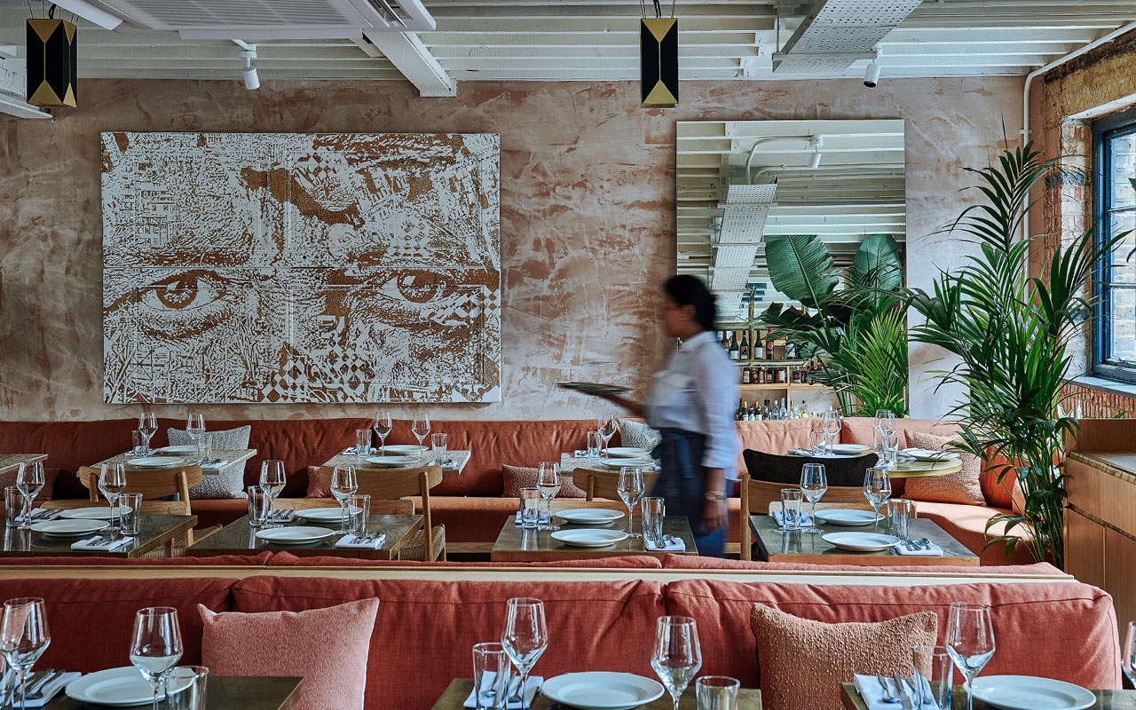
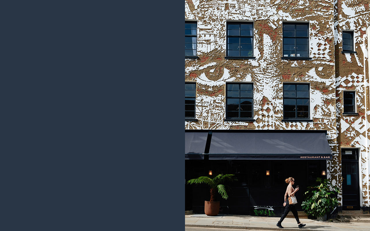
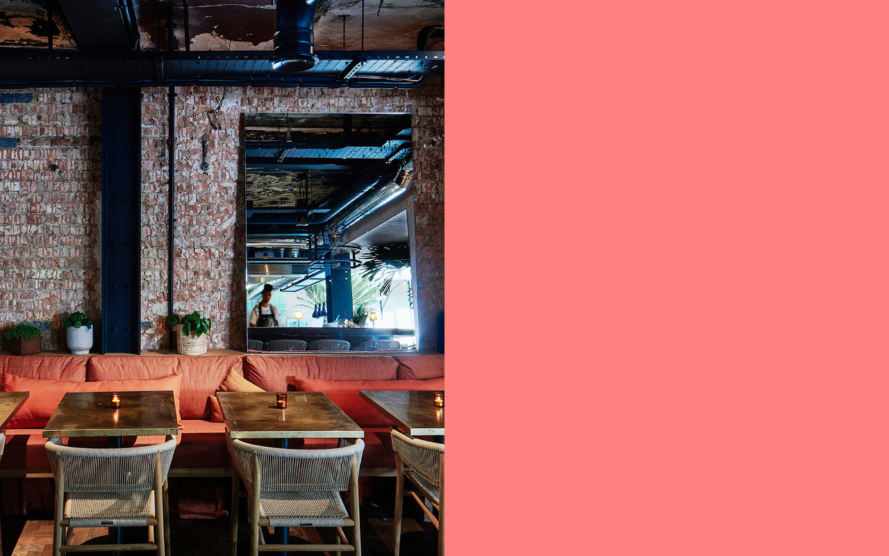
New restaurant branding project. Situated on the bustling Portobello Road, Gold Notting Hill is a vibrant new neighbourhood restaurant and late night bar. Inspired by the area’s diverse cultural history and artistic eclecticism, Gold is informal and honest, with a menu focussed on generous, seasonal plates cooked over open flame or in wood ovens and served to share. Set over 3 floors, Gold’s diverse space advocates laid-back dining, both indoor and out.
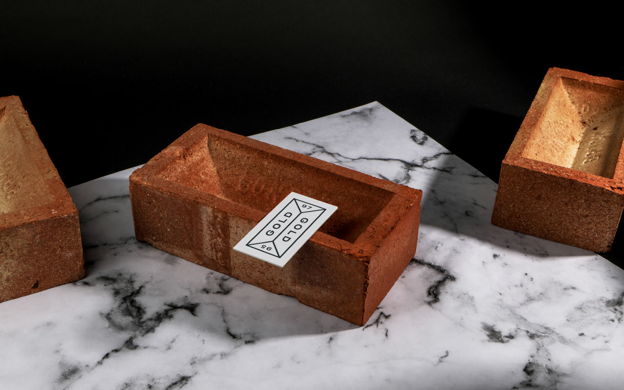
The concept itself is based on Notting Hill’s rich history. Long before gentrification set in, 1800s Notting Hill was a key brick making area. Using the London clay, workers would mould and fire the bricks that would build the buildings that stand there today. This idea influenced both the interior and the brand design – industrial elements paired with exposed brick are juxtaposed with contemporary natural woods and an abundance of plants to create a refined yet casual environment. The exterior facade by Portuguese street artist Vhils, further ties the concept together.
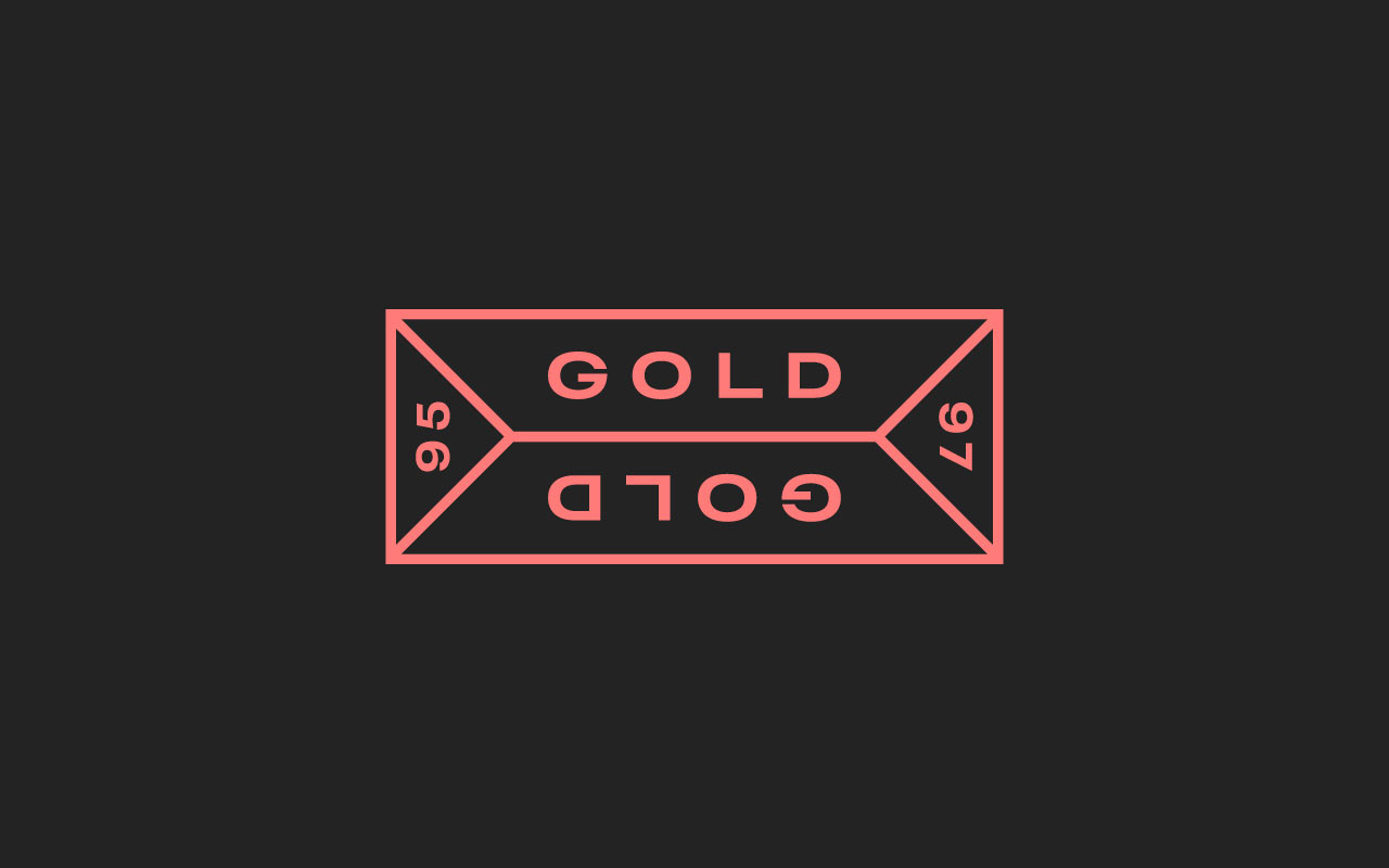
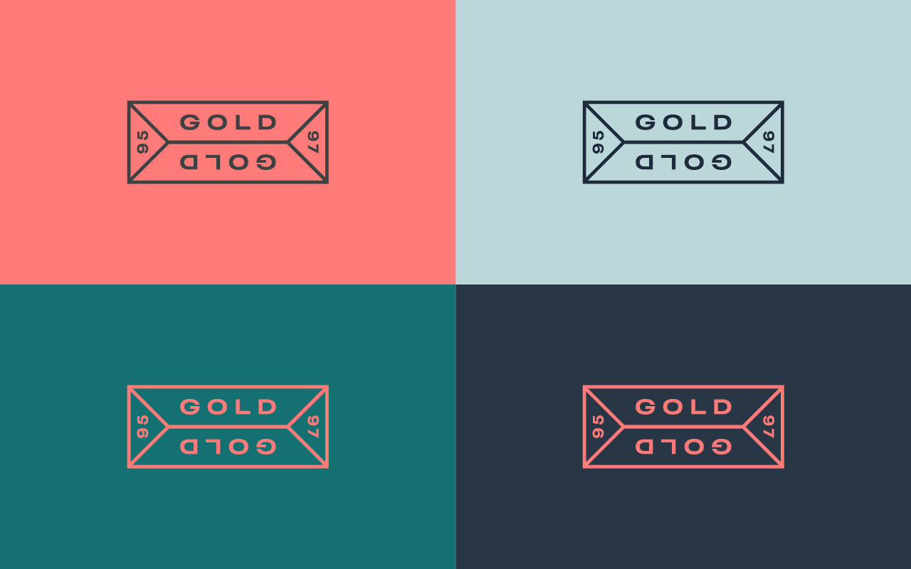
The bold logotype sits with refined typography and subtly nods to the brickmakers markings that still adorn bricks today. The rich colour palette is influenced by the painted buildings that are iconic to Portobello.
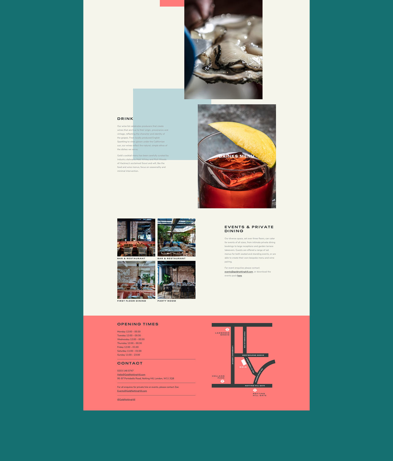
Get booking: goldnottinghill.com
Interior Design: Valerie & Felix Bechtolsheim
Interior Photography: Ingrid Rasmussen
Food Photography: Carla Gradiski